Configure the .NET MAUI ComboBox
The purpose of this help article is to show the basic configuration options of the .NET MAUI ComboBox control.
Placeholder
-
Placeholder(string): Sets the text which is used to give guidance to the end user on what can be entered/searched in the input. The watermark text is displayed when the input field is empty, or the selected item/s is/are cleared. -
PlaceholderColor(Color): Defines the color for the watermark text.
Here is an example of setting the Placeholder property:
<telerik:RadComboBox Placeholder="Select City!"
                     ItemsSource="{Binding Items}"
                     DisplayMemberPath="Name"
                     AutomationId="placeholderCombo"/>
The next image shows the result:

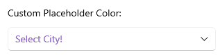
Here is an example of setting the PlaceholderColor property:
<telerik:RadComboBox Placeholder="Select City!"
                     PlaceholderColor="#8660C5"
                     ItemsSource="{Binding Items}"
                     DisplayMemberPath="Name"
                     AutomationId="placeholderColorCombo"/>
The next image shows the result:
Text
-
Text(string): Specifies the Text of the control. This is the Text that gets visualized when:- The control is editable.
- The control is non-editable and the selection mode is single.
Spell Checking
-
IsSpellCheckEnabled(bool)—Specifies whether the spell checking of the ComboBox is enabled. By default, theIsSpellCheckEnabledvalue isFalse. When spell checking is enabled, misspellings are indicated in the ComboBox input.
The example below shows how to apply the IsSpellCheckEnabled property:
<telerik:RadComboBox IsEditable="True"
                     IsSpellCheckEnabled="True"
                     ItemsSource="{Binding Items}"
                     DisplayMemberPath="Name"
                     AutomationId="spellCheckCombo"/>
Clear Button Visibility
The visibility state of the Clear X button can be changed using the IsClearButtonVisible(bool) property. By default its value is true.
Here is an example with IsClearButtonVisible property set:
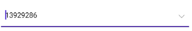
<telerik:RadComboBox IsClearButtonVisible="False"
                     ItemsSource="{Binding Items}"
                     DisplayMemberPath="Population"
                     IsEditable="True"
                     SearchTextPath="Population"
                     Keyboard="Numeric"
                     AutomationId="noClearButtonCombo"/>
and the result:
For the ComboBox Configuration example, refer to the SDKBrowser Demo Application and navigate to the ComboBox > Features category.
Drop-Down Behavior
To manage the drop-down of the ComboBox, use the following properties:
-
DropDownWidth(double)—Defines the width of the drop-down. -
DropDownHeight(double)—Defines the height of the drop-down. -
DropDownMaxHeight(double)—Defines the max height of the drop-down. Always set theDropDownMaxHeight, so that you can have a predefined height for the drop-down. If using both theDropDownMaxHeightandDropDownHeightproperties, the max height value must be higher. -
DropDownVerticalOffset(double)—Defines the vertical offset of the drop-down part of the control. This property allows an option to modify the control with no space between the ComboBox and the drop-down. -
IsDropDownOpen(bool)—Defines whether the drop-down part of the control is opened. The default value istrue. -
IsDropdownClosedOnSelection(bool)—Defines whether the drop-down will be closed when the item is selected or deselected. The default value istrue.
Here is an example that uses the DropDownWidth property:
<telerik:RadComboBox DropDownWidth="70"
                     ItemsSource="{Binding Items}"
                     DisplayMemberPath="Name"
                     AutomationId="dropdownWidthCombo"/>
Here is an example that uses the DropDownHeight property:
<telerik:RadComboBox DropDownHeight="30"
                     ItemsSource="{Binding Items}"
                     DisplayMemberPath="Name"
                     AutomationId="dropdownHeightCombo"/>
Here is an example that uses the DropDownMaxHeight property:
<telerik:RadComboBox DropDownMaxHeight="200"
                     ItemsSource="{Binding Items}"
                     DisplayMemberPath="Name"
                     AutomationId="dropdownMaxHeightCombo"/>
Here is an example that uses the DropDownVerticalOffset property:
<telerik:RadComboBox DropDownVerticalOffset="25"
                     ItemsSource="{Binding Items}"
                     DisplayMemberPath="Name"
                     AutomationId="dropdownVerticalOffsetCombo"/>
Here is an example with IsDropdownClosedOnSelection property set:
<telerik:RadComboBox IsDropDownClosedOnSelection="False"
                     ItemsSource="{Binding Items}"
                     DisplayMemberPath="Name"
                     AutomationId="openedAfterSelectionCombo"/>
-
OpenOnFocus(bool):Defines whether the drop down can be opened when the control is focused. The default value istrue. The property is applicable for Editable ComboBox.
Here is an example with OpenOnFocus property set:
<telerik:RadComboBox OpenOnFocus="False"
                     ItemsSource="{Binding Items}"
                     IsEditable="True"
                     SearchTextPath="Name"
                     DisplayMemberPath="Name"
                     AutomationId="notOpeningOnFocusCombo"/>
Review the Adding Select All Option in ComboBox Drop-Down article for more details how to select all items from the drop-down list.
Keyboard
The Keyboard property of type Microsoft.Maui.Keyboard allows you to define the type of the keyboard that will be visualized by the device. The default value is Text.
For the ComboBox Drop-Down Configuration example, refer to the SDKBrowser Demo Application and navigate to the ComboBox > Features category.