New to Telerik UI for .NET MAUI? Start a free 30-day trial

.NET MAUI ComboBox Edit Mode & Search

The Telerik UI for .NET MAUI ComboBox supports both editable and non editable state. When the control is in edit mode, users can type into the input field and searching through the control's ItemsSource can be performed.

This topic describes in details the configuration options related to the editable state of the ComboBox as well as its searching capabilities.

Edit Mode

  • IsEditable(bool)—Defines whether typing into the input area can be performed. The default value is false.
  • SearchTextPath(string)—Defines the name of the property against which the searching will be performed. The property is usable when the control is in edit mode (IsEditable is true).
  • OpenOnFocus(bool)—Specifies whether the drop-down will show as soon as the control is focused. The property is usable when the control is in edit mode (IsEditable is true). The default value is true. If the property is false when the control is focused the drop-down will no longer open.
  • Text(string)—Specifies the Text of the control. This is the Text that gets visualized when the control is editable or when its non-editable and the selection mode is single.

ComboBox provides both case-sensitive and case-insensitive searching modes. The following properties are exposed:
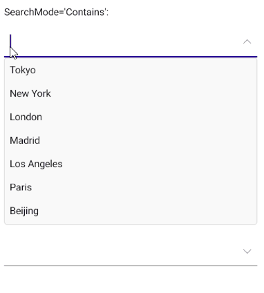
  • SearchMode(enumeration of type Telerik.Maui.Controls.SearchMode)—Defines the value that sets search sets some search criteria for the control. The available options are: Contains, StartsWith, ContainsCaseSensitive and StartsWithCaseSensitive. The default SearchMode is StartsWith.
  • SearchTexhPath(string)—Specifies the name of the property against which the searching will be performed.
  • HighlightTextColor(Microsoft.Maui.Graphics.Color)—Defines the color of the text that will be highlighted when searching is performed.

Searching can be performed when IsEditable is true.

If you want the text to be highlighted when using custom ItemTemplate, you have to add a RadHighlightLabel inside the ItemTemplate.

Here is an example:

<telerik:RadComboBox x:Name="comboBox"
        ItemsSource="{Binding Items}" 
        DisplayMemberPath="Name"
        Placeholder="Select City"
        AutomationId="comboBox"
        HighlightTextColor="Red"
        IsEditable="True">
    <telerik:RadComboBox.ItemTemplate>
        <DataTemplate>
            <telerik:RadBorder BackgroundColor="LightYellow"
                MinimumWidthRequest="300">

                <telerik:RadHighlightLabel TextColor="Black" Padding="10"
            HighlightTextColor="BlueViolet"
            UnformattedText="{Binding Name}"
            HighlightText="{Binding Source={x:Reference comboBox}, Path=Text}" />

            </telerik:RadBorder>
        </DataTemplate>
    </telerik:RadComboBox.ItemTemplate>
    <telerik:RadComboBox.SelectedItemTemplate>
        <DataTemplate>
            <telerik:RadBorder BackgroundColor="LightBlue"
                MinimumWidthRequest="300">
                <VerticalStackLayout>
                    <Label Text="{Binding Name}"
            Padding="8, 7, 0, 7"
            TextColor="Black"/>
                    <Label Text="{Binding Population}" 
            FontSize="12"
            Padding="8, 7, 0, 7"/>
                </VerticalStackLayout>
            </telerik:RadBorder>
        </DataTemplate>
    </telerik:RadComboBox.SelectedItemTemplate>
</telerik:RadComboBox>

Example

Here is the ComboBox definition in XAML:

When binding to a complex objects, ComboBox DisplayMemberPath property needs to be set. Also when IsEditable is true SearchTextPath property needs be set.

In addition to this, you need to add the following namespace:

xmlns:telerik="http://schemas.telerik.com/2022/xaml/maui"

the sample business model

public class City
{
    public string Name { get; set; }
    public int Population { get; set; }
}

and the ViewModel used:

public class ViewModel
{
    public ViewModel()
    {
        this.Items = new ObservableCollection<City>
        {
            new City { Name = "Tokyo", Population = 13929286 },
            new City { Name = "New York", Population = 8623000 },
            new City { Name = "London", Population = 8908081 },
            new City { Name = "Madrid", Population = 3223334 },
            new City { Name = "Los Angeles", Population = 4000000},
            new City { Name = "Paris", Population = 2141000 },
            new City { Name = "Beijing", Population = 21540000 },
            new City { Name = "Singapore", Population = 5612000 },
            new City { Name = "New Delhi", Population = 18980000 },
            new City { Name = "Bangkok", Population = 8305218 },
            new City { Name = "Berlin", Population = 3748000 },
        };
    }

    public ObservableCollection<City> Items { get; set; }
}

Here is how the control looks in edit mode:

ComboBox Edit Mode

See Also

In this article