New to Telerik UI for .NET MAUI? Start a free 30-day trial

Header and Footer in .NET MAUI ComboBox

You can add Header and Footer to the drop-down list of the .NET MAUI ComboBox control through the following properties:

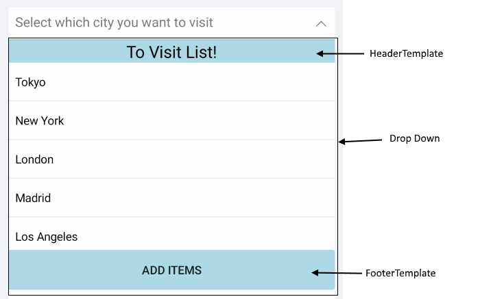
  • HeaderTemplate(DataTemplate)—Defines the template of the header that will be visualized in the drop down list.
  • FooterTemplate(DataTemplate)—Defines the template of the footer that will be visualized in the drop down list.

It's not recommended to add controls in the Header and Footer which steal the focus (like Entry, editor, etc.) from the ComboBox control, as unexpected behavior may occur.

Example

Here is the ComboBox definition in XAML:

<telerik:RadComboBox ItemsSource="{Binding Items}" 
                     DisplayMemberPath="Name"
                     IsEditable="True"
                     SearchMode="Contains"
                     SearchTextPath="Name"
                     Placeholder="Select city to visit"
                     SelectionMode="Multiple"
                     DropDownMaxHeight="300"
                     x:Name="comboBox"
                     AutomationId="comboBox">
    <telerik:RadComboBox.HeaderTemplate>
        <DataTemplate>
            <StackLayout BackgroundColor="LightBlue">
                <Label Text="To Visit List!" 
                       FontSize="20"
                       TextColor="Black"
                       BackgroundColor="LightBlue"
                       VerticalOptions="Center" 
                       HorizontalOptions="Center"/>
            </StackLayout>
        </DataTemplate>
    </telerik:RadComboBox.HeaderTemplate>
    <telerik:RadComboBox.FooterTemplate>
        <DataTemplate>
            <StackLayout>
                <Button Text="Add Items" 
                        Clicked="Button_Clicked" 
                        BackgroundColor="LightBlue"/>
            </StackLayout>
        </DataTemplate>
    </telerik:RadComboBox.FooterTemplate>
</telerik:RadComboBox>

the sample business model

public class City
{
    public string Name { get; set; }
    public int Population { get; set; }
}

and the ViewModel used:

public class ViewModel
{
    public ViewModel()
    {
        this.Items = new ObservableCollection<City>
        {
            new City { Name = "Tokyo", Population = 13929286 },
            new City { Name = "New York", Population = 8623000 },
            new City { Name = "London", Population = 8908081 },
            new City { Name = "Madrid", Population = 3223334 },
            new City { Name = "Los Angeles", Population = 4000000},
            new City { Name = "Paris", Population = 2141000 },
            new City { Name = "Beijing", Population = 21540000 },
            new City { Name = "Singapore", Population = 5612000 },
            new City { Name = "New Delhi", Population = 18980000 },
            new City { Name = "Bangkok", Population = 8305218 },
            new City { Name = "Berlin", Population = 3748000 },
        };
    }

    public ObservableCollection<City> Items { get; set; }
}

This is how the Header and Footer Templates look:

ComboBox Header Footer Templates

For the ComboBox Header and Footer example, go to the SDKBrowser Demo Application and navigate to ComboBox -> Templates category.

See Also

In this article