Data Column
GridViewDataColumn derives from GridViewBoundColumnBase, which means that it inherits all of its functionality. In addition, it automatically creates appropriate editor elements based on the bound data type without you needing to specify a CellEditTemplate explicitly.
More specifically, the GridViewDataColumn will generate a CheckBox for boolean properties, a DateTimePicker for DateTime properties and a TextBox for all other properties once it enters edit mode.
The editors specified in the CellEditTemplate and CellEditTemplateSelector properties overwrite the default editors.
RadGridView's autogenerated columns are of this type.
Example 1: Define GridViewDataColumn in XAML.
Example 2: Define GridViewDataColumn in code
The DataMemberBinding property defines which property from the row's underlying data item should be used to populate the cells in the column. If the DataMemberBinding is not set, the column will try to fallback to the UniqueName property of the column (if assigned) and automatically create a binding using the unique name as the property path.
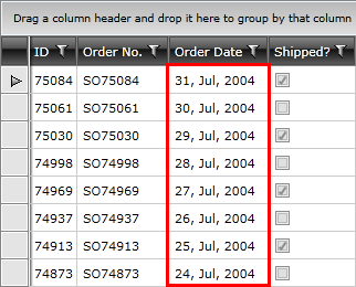
Via the DataFormatString property you are able to format the bound data and display it the way you want. Figure 1 shows a DateTime column with custom formatting.
Figure 1: GridViewDataColumn with custom formatting

To learn more about how to format the displayed data, please check the Data Formatting article.