Setting CellTemplate and CellEditTemplate
This article describes how to customize the RadGridView columns by using predefined column types and how to extend the functionality of the columns by defining a non-default editor.
Using Predefined Column Types
RadGridView provides a set of predefined column types like GridViewCheckBoxColumn, GridViewComboBoxColumn, GridViewSelectColumn, etc. that you can customize in accordance with the requirements and the type of properties exposed in your business object.
When you use a standard GridViewDataColumn, the RadGridView control automatically generates controls for the cell's view and edit modes:
-
Default controls in view mode:
TextBlock: For string, numeric and DateTime properties
CheckBox: For boolean properties
-
Default controls in edit mode:
TextBox: For string and numeric properties
CheckBox: For boolean properties
RadDatePicker: For DateTime properties
Creating CellTemplate and CellEditTemplate for a Column
Sometimes you need to extend the functionality of a column and define a custom editor. To achieve this, create a CellTemplate or CellEditTemplate for the column:
CellTemplate: Gets or sets the data template for the cell in view mode.
CellEditTemplate: Gets or sets the data template for the cell in edit mode.
You can also conditionally apply different data templates to RadGridView cells by using the CellTemplateSelector and CellEditTemplateSelector properties.
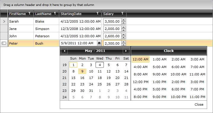
Example 1 demonstrates how to use both properties to customize your columns. We set the RadDateTimePicker as a CellEditTemplate for the DateTime column type and the RadNumericUpDown as a CellTemplate for the Salary column.
Example 1: Setting columns' CellTemplate and CellEditTemplate
<telerik:RadGridView x:Name="EmployeesGrid" AutoGenerateColumns="False" ItemsSource="{Binding Employees}">
    <telerik:RadGridView.Columns>
        <telerik:GridViewDataColumn DataMemberBinding="{Binding FirstName}" />
        <telerik:GridViewDataColumn DataMemberBinding="{Binding LastName}" />
        <telerik:GridViewDataColumn DataMemberBinding="{Binding StartingDate}">
            <telerik:GridViewDataColumn.CellEditTemplate>
                <DataTemplate>
                    <telerik:RadDateTimePicker SelectedDate="{Binding StartingDate}" IsTooltipEnabled="False"/>
                </DataTemplate>
            </telerik:GridViewDataColumn.CellEditTemplate>
        </telerik:GridViewDataColumn>
        <telerik:GridViewDataColumn DataMemberBinding="{Binding Salary}">
            <telerik:GridViewDataColumn.CellTemplate>
                <DataTemplate>
                    <telerik:RadNumericUpDown Value="{Binding Salary}" />
                </DataTemplate>
            </telerik:GridViewDataColumn.CellTemplate>
        </telerik:GridViewDataColumn>
    </telerik:RadGridView.Columns>
</telerik:RadGridView>
The RadGridView defined above will be displayed as shown in Figure 1.
Figure 1: RadGridView with CellTemplate and CellEditTemplate defined
When you define a CellEditTemplate for a column, the default validation mechanism is bypassed as you're directly binding to the source property. If you require this validation, create a custom column editor instead.
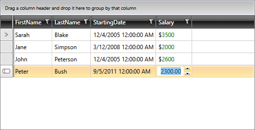
The first example illustrates how to define either a CellTemplate or CellEditTemplate. In the next example, we demonstrate how to set them both for the same column.
Example 2: Setting the CellTemplate and CellEditTemplate of a single column
<telerik:RadGridView x:Name="EmployeesGrid" AutoGenerateColumns="False" ItemsSource="{Binding Employees}">
    <telerik:RadGridView.Columns>
        <telerik:GridViewDataColumn DataMemberBinding="{Binding FirstName}" />
        <telerik:GridViewDataColumn DataMemberBinding="{Binding LastName}" />
        <telerik:GridViewDataColumn DataMemberBinding="{Binding StartingDate}" />
        <telerik:GridViewDataColumn DataMemberBinding="{Binding Salary}">
            <telerik:GridViewDataColumn.CellTemplate>
                <DataTemplate>
                    <StackPanel Orientation="Horizontal">
                        <TextBlock Text="$" />
                        <TextBlock Text="{Binding Salary}" Foreground="Green" />
                    </StackPanel>
                </DataTemplate>
            </telerik:GridViewDataColumn.CellTemplate>
            <telerik:GridViewDataColumn.CellEditTemplate>
                <DataTemplate>
                    <telerik:RadNumericUpDown Value="{Binding Salary}" />
                </DataTemplate>
            </telerik:GridViewDataColumn.CellEditTemplate>
        </telerik:GridViewDataColumn>
    </telerik:RadGridView.Columns>
</telerik:RadGridView>
The RadGridView defined above will be displayed as shown in Figure 1.
Figure 2: RadGridView with CellTemplate and CellEditTemplate defined for a single column
Tips about CellTemplate and CellEditTemplate
You can set the CellTemplate and CellEditTemplate in the code behind. See the Using DataTemplate in Code article for details.
If you set DataMemberBinding set to StartingDate, the aggregation, sorting, grouping and filtering operations on the column will be done based on the StartingDate property. If the user does not need to perform any aggregation, sorting, grouping or filtering operations for the column, then you can use a GridViewColumn instead.
In scenarios with a defined column.CellEditTemplate, the new value of the editor is not available in the arguments of the CellEditEnded event that is raised when committing an edit. To get the right value in e.NewValue, create your own Custom Column and override its GetNewValueFromEditor method.