Column Footers
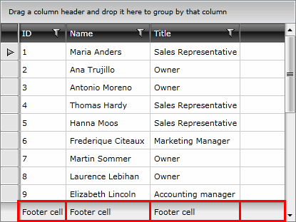
RadGridView allows you to display additional information which applies to the columns in a specific row placed at the bottom of the control. This row consists of individual footer cells for each column.
By default, column footers are hidden and in order to make them visible you have to set the ShowColumnFooters property to True.
Example 1: Show column footers
<telerik:RadGridView ShowColumnFooters="True">
  <!-- ... -->
</telerik:RadGridView>
Example 2: Set the content of the footer cells
<telerik:GridViewDataColumn Header="ID" DataMemberBinding="{Binding EmployeeID}" Footer="Footer cell" />
Figure 1: RadGridView with footer cells

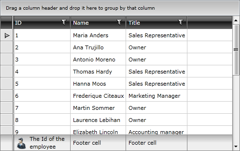
Because it is of type object, you are not limited to just using plain text. For example, you can add a corresponding picture to the footer text.
Example 3: Adding an image to the footer content
<telerik:GridViewDataColumn Header="ID" DataMemberBinding="{Binding EmployeeID}">
    <telerik:GridViewDataColumn.Footer>
        <Grid>
            <Grid.ColumnDefinitions>
                <ColumnDefinition Width="Auto" />
                <ColumnDefinition />
            </Grid.ColumnDefinitions>
            <Image Stretch="None" Source="../../Images/User.png" Margin="0,0,5,0" />
            <TextBlock Text="The Id of the employee" VerticalAlignment="Center" TextWrapping="Wrap" Grid.Column="1" />
        </Grid>
    </telerik:GridViewDataColumn.Footer>
</telerik:GridViewDataColumn>
Figure 2: Image in the footer cell

Aggregates
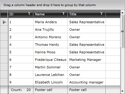
Column footers are also used to display aggregated information on the data displayed in the column via aggregate functions.
Example 4: Adding an aggregate function to a column
<telerik:GridViewDataColumn Header="ID" DataMemberBinding="{Binding EmployeeID}">
    <telerik:GridViewDataColumn.AggregateFunctions>
        <telerik:CountFunction Caption="Count:  " />
    </telerik:GridViewDataColumn.AggregateFunctions>
</telerik:GridViewDataColumn>
Figure 3: Footer cell with aggregate results

To learn more about aggregate functions please have a look at this article.
Please note that if the Footer property is explicitly defined, it will take precedence over the aggregate results.