Column Headers
This topic will guide you through the usage of the column headers, their customization as well through performing different data operations.
- Customizing Headers
- Hiding the Headers
- Sorting
- Filtering
- Grouping
- Merging the Headers
- Text Properties
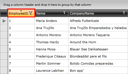
Usually the top cell of a column is called Header. Its purpose is to set a caption for the column, which describes the data displayed in it.
Figure 1: Displaying column headers
To set value for the header use the Header property of the column.
Example 1: Setting the Header Property
<telerik:GridViewDataColumn DataMemberBinding="{Binding EmployeeID}"
                Header="ID" />
Example 2: Setting Custom Content to the Header Property
<telerik:GridViewDataColumn DataMemberBinding="{Binding EmployeeID}">
    <telerik:GridViewDataColumn.Header>
        <StackPanel Orientation="Horizontal">
            <Image Stretch="None"
   Source="../../Images/User.png"
   Margin="0,0,5,0" />
            <TextBlock Text="ID"
       VerticalAlignment="Center" />
        </StackPanel>
    </telerik:GridViewDataColumn.Header>
</telerik:GridViewDataColumn>
Figure 2: Displaying custom content in column headers
Customizing the Headers
There are two elements on the headers that can be customized:
- Header Row - it is modified by setting an appropriate style as HeaderRowStyle of RadGridView. To learn how to style it take a look at the Styling the Header Row topic.
- Header Cell - it is styled by setting HeaderCellStyle for the column, which means that for each column you can have a differently styled header. To learn more about how to style the header cell take a look at the Styling the Column Headers topic.
Hiding the Headers
Column headers can only be hidden by setting ShowColumnHeaders property of RadGridView to False.
Example 3: Setting the ShowColumnHeaders property to False
<telerik:RadGridView x:Name="radGridView"
                 ShowColumnHeaders="False">
    <!-- ... -->
</telerik:RadGridView>
Figure 3: Hiding the column headers
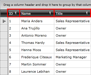
Sorting
The header of the column plays the main role when we want to sort it. It also hosts all the visual logic around this functionality. When the data is sorted by a column, its header changes its appearance and shows the sort direction via an indicator.
Figure 4: Sorting the column
As of Q2 2013, the user can benefit from Column Sort Sequence Indicator. In order to have this feature enabled you need to set ShowColumnSortIndexes property of RadGridView to True.
To learn more about the sorting functionality take a look at the Basic Sorting topic in the Sorting chapter.
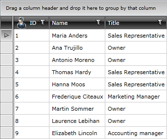
Filtering
The header of the column hosts the built-in filtering mechanism, which allows you to filter data by the columns' values.
Figure 5: Filtering the column
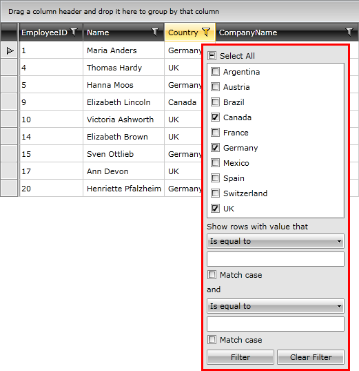
To learn more about the filtering functionality take a look at the Basic Filtering topic in the Filtering chapter.
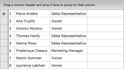
Grouping
The header is also used for grouping data. It has to be dragged into the group panel at the top of the control in order to get the data grouped by that column.
Figure 6: Grouping the column
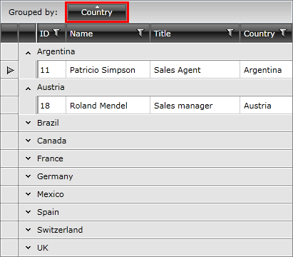
To learn more about the grouping functionality take a look at the Basic Grouping topic in the Grouping chapter.
Merging the Headers
Columns in RadGridView can be grouped in column groups(added with Q3 2011). Read more.
To learn more about the customizing of the headers please refer to the Customizing the Headers section above.
Text Properties
As of Q2 2016, GridViewHeaderCell exposes TextWrapping, TextAlignment, TextTrimming and TextDecorations properties. These customizations can be also applied on column level through the HeaderTextWrapping, HeaderTextAlignment, HeaderTextTrimming and HeaderTextDecorations properties. If the same property is set to both elements, the value of the one corresponding to GridViewColumn will be respected.
Example 5: Setting the Text Properties of GridViewHeaderCell and GridViewColumn
<Window.Resources>
    <Style TargetType="telerik:GridViewHeaderCell"
                x:Key="HeaderCellStyle">
        <Setter Property="TextAlignment"
                Value="Left"/>
    </Style>
</Window.Resources>


<telerik:RadGridView Name="clubsGrid"
                 ItemsSource="{Binding Clubs}"
                 AutoGenerateColumns="False"
                 GroupRenderMode="Flat">
     <telerik:RadGridView.Columns>
        <telerik:GridViewDataColumn DataMemberBinding="{Binding Name}"
                                    HeaderCellStyle="{StaticResource HeaderCellStyle}"
                                    HeaderTextAlignment="Right"/>

        <telerik:GridViewDataColumn DataMemberBinding="{Binding Established}"
                                    Header="Est."
                                    DataFormatString="{}{0:yyyy}"
                                    HeaderTextAlignment="Right"/>

        <telerik:GridViewDataColumn DataMemberBinding="{Binding StadiumCapacity}"
                                    Header="Stadium"
                                    DataFormatString="{}{0:N0}"
                                    HeaderTextTrimming="WordEllipsis"/>

        <telerik:GridViewDataColumn DataMemberBinding="{Binding FanClubCount}"
                                    HeaderTextDecorations="Underline"/>
    </telerik:RadGridView.Columns>
</telerik:RadGridView>
Figure 5: Setting the text properties of GridViewHeaderCell and GridViewColumn
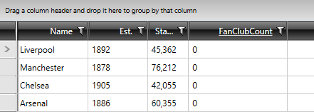
Note, that the first column has a HeaderCellStyle defined, which aligns the content of the HeaderCell to the left, but the Style is not applied, as the HeaderTextAlignment of GridViewColumn is also being set.