Styling
RadListView provides an API that allows you to customize of appearance of its items.
The following RadListView properties can be used to add Styles, DataTemplates and style/template selectors, thus changing the default appearance:
- ItemTemplate
- ItemTemplateSelector
- ItemStyle
- ItemStyleSelector
- GroupHeaderTemplate
- GroupHeaderTemplateSelector
- GroupHeaderStyle
- GroupHeaderStyleSelector
Example
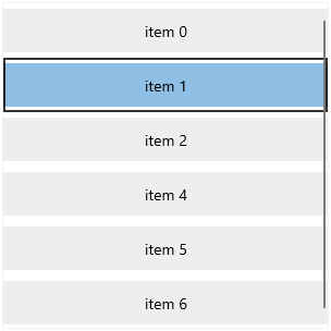
The following example shows how to define a Style and a DataTemplate, and then assign them to the corresponding RadListView properties.
Example 1: Setting up ItemTemplate and ItemStyle
<telerikData:RadListView x:Name="listView">
    <telerikData:RadListView.ItemStyle>
        <Style TargetType="telerikListView:RadListViewItem">
            <Setter Property="Margin" Value="0,5,0,5"/>
            <Setter Property="Padding" Value="0"/>
            <Setter Property="Background" Value="#EEEEEE"/>
        </Style>
    </telerikData:RadListView.ItemStyle>
    <telerikData:RadListView.ItemTemplate>
        <DataTemplate>
            <TextBlock Text="{Binding}" VerticalAlignment="Center" HorizontalAlignment="Center"/>
        </DataTemplate>
    </telerikData:RadListView.ItemTemplate>
</telerikData:RadListView>
Example 2: Populating with data
public MainWindow()
{
    this.InitializeComponent();

}