Layouts
RadListView supports different layouts that can be enabled in order to change the ordering of the items.
The layout is controlled using the Orientation and LayoutDefinition properties of RadListView.
Orientation
Each layout supports horizontal and vertical orientation set via the Orientation property of RadListView.
LayoutDefinition
The LayoutDefinition describes how the items should arrange in the control. RadListView supports several implementations of the LayoutDefinitionBase which can be assigned using the LayoutDefinition property.
The control provides the following layout definition implementations:
-
StackLayoutDefinition: A layout definition that arranges the items in a stack.
Example 1: Setting StackLayoutDefinition
    <telerikData:RadListView>
        <telerikData:RadListView.LayoutDefinition>
            <telerikListView:StackLayoutDefinition/>
        </telerikDataControls:RadListView.LayoutDefinition>
    </telerikDataControls:RadListView>
WheretelerikListViewpoints toxmlns:telerikListView="using:Telerik.UI.Xaml.Controls.Data.ListView".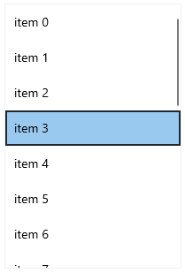
-
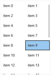
GridLayoutDefinition: A layout definition that arranges the items in a grid. The SpanCount property specifies the columns count of the grid.
Example 2: Setting GridLayoutDefinition
    <telerikDataControls:RadListView>
        <telerikDataControls:RadListView.LayoutDefinition>
            <telerikListView:GridLayoutDefinition SpanCount="2"/>
        </telerikDataControls:RadListView.LayoutDefinition>
    </telerikDataControls:RadListView>
-
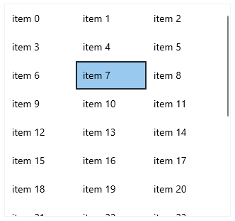
WrapLayoutDefinition: A layout definition that wraps the items. Only items with equal width are supported. Through the ItemWidth property you can define the width of the items.
Example 3: Setting WrapLayoutDefinition
    <telerikDataControls:RadListView ItemsSource="{Binding}" Height="350" Width="300" >
        <telerikDataControls:RadListView.LayoutDefinition>
            <telerikListView:WrapLayoutDefinition ItemWidth="100"/>
        </telerikDataControls:RadListView.LayoutDefinition>
    </telerikDataControls:RadListView>
-
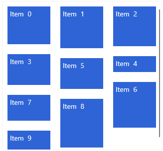
StaggeredLayoutDefinition: A layout definition that arranges variable sized items in columns. Through the SpanCount property you can set the column count of the layout.
Example 4: Setting StaggeredLayoutDefinition
    <telerikDataControls:RadListView ItemsSource="{Binding}" Height="350" Width="300" >
        <telerikDataControls:RadListView.LayoutDefinition>
            <telerikListView:StaggeredLayoutDefinition SpanCount="3" />
        </telerikDataControls:RadListView.LayoutDefinition>
    </telerikDataControls:RadListView>