WinUI ListView Overview
RadListView is a virtualizing list component that provides the most popular features associated with scenarios where a list of items is used.
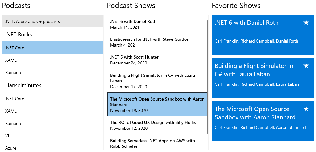
All the features are embedded in one control with the idea to save developer time and provide better experience. The control's features include item animations, different layouts and orientations, smart defaults for many gestures - execution of special action on swipe, reorder of items on long press and drag, refreshing the list on swipe or loading more items only when need. The control can also be used to easily visualize your items in groups, sorted and filtered in accordance with your criteria.
The ListView is part of Telerik UI for WinUI, a
professional grade UI component library for building modern and feature-rich applications. To try it out sign up for a free 30-day trial.

Key Features
This is a list with short descriptions of the top-of-the-line features of the RadListView control.
- Layouts: RadListView provides several different layouts - like grid and stack. Read more in the Layouts article.
- Header and Footer: This feature allows you to add custom visual elements in the begining and end of the scrollable area of the control. Read more in the Header and Footer article.
- Selection: The selection allows you to highlight one or more items on click/tap. Read more in the Selection article.
- Grouping: The control allows grouping its items into separate categories. Read more in the Grouping article.
- Filtering: This feature allows you to filter the data based on some criteria. Read more in the Filtering article.
- Sorting: The items in the control can be easily ordered. Read more in the Sorting article.
- Incremental Loading: This feature allows you to use data virtualization by loading only portions of the data after an action like scroll-down or button click is executed. Read more in the Incremental Loading article.
- Swipe and Reorder: The control provides a mechanism for dragging its items. Based on the input gesture the items can be reordered or additional visual element can be shown. Read more in the Swipe and Reorder article.
- Commands: Most actions in the control are implemented using commands. Read more in the Commands article.
- Animations RadListView comes with animation for removing and adding items. Read more in the Animations article.
- Styling Item Appearance: The listview items can be customized using Style and DataTemplate objects. Read more in the Styling article.
Get started with the control with its Getting Started help article that shows how to use it in a basic scenario.
Check out the Telerik UI for WinUI Examples at https://demos.telerik.com/winui. Also, you can check the Examples Application help article.
Telerik UI for WinUI Support and Learning Resources
- Telerik UI for WinUI ListView Homepage
- Get Started with the Telerik UI for WinUI ListView
- Telerik UI for WinUI API Reference
- Getting Started with Telerik UI for WinUI Components
- Telerik UI for WinUI ListView Forums