Styling the TreeView
The TreeView for .NET MAUI allows you to style its checkboxes, expand indicator, and items by using the provided properties.
To style the TreeView, use the following properties:
-
BackgroundColor(Color)—Specifies the background color of the control. -
BorderColor(Color)—Specifies the border color of the control. -
BorderBrush(Color)—Specifies the border brush of the control. -
BorderThickness(Thickness)—Specifies the border thickness of the control. -
CornerRadius(Thickness)—Specifies the corner radius of the control. -
ContentPadding(Thickness)—Specifies the content padding of the control.
Styling and Configuring the TreeView Item
The TreeView provides a styling mechanism for customizing the look of its items.
To use it, set the ItemStyle property of the control with a target type TreeViewItemView. The property can be applied on a TreeView and TreeViewDescriptor level.
The available properties are:
-
IsExpanded(bool)—Defines a value indicating whether the tree item is expanded. -
IsChecked(bool?)—Defines a value indicating whether the tree item is checked. -
ImageSource(ImageSource)—Defines the source of the image to display in the tree item. -
IsImageVisible(bool)—Defines a value indicating whether the image is visible. -
IsExpandButtonVisible(bool)—Defines a value indicating whether the expand button is visible. -
BackgroundColor(Color)—Defines the background color of the tree item. -
BorderBrush(Brush)—Defines the brush od the border around the tree item. -
BorderThickness(Thickness)—Defines the thickness of the border around the tree item. -
TextColor(Color)—Defines the color of the text in the tree item. -
CheckBoxStyle(Stylewith target typetelerik:RadCheckBox)—Specifies the style for the Checkbox element. -
ExpandButtonStyle(Stylewith target typetelerik:RadButton)—Specifies the style for the Expand element. -
ImageStyle(Stylewith target typeImage)—Specifies the style for the Image element.
The following example demonstrates how to style the TreeView item:
1. Define the ItemStyle to the TreeView:
<Style TargetType="telerik:TreeViewItemView" x:Key="TreeViewItemStyle">
<Setter Property="BackgroundColor" Value="#0D8660C5" />
<Setter Property="Spacing" Value="5" />
<Setter Property="IsImageVisible" Value="True" />
<Setter Property="ImageSource">
<FontImageSource Glyph=""
FontFamily="TelerikFontExamples"
Color="{Binding TextColor, Source={x:RelativeSource AncestorType={x:Type telerik:TreeViewItemView}}}"
Size="16" />
</Setter>
<Setter Property="VisualStateManager.VisualStateGroups">
<VisualStateGroupList>
<VisualStateGroup Name="CommonStates">
<VisualState Name="Normal" />
<VisualState Name="PointerOver">
<VisualState.Setters>
<Setter Property="BackgroundColor" Value="#268660C5" />
</VisualState.Setters>
</VisualState>
<VisualState Name="Disabled">
<VisualState.Setters>
<Setter Property="TextColor" Value="#61000000" />
</VisualState.Setters>
</VisualState>
<VisualState Name="Selected">
<VisualState.Setters>
<Setter Property="BackgroundColor" Value="#408660C5" />
</VisualState.Setters>
</VisualState>
</VisualStateGroup>
</VisualStateGroupList>
</Setter>
<Setter Property="CheckBoxStyle">
<Style TargetType="telerik:RadCheckBox">
<Setter Property="CheckedColor" Value="#8660C5" />
<Setter Property="CheckedSymbolColor" Value="White" />
<Setter Property="UncheckedColor" Value="Gray" />
</Style>
</Setter>
<Setter Property="ExpandButtonStyle" Value="{StaticResource TreeViewItemExpandButton_Style}" />
</Style>
2. Define the ItemStyle to the TreeViewDescriptor:
<Style TargetType="telerik:TreeViewItemView" x:Key="CityDescriptorStyle">
    <Setter Property="BackgroundColor" Value="#0DFFAC3E" />
    <Setter Property="CheckBoxStyle" Value="{StaticResource CheckBoxDescriptorStyle}" />
    <Setter Property="VisualStateManager.VisualStateGroups">
        <VisualStateGroupList>
            <VisualStateGroup Name="CommonStates">
                <VisualState Name="Normal" />
                <VisualState Name="PointerOver">
                    <VisualState.Setters>
                        <Setter Property="BackgroundColor" Value="#26FFAC3E" />
                    </VisualState.Setters>
                </VisualState>
                <VisualState Name="Disabled">
                    <VisualState.Setters>
                        <Setter Property="TextColor" Value="#61000000" />
                    </VisualState.Setters>
                </VisualState>
                <VisualState Name="Selected">
                    <VisualState.Setters>
                        <Setter Property="BackgroundColor" Value="#40FFAC3E" />
                    </VisualState.Setters>
                </VisualState>
            </VisualStateGroup>
        </VisualStateGroupList>
    </Setter>
</Style>
And the style used for the checkbox element:
<Style TargetType="telerik:RadCheckBox" x:Key="CheckBoxDescriptorStyle">
    <Setter Property="CheckedColor" Value="#F18900" />
    <Setter Property="CheckedSymbolColor" Value="White" />
</Style>
3. Set the style to the RadTreeView and TreeViewDescriptor:
<telerik:RadTreeView x:Name="treeView"
                     CheckBoxMode="Recursive"
                     ItemStyle="{StaticResource TreeViewItemStyle}"
                     ItemsSource="{Binding Countries}"
                     SelectedItem="{Binding SelectedLocation}">
    <telerik:TreeViewDescriptor TargetType="{x:Type local:Country}"
                                DisplayMemberPath="Name"
                                ItemsSourcePath="Cities" />
    <telerik:TreeViewDescriptor TargetType="{x:Type local:City}"
                                DisplayMemberPath="Name"
                                ItemStyle="{StaticResource CityDescriptorStyle}" />
    <telerik:RadTreeView.BindingContext>
        <local:LocationViewModel/>
    </telerik:RadTreeView.BindingContext>
</telerik:RadTreeView>
4. Add the location DataModel:
public class Location : NotifyPropertyChangedBase
{
    private string name;

    public string Name
    {
        get => this.name;
        set => this.UpdateValue(ref this.name, value);
    }
}
5. Add the Country DataModel:
public class Country : Location
{
    public Country()
    {
        this.Cities = new ObservableCollection<City>();
    }

    public IList<City> Cities { get; }
}
6. Add the City DataModel:
public class City : Location
{
}
7. Add the ViewModel:
public class LocationViewModel : NotifyPropertyChangedBase
{
private ObservableCollection<Country> countries;
private Location selectedLocation;
public LocationViewModel()
{
this.Countries = new ObservableCollection<Country>
{
new Country
{
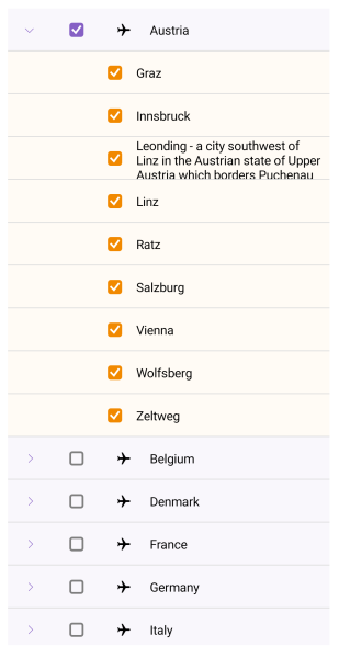
Name = "Austria",
Cities =
{
new City { Name = "Graz" },
new City { Name = "Innsbruck" },
new City { Name = "Leonding - a city southwest of Linz in the Austrian state of Upper Austria which borders Puchenau and the river Danube in the north, Wilhering and Pasching in the west, Traun in the south and Linz in the east and has a population of more than 27 thousand people, making it the most populous city of the Linz-Land district and the fourth most populous city in Upper Austria" },
new City { Name = "Linz" },
new City { Name = "Ratz" },
new City { Name = "Salzburg" },
new City { Name = "Vienna" },
new City { Name = "Wolfsberg" },
new City { Name = "Zeltweg" }
}
},
new Country
{
Name = "Belgium",
Cities =
{
new City { Name = "Antwerp" },
new City { Name = "Assesse" },
new City { Name = "Bruges" },
new City { Name = "Charleroi" },
new City { Name = "Lint" },
new City { Name = "Ranst" },
new City { Name = "Schaffen" },
new City { Name = "Veurne" },
new City { Name = "Zingem" },
}
},
new Country
{
Name = "Denmark",
Cities =
{
new City { Name = "Aalborg" },
new City { Name = "Aarhus" },
new City { Name = "Billund" },
new City { Name = "Copenhagen" },
new City { Name = "Karup" },
new City { Name = "Odense" },
new City { Name = "Viborg" },
new City { Name = "Vojens" }
}
},
new Country
{
Name = "France",
Cities =
{
new City { Name = "Aurillac" },
new City { Name = "Belley" },
new City { Name = "Carcassonne" },
new City { Name = "Caen" },
new City { Name = "Deauville" },
new City { Name = "La Rochelle" },
new City { Name = "Nice" },
new City { Name = "Marseille" },
new City { Name = "Paris" },
new City { Name = "Rodez" }
}
},
new Country
{
Name = "Germany",
Cities =
{
new City { Name = "Baden-Baden" },
new City { Name = "Berlin" },
new City { Name = "Borkum" },
new City{ Name = "Bremen" },
new City{ Name = "Dortmund" },
new City{ Name = "Dresden" },
new City{ Name = "Hamburg" },
new City{ Name = "Hannover" },
new City{ Name = "Leipzig" },
new City{ Name = "Mannheim" },
new City{ Name = "Munich" },
new City{ Name = "Nuremberg" }
}
},
new Country
{
Name = "Italy",
Cities =
{
new City { Name = "Aosta" },
new City { Name = "Bari" },
new City { Name = "Bologna" },
new City { Name = "Parma" },
new City { Name = "Rimini" },
new City { Name = "Rome" }
}
},
new Country
{
Name = "Netherlands",
Cities =
{
new City { Name = "Amsterdam" },
new City { Name = "Bonaire" },
new City { Name = "Eindhoven" },
new City { Name = "Maastricht" },
new City { Name = "Rotterdam" }
}
},
new Country
{
Name = "Portugal",
Cities =
{
new City { Name = "Braga" },
new City { Name = "Cascais" },
new City { Name = "Lisbon" },
new City { Name = "Porto" }
}
},
new Country
{
Name = "Spain",
Cities =
{
new City { Name = "Alicante" },
new City { Name = "Barcelona" },
new City { Name = "Madrid" },
new City { Name = "Seville" },
new City { Name = "Valencia" },
new City { Name = "Zaragoza" }
}
},
new Country
{
Name = "United Kingdom",
Cities =
{
new City { Name = "Bristol" },
new City { Name = "Liverpool" },
new City { Name = "London" },
new City { Name = "Manchester" },
new City { Name = "Norwich" },
new City { Name = "Southampton" }
}
},
};
}
public Location SelectedLocation
{
get => this.selectedLocation;
set => this.UpdateValue(ref this.selectedLocation, value);
}
public ObservableCollection<Country> Countries
{
get => this.countries;
set => this.UpdateValue(ref this.countries, value);
}
}
Styling the Expand Button
To style the expand button, which is used for expanding or collapsing the TreeView item, use the TreeViewItemExpandButton. It inherits from the TreeViewItemButton. The control used for the button is the .NET MAUI RadButton control. All styling properties available for RadButton can be applied to TreeViewItemExpandButton.
<Style x:Key="TreeViewItemButton_Style"
       TargetType="telerik:TreeViewItemButton">
    <Setter Property="BackgroundColor" Value="Transparent" />
    <Setter Property="BorderColor" Value="Transparent" />
    <Setter Property="BorderThickness" Value="0" />
    <Setter Property="BorderWidth" Value="0" />
    <Setter Property="CornerRadius" Value="0" />
    <Setter Property="Padding" Value="0" />
    <Setter Property="WidthRequest" Value="{OnPlatform Android=48, iOS=44, MacCatalyst=24, WinUI=26}" />
    <Setter Property="HeightRequest" Value="{OnPlatform Android=48, iOS=44, MacCatalyst=24, WinUI=26}" />
    <Setter Property="HorizontalOptions" Value="Start" />
    <Setter Property="VerticalOptions" Value="Center" />
    <Setter Property="FontSize" Value="12" />
</Style>
<Style x:Key="TreeViewItemExpandButton_Style"
       TargetType="telerik:TreeViewItemExpandButton"
       BasedOn="{StaticResource TreeViewItemButton_Style}">
    <Setter Property="Text" Value="{x:Static telerik:TelerikFont.IconEmpty}" />
    <Setter Property="VisualStateManager.VisualStateGroups">
        <VisualStateGroupList>
            <VisualStateGroup Name="ExpandStates">
                <VisualState Name="Leaf" />
                <VisualState Name="Expanded">
                    <VisualState.Setters>
                        <Setter Property="Text" Value="{x:Static telerik:TelerikFont.IconDownArrow}" />
                    </VisualState.Setters>
                </VisualState>
                <VisualState Name="Collapsed">
                    <VisualState.Setters>
                        <Setter Property="Text" Value="{x:Static telerik:TelerikFont.IconRightArrow}" />
                    </VisualState.Setters>
                </VisualState>
            </VisualStateGroup>
        </VisualStateGroupList>
    </Setter>
</Style>
Styling the Image
To style the image in the TreeView item, use the TreeViewItemImage. The control used for this image is the .NET MAUI Image control.
<Style TargetType="telerik:TreeViewItemImage">

</Style>
Style the Checkbox
To style the checkbox element in the TreeView, use the TreeViewItemCheckBox. The control used for the checkbox elements is the Telerik RadCheckBox control. You can use all styling properties provided by the RadCheckBox to style the checkbox elements in the TreeView.
<Style TargetType="telerik:TreeViewItemCheckBox">
    <Setter Property="CheckedColor" Value="#8660C5" />
    <Setter Property="IndeterminateColor" Value="#8660C5"/>
    <Setter Property="CheckedSymbolColor" Value="White" />
</Style>
For a runnable example demonstrating the TreeView item's style, see the SDKBrowser Demo Application and go to TreeView > Styling.