.NET MAUI CheckBox Overview
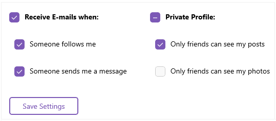
Telerik UI for .NET MAUI CheckBox is a control, which enables users to make a choice between two mutually exclusive options. The user selection is indicated by a check mark, and when a user clicks the checkbox, its appearance and state change.
The CheckBox is part of Telerik UI for .NET MAUI, the most comprehensive UI suite for .NET MAUI! To try it out, sign up for a free 30-day trial and kickstart your cross-platform app development today.
The CheckBox follows the rendering guidelines of the operating system. As a result, on iOS its visualized as a circle while
AndroidandWinUIdisplay it as a square.

Key Features of the .NET MAUI CheckBox
- Checked states—The CheckBox delivers options for setting its state to checked and unchecked, and provides an additional indeterminate state which indicates the control is neither checked nor unchecked.
- Size—You can set the width and height of the CheckBox by adjusting only a single CheckBox property.
- Disable the animation—The CheckBox provides an option for turning off the animation when the CheckBox state changes.
- Flexible styling API—The CheckBox exposes a set of styling properties for customizing its visual appearance and enables you to set its background, border, and symbol color, as well as customize its layout, including the borders and the check mark.