.NET MAUI TabView Header Styling
The TabView control provides the built-in HeaderStyle property, which allows you to apply styling properties to the TabViewHeader.
The following table summarizes the properties that you can apply to the TabViewHeader:
| Property | Description |
|---|---|
BackgroundColor (Color) |
Specifies the background color of the header area. |
BorderColor (Color) |
Specifies the border color of the header area. |
BorderThickness (Thickness) |
Specifies the border thickness of the header area. |
CornerRadius (Thickness) |
Specifies the corner radius of the header area. |
ContentPadding (Thickness) |
Specifies the padding of the inner content of the header area. |
Spacing (double) |
Specifies the spacing in pixels between the header items in the header area. |
SelectedIndex (int) |
Specifies the index of the currently selected item in the header area. |
IsScrollable (bool) |
Specifies whether the header area can be scrolled with a pan gesture. |
Orientation (enum of type Telerik.Maui.Controls.TabViewScrollOrientation) |
Specifies the scroll orientation of the header area. The available options are Horizontal and Vertical. |
The example below shows how to style the header of the TabView:
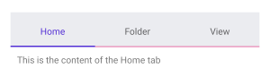
The example produces the following result:
For a runnable example with the TabView
HeaderStylescenario, see the SDKBrowser Demo Application and go to TabView > Styling.