.NET MAUI TabView Overview
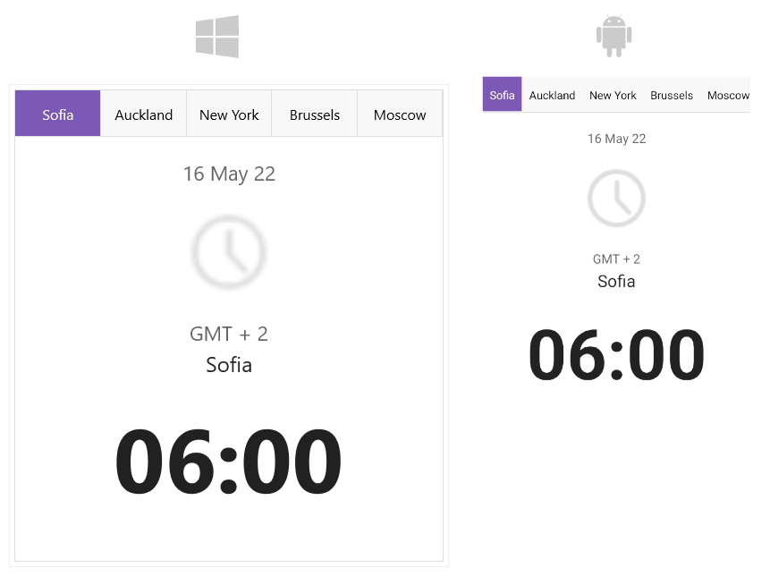
The Telerik TabView for .NET MAUI is a flexible navigation control that allows you to build tabbed interfaces. Each TabView item has an associated content displayed on selection. The control is customizable. Using the API you can customize the TabView header area that contains the tabs and the TabView content.
The TabView is part of Telerik UI for .NET MAUI, the most comprehensive UI suite for .NET MAUI! To try it out, sign up for a free 30-day trial and kickstart your cross-platform app development today.
.NET MAUI TabView Video Tutorial
If you prefer video instructions, watch this short MAUI TabView video tutorial. It covers to following topics:
- Overview of the .NET MAUI TabView control.
- Replace custom tab implementation with Telerik MAUI TabView.
Key Features of the .NET MAUI TabView
- Item Selection—TabView exposes selection API which allows you as a developer to extend the navigation per application needs.
-
Header Customization—TabView provides means for customizing the header area containing the tabs—through the
HeaderStyleproperty you can change its position, orientation, and spacing between the tabs; through theHeaderTemplateproperty you can modify its look and feel. - Image support in the header—add images inside the header. In addition you can controls the position of the image and the spacing between the image and the header text.
- Change the header position to top, bottom, left or right.
-
Tabs Customization—You can customize the appearance of each tab. Each tab has a header and content. The
TabViewItemclass gives you the option to set Tab's header text, add an image which will be displayed in the header, add a content and decide whether the tab will be selected, visible and enabled. - Flexible styling API—The TabView provides a number of styling capabilities, which enable you to style its header, header items and content. In addition, there is a styling option for the TabView control.
- Templates—The TabView provides templates for its header, header items and content.