New to Telerik UI for .NET MAUI? Start a free 30-day trial

.NET MAUI TabView Content Styling

The TabView control provides the built-in ContentStyle property, which allows you to apply styling properties to the TabViewContent.

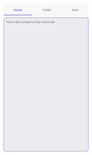
You can use the following properties to style the content of the TabView:

  • BackgroundColor (Color)—Specifies the background color of the content.
  • BorderColor (Color)—Specifies the border color of the content.
  • BorderThickness (Thickness)—Specifies the border thickness of the content.
  • CornerRadius (Thickness)—Specifies the corner radius of the content.
  • ContentPadding (Thickness)—Specifies the padding of the inner content of the content.

The example below shows how to style the content of the TabView.

<telerik:RadTabView x:Name="tabView"
                    HeaderSpacing="10">
    <telerik:RadTabView.ContentStyle>
        <Style TargetType="telerik:TabViewContent">
            <Setter Property="BackgroundColor" Value="#EBECF0" />
            <Setter Property="BorderColor" Value="#623FEA" />
            <Setter Property="BorderThickness" Value="1" />
            <Setter Property="CornerRadius" Value="10"/>
        </Style>
    </telerik:RadTabView.ContentStyle>
    <telerik:TabViewItem HeaderText="Home">
        <Label Margin="10" Text="This is the content of the Home tab" />
    </telerik:TabViewItem>
    <telerik:TabViewItem HeaderText="Folder">
        <Label Margin="10" Text="This is the content of the Folder tab" />
    </telerik:TabViewItem>
    <telerik:TabViewItem HeaderText="View">
        <Label Margin="10" Text="This is the content of the View tab" />
    </telerik:TabViewItem>
</telerik:RadTabView>

The example produces the following result:

.NET MAUI TabView Content Style

For a runnable example with the TabView ContentStyle scenario, see the SDKBrowser Demo Application and go to TabView > Styling.

See Also

In this article