.NET MAUI TabView Header ItemStyle Selector
The TabView control provides the built-in HeaderItemStyleSelector property, which allows you to apply different styles to each TabView header item. The target type of the style must be TabViewHeaderItem.
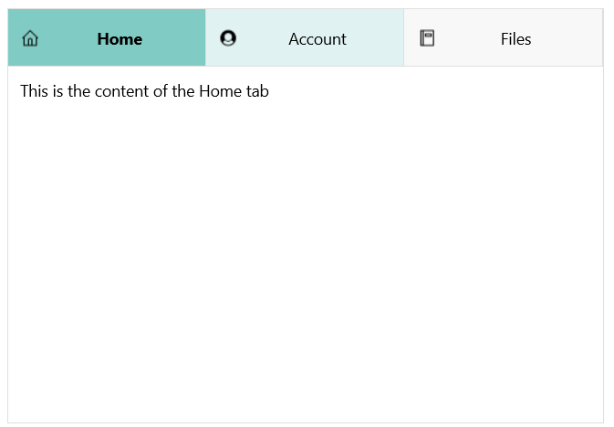
The following example shows how to apply styles to the TabView heare using a style selector.
1. Define the TabView control:
- XAML
<telerik:RadTabView x:Name="tabView"
HeaderItemStyleSelector="{StaticResource HeaderStyleSelector}">
<telerik:TabViewItem HeaderText="Home">
<telerik:TabViewItem.ImageSource>
<FontImageSource Glyph=""
Size="16"
Color="Black"
FontFamily="TelerikFontExamples" />
</telerik:TabViewItem.ImageSource>
<Label Margin="10" Text="This is the content of the Home tab" />
</telerik:TabViewItem>
<telerik:TabViewItem HeaderText="Account">
<telerik:TabViewItem.ImageSource>
<FontImageSource Glyph=""
Size="16"
Color="Black"
FontFamily="TelerikFontExamples" />
</telerik:TabViewItem.ImageSource>
<Label Margin="10" Text="This is the content of the Account tab" />
</telerik:TabViewItem>
<telerik:TabViewItem HeaderText="Files">
<telerik:TabViewItem.ImageSource>
<FontImageSource Glyph=""
Size="16"
Color="Black"
FontFamily="TelerikFontExamples"/>
</telerik:TabViewItem.ImageSource>
<Label Margin="10" Text="This is the content of the Files tab" />
</telerik:TabViewItem>
</telerik:RadTabView>2. Define the StylSelector resources:
- XAML
<ResourceDictionary>
    <Style x:Key="HomeStyle" TargetType="telerik:TabViewHeaderItem">
        <Setter Property="FontAttributes" Value="None" />
        <Setter Property="VisualStateManager.VisualStateGroups">
            <VisualStateGroupList>
                <VisualStateGroup Name="CommonStates">
                    <VisualState Name="Normal">
                        <VisualState.Setters>
                            <Setter Property="BackgroundColor" Value="#E0F2F1" />
                        </VisualState.Setters>
                    </VisualState>
                    <VisualState Name="Selected">
                        <VisualState.Setters>
                            <Setter Property="BackgroundColor" Value="#80CBC4"/>
                            <Setter Property="FontAttributes" Value="Bold"/>
                        </VisualState.Setters>
                    </VisualState>
                </VisualStateGroup>
            </VisualStateGroupList>
        </Setter>
    </Style>
    <Style x:Key="AccountStyle" TargetType="telerik:TabViewHeaderItem">
        <Setter Property="VisualStateManager.VisualStateGroups">
            <VisualStateGroupList>
                <VisualStateGroup Name="CommonStates">
                    <VisualState Name="Normal">
                        <VisualState.Setters>
                            <Setter Property="BackgroundColor" Value="#E0F2F1" />
                        </VisualState.Setters>
                    </VisualState>
                    <VisualState Name="Selected">
                        <VisualState.Setters>
                            <Setter Property="BackgroundColor" Value="#80CBC4"/>
                        </VisualState.Setters>
                    </VisualState>
                </VisualStateGroup>
            </VisualStateGroupList>
        </Setter>
    </Style>
    <Style x:Key="FilesStyle" TargetType="telerik:TabViewHeaderItem">
        <Setter Property="FontAttributes" Value="None" />
        <Setter Property="VisualStateManager.VisualStateGroups">
            <VisualStateGroupList>
                <VisualStateGroup Name="CommonStates">
                    <VisualState Name="Normal" />
                    <VisualState Name="Selected">
                        <VisualState.Setters>
                            <Setter Property="FontAttributes" Value="Italic" />
                            <Setter Property="BackgroundColor" Value="#80CBC4"/>
                        </VisualState.Setters>
                    </VisualState>
                </VisualStateGroup>
            </VisualStateGroupList>
        </Setter>
    </Style>

    <local:MyCustomHeaderItemStyleSelector x:Key="HeaderStyleSelector"
                                           HomeStyle="{StaticResource HomeStyle}"
                                           AccountStyle="{StaticResource AccountStyle}"
                                           FilesStyle="{StaticResource FilesStyle}"/>
</ResourceDictionary>
3. Define the StylSelector class:
- C#
 -->
public class MyCustomHeaderItemStyleSelector : IStyleSelector
{
    public Style HomeStyle { get; set; }
    public Style AccountStyle { get; set; }
    public Style FilesStyle { get; set; }

    public Style SelectStyle(object item, BindableObject bindable)
    {
        TabViewItem tabViewItem = (TabViewItem)item;

        if (tabViewItem.HeaderText.Contains("Home"))
        {
            return this.HomeStyle;
        }
        else if (tabViewItem.HeaderText.Contains("Account"))
        {
            return this.AccountStyle;
        }
        else if (tabViewItem.HeaderText.Contains("Files"))
        {
            return this.FilesStyle;
        }
        else
        {
            return null;
        }
    }
}
The example produces the following result:
For a runnable example with the TabView
HeaderItemStyleSelectorscenario, see the SDKBrowser Demo Application and go to TabView > Styling.