.NET MAUI TabView Header Item Styling
The TabView control provides the built-in HeaderItemStyle property, which allows you to apply styling properties to the TabViewHeaderItem.
The following table summarizes the properties that you can apply to the TabViewHeaderItem:
| Property | Description |
|---|---|
BackgroundColor |
Specifies the background color of the header item. |
BorderColor |
Specifies the border color of the header item. |
BorderThickness |
Specifies the border thickness of the header item. |
CornerRadius |
Specifies the corner radius of the header item. |
ContentPadding |
Specifies the padding of the inner content of the header item. |
TextColor |
Specifies the color of the text in the header item. |
FontFamily |
Specifies the font family of the text in the header item. |
FontSize |
Specifies the font size of the text in the header item. |
FontAttributes |
Specifies the font attributes of the text in the header item. |
TextDecorations |
Specifies the decorations of the text in the header item. |
HorizontalTextAlignment |
Specifies the horizontal alignment of the text in the header item. |
VerticalTextAlignment |
Specifies the vertical alignment of the text in the header item. |
ImageSource |
Specifies the source of the image icon in the header item. |
ImageAspect |
Specifies the aspect of the image icon in the header item. |
ImageWidth |
Specifies the width of the image icon in the header item. |
ImageHeight |
Specifies the height of the image icon in the header item. |
ImageSpacing |
Specifies the spacing between the image icon and the text in the header item. |
ImagePosition |
Specifies the position of the image icon relative to the text (Left, Top, Right, and Bottom). |
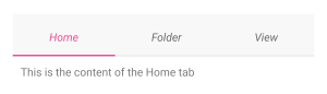
The example below shows how to style the header item of the TabView:
The example produces the following result:
For a runnable example with the TabView
HeaderItemStylescenario, see the SDKBrowser Demo Application and go to TabView > Styling.