.NET MAUI NavigationView Visual Structure
The visual structure of the .NET MAUI NavigationView represents the anatomy of the UI component. Being familiar with the visual elements of the NavigationView allows you to quickly find the information required to configure them.
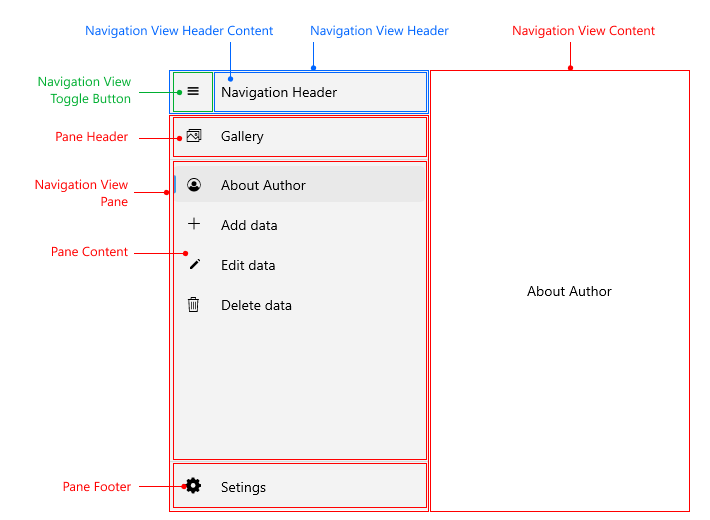
Displayed Elements
- Navigation View Header—The area that holds the navigation header content and toggle button.
- Navigation View Header Content—Represents the content in the navigation header.
- Navigation View Toggle Button—Used for opening/closing the pane. For more details review the navigation header article.
- Navigation View Pane—The area that holds the pane header, pane footer, and pane content.
- Pane Header—Sticky area on the top of the pane.
-
Pane Content—Scrollable area between the pane header and the pane footer. By default all items in the pane are added to the content, if
Positionis not explicitly defined. - Pane Footer—Sticky area to the bottom of the pane.
- NavigationView Content—Represents a content in the NavigationView.