New to Telerik UI for .NET MAUI? Start a free 30-day trial

Styling a Navigation Item

Style the navigation items by setting the Style property to the NavigationViewItem or using an implicit style:

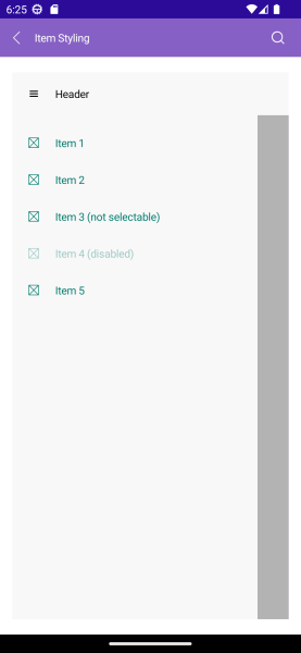
The image below shows sample navigation item styling:

Telerik UI for .NET MAUI NavigationView Styling

  • Explicit style:
<ContentView.Resources>
    <ResourceDictionary>
        <Style TargetType="telerik:NavigationViewItemView" x:Key="NavigationItemStyle">
            <Setter Property="Spacing" Value="10"/>
        </Style>
    </ResourceDictionary>
</ContentView.Resources>

<telerik:NavigationViewItem Text="Item 1" Style="{StaticResource NavigationItemStyle}" />
  • Implicit style:
<Style TargetType="telerik:NavigationViewItemView">
   <Setter Property="Spacing" Value="10"/>            
</Style>

The available properties are described in the table below:

Property Description
Command (ICommand) Executed when the navigation item is clicked.
CommandParameter (object) Specifies a parameter to command which is executed when the navigation item is clicked.
IsSelectable (bool) Specifies whether the navigation item is selectable.
IsSelected (bool) Specifies whether the navigation item is selected.
ImageSource (ImageSource) Specifies the source of the image that is displayed in the navigation item.
ImageAspect (Microsoft.Maui.Aspect) Specifies the aspect ratio of the image that is displayed in the navigation item.
ImageWidth (double) Specifies the width in pixels of the image that is displayed in the navigation item.
ImageHeight (double) Specifies the height in pixels of the image that is displayed in the navigation item.
Spacing (double) Specifies the spacing in pixels between the image area and the content of the navigation item.

Example

Here is an example how to define visual states to the navigation item and style the elements:

1. Define the RadNavigationView:

<telerik:RadNavigationView x:Name="navigationView"
                           HeaderText="Header">
    <telerik:RadNavigationView.Items>
        <telerik:NavigationViewItem Text="Item 1" />
        <telerik:NavigationViewItem Text="Item 2" />
        <telerik:NavigationViewItem Text="Item 3 (not selectable)" IsSelectable="False" />
        <telerik:NavigationViewItem Text="Item 4 (disabled)" IsEnabled="False" />
        <telerik:NavigationViewItem Text="Item 5" />
    </telerik:RadNavigationView.Items>
    <Label HorizontalOptions="Center"
           VerticalOptions="Center"
           Text="{Binding SelectedItem.Text, Source={x:Reference navigationView}}" />
</telerik:RadNavigationView>

2. Define the VisualStates for the NavigationViewItem:

<Style TargetType="telerik:NavigationViewItemView">
    <Setter Property="TextColor" Value="#00796B" />
    <Setter Property="VisualStateManager.VisualStateGroups">
        <VisualStateGroupList>
            <VisualStateGroup Name="CommonStates">
                <VisualState Name="Normal" />
                <VisualState Name="PointerOver">
                    <VisualState.Setters>
                        <Setter Property="BackgroundColor" Value="#B2DFDB" />
                        <Setter Property="TextColor" Value="#000000" />
                    </VisualState.Setters>
                </VisualState>
                <VisualState Name="Selected">
                    <VisualState.Setters>
                        <Setter Property="BackgroundColor" Value="#80CBC4" />
                        <Setter Property="TextColor" Value="#000000" />
                        <Setter Property="FontAttributes" Value="Bold" />
                    </VisualState.Setters>
                </VisualState>
                <VisualState Name="Disabled">
                    <VisualState.Setters>
                        <Setter Property="TextColor" Value="#6100796B" />
                    </VisualState.Setters>
                </VisualState>
            </VisualStateGroup>
        </VisualStateGroupList>
    </Setter>
</Style>

3. Add the telerik namespace:

xmlns:telerik="http://schemas.telerik.com/2022/xaml/maui"

For the runnable NavigationView Item Styling example, see the SDKBrowser Demo Application and go to NavigationView > Styling category.

See Also

In this article