New to Telerik UI for .NET MAUI? Start a free 30-day trial

.NET MAUI NavigationView Display Mode

The NavigationView provides three layouts based on its DisplayMode (enum of type Telerik.Maui.Controls.NavigationViewDisplayMode) property. The available options are:

  • Minimal—This option fixes the menu button. The pane shows and hides when the menu button is clicked.
  • Compact—The pane always shows as a narrow sliver which can be opened to full width.
  • Expanded—The pane stays open alongside the content.

Automatically Changing the Display Mode

The NavigationView dynamically adjusts its layout depending on its size. This is controlled with the AutoChangeDisplayMode (bool) property. On desktop its value is true, on mobile false.

In addition use the following properties for setting the minimum width at which the NavigationView enters the Compact and Expanded display modes:

  • ExpandedModeThresholdWidth (double)—Specifies the minimum width at which the NavigationView enters Expanded display mode.
  • CompactModeThresholdWidth (double)—Specifies the minimum width at which the NavigationView enters Compact display mode.

Example with DisplayMode Minimal

1. Define the RadNavigationView in XAML:

<telerik:RadNavigationView x:Name="minimalNavigationView"
                           DisplayMode="Minimal"
                           AutoChangeDisplayMode="False"
                           Grid.Row="1">
    <telerik:RadNavigationView.Items>
        <telerik:NavigationViewItem Text="Item 1" />
        <telerik:NavigationViewItem Text="Item 2" />
    </telerik:RadNavigationView.Items>
    <telerik:RadNavigationView.Content>
        <Label HorizontalOptions="Center"
               VerticalOptions="Center"
               Text="{Binding SelectedItem.Text, Source={x:Reference minimalNavigationView}}" />
    </telerik:RadNavigationView.Content>
</telerik:RadNavigationView>

2. Add the telerik namespace:

xmlns:telerik="http://schemas.telerik.com/2022/xaml/maui"

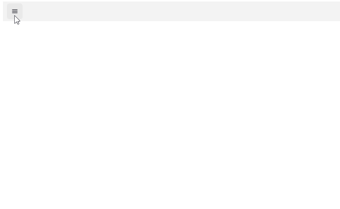
Here is how the Minimal DisplayMode looks:

Telerik UI for .NET MAUI NavigationView Minimal DisplayMode

For the runnable NavigationView Minimal DisplayMode example, see the SDKBrowser Demo Application and go to NavigationView > Features category.

Example with DisplayMode Compact

1. Define the RadNavigationView in XAML:

<telerik:RadNavigationView x:Name="navigationView" 
                           DisplayMode="Compact"
                           AutoChangeDisplayMode="False"
                           CompactModeThresholdWidth="20"
                           Grid.Row="1">
    <telerik:RadNavigationView.Items>
        <telerik:NavigationViewItem Text="Item 1" />
        <telerik:NavigationViewItem Text="Item 2" />
    </telerik:RadNavigationView.Items>
    <telerik:RadNavigationView.Content>
        <Label HorizontalOptions="Center"
               VerticalOptions="Center"
               Text="{Binding SelectedItem.Text, Source={x:Reference navigationView}}" />
    </telerik:RadNavigationView.Content>
</telerik:RadNavigationView>

2. Add the telerik namespace:

xmlns:telerik="http://schemas.telerik.com/2022/xaml/maui"

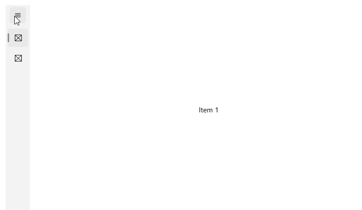
Here is how the Compact DisplayMode looks:

Telerik UI for .NET MAUI NavigationView Compact DisplayMode

For the runnable NavigationView Compact DisplayMode example, see the SDKBrowser Demo Application and go to NavigationView > Features category.

Example with DisplayMode Expanded

1. Define the RadNavigationView in XAML:

<telerik:RadNavigationView x:Name="expandedNavigationView" 
                           DisplayMode="Expanded"
                           AutoChangeDisplayMode="False"
                           ExpandedModeThresholdWidth="10"
                           Grid.Row="1">
    <telerik:RadNavigationView.Items>
        <telerik:NavigationViewItem Text="Item 1" />
        <telerik:NavigationViewItem Text="Item 2" />
    </telerik:RadNavigationView.Items>
    <telerik:RadNavigationView.Content>
        <Label HorizontalOptions="Center"
               VerticalOptions="Center"
               Text="{Binding SelectedItem.Text, Source={x:Reference expandedNavigationView}}" />
    </telerik:RadNavigationView.Content>
</telerik:RadNavigationView>

2. Add the telerik namespace:

xmlns:telerik="http://schemas.telerik.com/2022/xaml/maui"

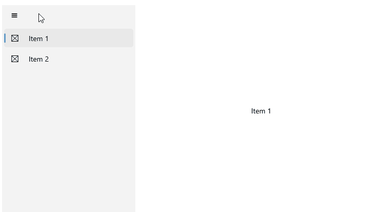
Here is how the Expanded DisplayMode looks:

Telerik UI for .NET MAUI NavigationView Expanded DisplayMode

For the runnable NavigationView Expanded DisplayMode example, see the SDKBrowser Demo Application and go to NavigationView > Features category.

See Also

In this article