.NET MAUI NavigationView Pane Styling
The NavigationView Pane for .NET MAUI provides a styling mechanism for customizing its look, as well as the look of its header and footer.
To use it, set the PaneStyle property of the control with a target type NavigationViewPane.
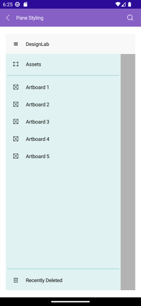
The image below shows sample pane styling:
The available properties are described in the table below:
| Property | Description |
|---|---|
ItemSpacing (double) |
Specifies the spacing between the items in the pane. |
DisplayMode (enum of type Telerik.Maui.Controls.NavigationViewDisplayMode) |
Specifies how the pane displays the navigation items - Minimal, Compact or Expanded. |
IsOpen (bool) |
Specifies whether the navigation pane is open. |
CompactWidth (double) |
Specifies the width of the navigation pane in compact mode. |
ExpandedWidth (double) |
Specifies the width of the navigation pane in expanded mode. |
HeaderStyle (Style with a target type of NavigationViewPaneHeader) |
Specifies the style applied to the Pane header. |
HeaderTemplate (ControlTemplate) |
Replaces the default header template with a custom template. |
FooterStyle (Style with a target type of NavigationViewPaneFooter) |
Specifies the style applied to the Pane header. |
FooterTemplate (ControlTemplate) |
Replaces the default header template with a custom template. |
VerticalScrollBarStyle (Style with a target type of RadScrollBar) |
Specifies the style for the vertical scroll bar. |
VerticalScrollBarTemplate (ControlTemplate) |
Specifies the template of the vertical scroll bar. |
VerticalScrollBarVisibility (Microsoft.Maui.ScrollBarVisibility) |
Specifies the visibility of the vertical scroll bar. The available options are - Default, Always, and Never. |
BackgroundColor (Color) |
Specifies the background color of the pane. |
BorderColor (Color) |
Specifies the border color of the pane. |
BorderBrush (Brush) |
Specifies the border brush of the pane. |
BorderThickness (Thickness) |
Specifies the border thickness of the pane. |
CornerRadius (Thickness) |
Specifies the corner radius of the border around the pane. |
ContentPadding (Thickness) |
Specifies the content padding of the control. |
Here is an example with PaneStyle:
For the runnable NavigationView Pane Styling example, see the SDKBrowser Demo Application and go to NavigationView > Styling category.
Styling the Pane Header and Footer
You can style the pane header and footer by setting the HeaderStyle and FooterStyle properties to the PaneStyle.
You can use the following properties for HeaderStyle and FooterStyle:
| Property | Description |
|---|---|
BackgroundColor (Color) |
Specifies the background color of the pane. |
BorderColor (Color) |
Specifies the border color of the pane. |
BorderBrush (Brush) |
Specifies the border brush of the pane. |
BorderThickness (Thickness) |
Specifies the border thickness of the pane. |
CornerRadius (Thickness) |
Specifies the corner radius of the border around the pane. |
ContentPadding (Thickness) |
Specifies the content padding of the control. |
Here is an example with HeaderStyle:
Here is an example with FooterStyle:
For the runnable NavigationView Pane Styling example, see the SDKBrowser Demo Application and go to NavigationView > Styling category.
Templates
You can replace the default pane header and footer template with custom one by setting the HeaderTemplate (ControlTemplate) and FooterTemplate (ControlTemplate) to the PaneStyle.