Data Binding in .NET MAUI NavigationView
For all cases where the business items are not simple strings, data-binding is necessary to correctly visualize information. The NavigationView for .NET MAUI component supports data binding.
-
ItemsSource(IList)—Defines a collection of items that are populated in the NavigationView.
The properties described below are used in a combination with the ItemsSource property when generating navigation items automatically from a custom collection of items:
-
DisplayMemberPath(string)—Specifies the name of the property (the path) which will be displayed as a text in the generated navigation items. -
DisplayMemberConverter(IValueConverter)—Specifies a converter for the display member of the generated navigation items. -
ImageSourcePath(string)—Specifies the name of the property (the path to the image source) which will be displayed as an image in the generated navigation items. -
ImageSourceConverter(IValueConverter)—Specifies the converter for the image source of the generated navigation items.
Styling the Navigation Items
You can style the generated items by setting the ItemStyle (Style with target type NavigationViewItemView) property or use a conditional styling by setting the ItemStyleSelector (of type IStyleSelector with Style property with target type NavigationViewItemView). Both properties are applicable when ItemsSource property is used.
Customizing the Navigation Items
You can present complex data in the navigation items by using the ItemTemplate property. In addition, using the ItemTemplate property you can apply a different template to each item depending on a specific condition. The property is applicable when ItemsSource property is used.
Examples
Let's create examples for Data Binding, Item Style, Item Template and selectors. All examples use the same ViewModel, business model and a converter for the images in the navigation items:
1. Add the following ViewModel:
public class ViewModel : NotifyPropertyChangedBase
{
    private readonly ObservableCollection<DataItem> navigationItems;
    private object selectedItem;

    public ViewModel()
    {
        this.navigationItems = new ObservableCollection<DataItem>
        {
            new DataItem
            {
                Text = "Inbox",
                Icon = "\ue8a2",
                Tag = "5"
            },
            new DataItem
            {
                Text = "Draft",
                Icon = "\ue870"
            },
             new DataItem
            {
                Text = "Archive",
                Icon = "\ue826"
            },
            new DataItem
            {
                Text = "Sent",
                Icon = "\ue82d"
            },
            new DataItem
            {
                Text = "Spam",
                Icon = "\ue82e",
                Tag = "99+"
            },
            new DataItem
            {
                Text = "Deleted",
                Icon = "\ue827"
            },
        };
    }

    public IList<DataItem> Items => this.navigationItems;
}
2. Add a sample business model
public class DataItem
{
    public string Text { get; set; }
    public string Icon { get; set; }
    public string Tag { get; set; }
}
3. The font icon converter implementation:
public class FontIconConverter : IValueConverter
{
    public string FontFamily { get; set; }
    public double FontSize { get; set; }
    public Color TextColor { get; set; }

    public object Convert(object value, Type targetType, object parameter, CultureInfo culture)
    {
        if (value is string textGlyph)
        {
            return new FontImageSource
            {
                Glyph = textGlyph,
                FontFamily = this.FontFamily,
                Size = this.FontSize,
                Color = this.TextColor
            };
        }

        return null;
    }

    public object ConvertBack(object value, Type targetType, object parameter, CultureInfo culture)
    {
        if (value is FontImageSource imageSource)
        {
            return imageSource.Glyph;
        }

        return null;
    }
}
4. Define the font converter in the page's resources:
<converters:FontIconConverter x:Key="FontIconConverter"
                              FontFamily="TelerikFontExamples"
                              FontSize="16" />
5. Add the common namespace to XAML page:
xmlns:telerik="http://schemas.telerik.com/2022/xaml/maui"
1. Define the NavigationView in XAML:
<telerik:RadNavigationView x:Name="navigationView"
                           HeaderText="MyMail"
                           ItemsSource="{Binding Items}"
                           SelectedItem="{Binding SelectedItem}"
                           DisplayMemberPath="Text"
                           ImageSourcePath="Icon"
                           ImageSourceConverter="{StaticResource FontIconConverter}">
    <telerik:RadNavigationView.BindingContext>
        <local:ViewModel/>
    </telerik:RadNavigationView.BindingContext>
    <telerik:RadNavigationView.Items>
        <telerik:NavigationViewItem Position="Header"
                                    Text="Home"
                                    ImageSource="{StaticResource HomeIcon}" />
        <telerik:NavigationViewItem Position="Footer"
                                    Text="Settings"
                                    ImageSource="{StaticResource SettingsIcon}" />
    </telerik:RadNavigationView.Items>
    <Label Text="NavigationView Content"
           HorizontalOptions="Center"
           VerticalOptions="Center" />
</telerik:RadNavigationView>
2. Define the StaticResources in the page's resources:
<FontImageSource x:Key="HomeIcon"
Glyph=""
FontFamily="TelerikFontExamples"
Size="16" />
<FontImageSource x:Key="SettingsIcon"
Glyph=""
FontFamily="TelerikFontExamples"
Size="16" />
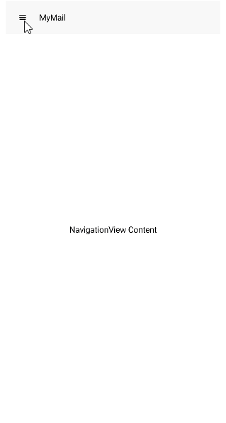
Here is how the NavigationView looks when ItemsSource is set:
For the runnable NavigationView DataBinding example, see the SDKBrowser Demo Application and go to NavigationView > Data Binding category.
Example with ItemStyle
1. Define the NavigationView in XAML:
<telerik:RadNavigationView x:Name="navigationView"
                           HeaderText="MyMail"
                           ItemsSource="{Binding Items}"
                           SelectedItem="{Binding SelectedItem}"
                           ItemStyle="{StaticResource ItemStyle}"
                           DisplayMemberPath="Text"
                           ImageSourcePath="Icon"
                           ImageSourceConverter="{StaticResource FontIconConverter}">
    <telerik:RadNavigationView.BindingContext>
        <local:ViewModel/>
    </telerik:RadNavigationView.BindingContext>
    <Label Text="NavigationView Content"
           HorizontalOptions="Center"
           VerticalOptions="Center" />
</telerik:RadNavigationView>
2. Define the ItemStyle resources in the page's resources:
<Style TargetType="telerik:NavigationViewItemView" x:Key="ItemStyle">
    <Setter Property="TextColor" Value="#00796B" />
    <Setter Property="VisualStateManager.VisualStateGroups">
        <VisualStateGroupList>
            <VisualStateGroup Name="CommonStates">
                <VisualState Name="Normal" />
                <VisualState Name="PointerOver">
                    <VisualState.Setters>
                        <Setter Property="BackgroundColor" Value="#B2DFDB" />
                        <Setter Property="TextColor" Value="#000000" />
                    </VisualState.Setters>
                </VisualState>
                <VisualState Name="Selected">
                    <VisualState.Setters>
                        <Setter Property="BackgroundColor" Value="#80CBC4" />
                        <Setter Property="TextColor" Value="#000000" />
                        <Setter Property="FontAttributes" Value="Bold" />
                    </VisualState.Setters>
                </VisualState>
                <VisualState Name="Disabled">
                    <VisualState.Setters>
                        <Setter Property="TextColor" Value="#6100796B" />
                    </VisualState.Setters>
                </VisualState>
            </VisualStateGroup>
        </VisualStateGroupList>
    </Setter>
</Style>
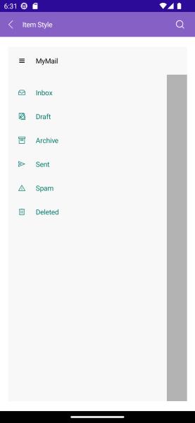
Here is how the NavigationView looks when ItemsSource is set and ItemStyle is applied:
For the runnable NavigationView ItemStyle example, see the SDKBrowser Demo Application and go to NavigationView > Data Binding category.
Example with ItemStyleSelector
1. Define the NavigationView in XAML:
<telerik:RadNavigationView x:Name="navigationView"
                           HeaderText="MyMail"
                           ItemsSource="{Binding Items}"
                           SelectedItem="{Binding SelectedItem}"
                           ItemStyleSelector="{StaticResource ItemStyleSelector}"
                           DisplayMemberPath="Text"
                           ImageSourcePath="Icon"
                           ImageSourceConverter="{StaticResource FontIconConverter}">
    <telerik:RadNavigationView.BindingContext>
        <local:ViewModel/>
    </telerik:RadNavigationView.BindingContext>
    <Label Text="NavigationView Content"
           HorizontalOptions="Center"
           VerticalOptions="Center" />
</telerik:RadNavigationView>
2. Define the ItemStyleSelector resources in the page's resources:
<Style TargetType="telerik:NavigationViewItemView" x:Key="NormalItemStyle">
    <Setter Property="TextColor" Value="#00796B" />
    <Setter Property="VisualStateManager.VisualStateGroups">
        <VisualStateGroupList>
            <VisualStateGroup Name="CommonStates">
                <VisualState Name="Normal" />
                <VisualState Name="PointerOver">
                    <VisualState.Setters>
                        <Setter Property="telerik:NavigationViewItemView.BackgroundColor" Value="#06000000" />
                    </VisualState.Setters>
                </VisualState>
                <VisualState Name="Selected">
                    <VisualState.Setters>
                        <Setter Property="telerik:NavigationViewItemView.BackgroundColor" Value="#0A000000" />
                    </VisualState.Setters>
                </VisualState>
                <VisualState Name="Disabled">
                    <VisualState.Setters>
                        <Setter Property="telerik:NavigationViewItemView.Opacity" Value="0.38" />
                    </VisualState.Setters>
                </VisualState>
            </VisualStateGroup>
        </VisualStateGroupList>
    </Setter>
</Style>

<Style TargetType="telerik:NavigationViewItemView" x:Key="UpdatedItemStyle" BasedOn="{StaticResource NormalItemStyle}">
    <Setter Property="TextColor" Value="#A55200" />
    <Setter Property="FontAttributes" Value="Bold" />
</Style>

<example:NavigationItemStyleSelector x:Key="ItemStyleSelector"
                                     NormalItemStyle="{StaticResource NormalItemStyle}"
                                     UpdatedItemStyle="{StaticResource UpdatedItemStyle}" />
3. The NavigationItemStyleSelector implementation:
public class NavigationItemStyleSelector : IStyleSelector
{
    public Style NormalItemStyle { get; set; }
    public Style UpdatedItemStyle { get; set; }

    public Style SelectStyle(object item, BindableObject bindable)
    {
        return !string.IsNullOrEmpty(((DataItem)item).Tag) ? UpdatedItemStyle : NormalItemStyle;
    }
}
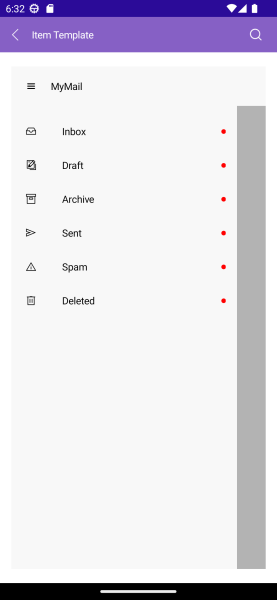
Here is how the NavigationView looks when ItemsSource is set and ItemStyleSelector is applied:
For the runnable NavigationView ItemStyleSelector example, see the SDKBrowser Demo Application and go to NavigationView > Data Binding category.
Example with ItemTemplate
1. Define the NavigationView in XAML:
<telerik:RadNavigationView x:Name="navigationView"
                           HeaderText="MyMail"
                           ItemsSource="{Binding Items}"
                           SelectedItem="{Binding SelectedItem}"
                           DisplayMemberPath="Text"
                           ItemTemplate="{StaticResource NavigationItemTemplate}"
                           ImageSourcePath="Icon"
                           ImageSourceConverter="{StaticResource FontIconConverter}">
    <telerik:RadNavigationView.BindingContext>
        <local:ViewModel/>
    </telerik:RadNavigationView.BindingContext>
    <Label Text="NavigationView Content"
           HorizontalOptions="Center"
           VerticalOptions="Center" />
</telerik:RadNavigationView>
2. Define the ItemTemplate in the page's resources:
<DataTemplate x:Key="NavigationItemTemplate">
    <Grid>
        <telerik:RadBadgeView BadgeType="Dot"
                              BadgeHorizontalPosition="End"
                              BadgeVerticalPosition="Center"
                              BadgeHorizontalAlignment="Start"
                              BadgeVerticalAlignment="Center"
                              Margin="16, 0">
            <telerik:RadBadgeView.Content>
                <Label Text="{Binding Text}"
                       TextColor="{Binding TextColor, Source={RelativeSource AncestorType={x:Type telerik:NavigationViewItemView}}}"
                       VerticalOptions="Center" />
            </telerik:RadBadgeView.Content>
        </telerik:RadBadgeView>
    </Grid>
</DataTemplate>
Here is how the NavigationView looks when ItemsSource is set and ItemTemplate is applied:
For the runnable NavigationView ItemTemplate example, see the SDKBrowser Demo Application and go to NavigationView > Data Binding category.
Example with ItemTemplateSelector
1. Define the NavigationView in XAML:
<telerik:RadNavigationView x:Name="navigationView"
                           HeaderText="MyMail"
                           ItemsSource="{Binding Items}"
                           SelectedItem="{Binding SelectedItem}"
                           DisplayMemberPath="Text"
                           ItemTemplate="{StaticResource ItemTemplateSelector}"
                           ImageSourcePath="Icon"
                           ImageSourceConverter="{StaticResource FontIconConverter}">
    <telerik:RadNavigationView.BindingContext>
        <local:ViewModel/>
    </telerik:RadNavigationView.BindingContext>
    <Label Text="NavigationView Content"
           HorizontalOptions="Center"
           VerticalOptions="Center" />
</telerik:RadNavigationView>
2. Define the ItemTemplateSelector resources in the page's resources:
<DataTemplate x:Key="BadgeTemplate">
<Grid ColumnDefinitions="*, Auto">
<Label Text="{Binding Text}"
TextColor="{Binding TextColor, Source={RelativeSource AncestorType={x:Type telerik:NavigationViewItemView}}}"
VerticalOptions="Center" />
<telerik:RadBorder Grid.Column="1"
WidthRequest="32"
HeightRequest="16"
CornerRadius="4"
BackgroundColor="Red"
VerticalOptions="Center"
Margin="0, 0, 16, 0">
<Label Text="{Binding Tag}"
TextColor="White"
FontSize="10"
FontAttributes="Bold"
HorizontalOptions="Center"
VerticalTextAlignment="Center" />
</telerik:RadBorder>
</Grid>
</DataTemplate>
<DataTemplate x:Key="FavoriteTemplate">
<Grid ColumnDefinitions="*, Auto">
<Label Text="{Binding Text}"
TextColor="{Binding TextColor, Source={RelativeSource AncestorType={x:Type telerik:NavigationViewItemView}}}"
VerticalOptions="Center" />
<Label Grid.Column="1"
WidthRequest="32"
FontFamily="TelerikFontExamples"
FontSize="16"
Text=""
TextColor="{Binding TextColor, Source={RelativeSource AncestorType={x:Type telerik:NavigationViewItemView}}}"
HorizontalTextAlignment="Center"
VerticalTextAlignment="Center"
Margin="0, 0, 16, 0" />
</Grid>
</DataTemplate>
<example:NavigationItemTemplateSelector x:Key="ItemTemplateSelector"
BadgeTemplate="{StaticResource BadgeTemplate}"
FavoriteTemplate="{StaticResource FavoriteTemplate}" />
3. The NavigationItemTemplateSelector implementation:
public class NavigationItemTemplateSelector : DataTemplateSelector
{
    public DataTemplate BadgeTemplate { get; set; }
    public DataTemplate FavoriteTemplate { get; set; }

    protected override DataTemplate OnSelectTemplate(object item, BindableObject container)
    {
        return !string.IsNullOrEmpty(((DataItem)item).Tag) ? BadgeTemplate : FavoriteTemplate;
    }
}
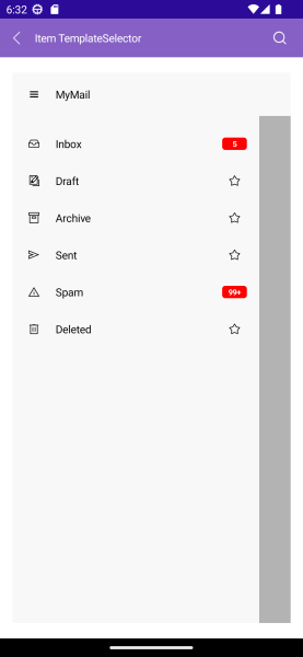
Here is how the NavigationView looks when ItemsSource is set and ItemTemplateSelector is applied:
For the runnable NavigationView ItemTemplateSelector example, see the SDKBrowser Demo Application and go to NavigationView > Data Binding category.