.NET MAUI NavigationView Styling
The NavigationView for .NET MAUI provides a styling mechanism for customizing its header-including the navigation header and navigation toggle button, navigation pane and navigation items.
Styling the NavigationView Header
The NavigationView Header for .NET MAUI provides a styling mechanism for customizing its look and the look of the toggle navigation button.
To use it, set the HeaderStyle property of the control with a target type NavigationViewHeader.
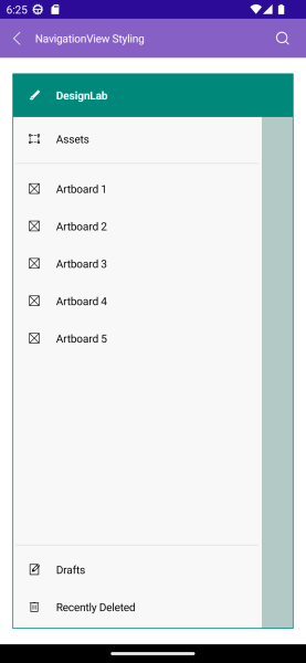
The image below shows sample navigation header styling:
The available properties are described in the table below:
| Property | Description |
|---|---|
FontFamily (string) |
Specifies the font family of the container in compact mode. |
FontSize (double) |
Specifies the font size in pixels of the displayed text. |
FontAttributes (Microsoft.Maui.Control.FontAttributes) |
Specifies the font attributes of the displayed text |
TextDecorations (Microsoft.Maui.TextDecorations) |
Specifies the text decorations of the displayed text. |
LineBreakMode (Microsoft.Maui.LineBreakMode) |
Specifies the line break mode of the displayed text. |
HorizontalTextAlignment (Microsoft.Maui.TextAlignment) |
Specifies the horizontal alignment of the displayed text. |
VerticalTextAlignment (Microsoft.Maui.TextAlignment) |
Specifies the vertical alignment of the displayed text. |
HorizontalContentOptions (Microsoft.Maui.Controls.LayoutOptions) |
Specifies the horizontal layout options of the displayed content. |
VerticalContentOptions (Microsoft.Maui.Controls.LayoutOptions) |
Specifies the vertical layout options of the displayed content. |
BackgroundColor (Color) |
Specifies the background color of the header area. |
BorderColor (Color) |
Specifies the border color around the header area. |
BorderBrush (Brush) |
Specifies the border brush around the header area. |
BorderThickness (Thickness) |
Specifies the border thickness around the header area. |
CornerRadius (Thickness) |
Specifies the corner radius of the border around the header area. |
ContentPadding (Thickness) |
Specifies the content padding of the header area. |
CompactWidth |
Specifies the width of the container in compact mode. |
ExpandedWidth |
Specifies the width of the container in expanded mode. |
IsHeaderButtonVisible (bool) Default value true
|
Specifies the visibility of the navigation toggle button. |
IsHeaderButtonToggled (bool) |
Specifies whether the navigation button is toggled. |
HeaderButtonStyle (Style with a target type of NavigationViewToggleButton) |
Specifies the style that will be applied to the navigation toggle button. |
Here is a sample header styling definition:
<Style TargetType="telerik:NavigationViewHeader" x:Key="HeaderStyle">
    <Setter Property="TextColor" Value="White" />
    <Setter Property="BackgroundColor" Value="#00897B" />
    <Setter Property="HeaderButtonStyle" Value="{StaticResource NavigationViewToggleButtonStyle}" />
    <Setter Property="FontFamily" Value="Helvetica" />
    <Setter Property="FontAttributes" Value="Bold"/>
</Style>
For the runnable NavigationView Header Styling example, see the SDKBrowser Demo Application and go to NavigationView > Styling category.
Styling the Navigation Toggle Button
You can style the toggle button by setting the HeaderButtonStyle property to the HeaderStyle. The target type of the HeaderButtonStyle is NavigationViewToggleButton.
NavigationViewToggleButton inherits from Telerik .NET MAUI Button control. Use all properties applicable for the RadButton to style the Toggle Button.
Visual States
You can customize the visual states to the NavigationViewToggleButton. Here is a sample XAML definition with visual states:
<Style TargetType="telerik:NavigationViewToggleButton" x:Key="NavigationViewToggleButtonStyle">
<Setter Property="Text" Value="" />
<Setter Property="FontFamily" Value="TelerikFontExamples" />
<Setter Property="FontSize" Value="16"/>
<Setter Property="TextColor" Value="White" />
<Setter Property="BorderColor" Value="#4DB6AC" />
<Setter Property="BorderThickness" Value="{OnIdiom Default=0, Desktop=1}" />
<Setter Property="CornerRadius" Value="{OnPlatform Android=24, iOS=22, MacCatalyst=12, WinUI=16}" />
<Setter Property="VisualStateManager.VisualStateGroups">
<VisualStateGroupList>
<VisualStateGroup x:Name="CommonStates">
<VisualState x:Name="Normal" />
<VisualState x:Name="Disabled">
<VisualState.Setters>
<Setter Property="Opacity" Value="0.38" />
</VisualState.Setters>
</VisualState>
<VisualState x:Name="ToggledDisabled" />
<VisualState x:Name="Toggled">
<VisualState.Setters>
<Setter Property="BackgroundColor" Value="{OnIdiom Default=Transparent, Desktop=#00796B}" />
<Setter Property="FontAttributes" Value="Bold" />
</VisualState.Setters>
</VisualState>
</VisualStateGroup>
</VisualStateGroupList>
</Setter>
</Style>
For the runnable NavigationView Header Styling example, see the SDKBrowser Demo Application and go to NavigationView > Styling category.
Styling the Overlay
An overlay is displayed initially when the DisplayMode of the NavigationView is set to Minimal or Compact. Otherwise the overlay is not visible.
You can style the overlay by using the following properties:
-
DismissOverlayBrush(Brush)—Specifies the brush for the overlay. -
DismissOverlayColor(Color)—Specifies the color for the overlay.