.NET MAUI DataGrid Styling
The .NET MAUI DataGrid control enables you to customize its look and feel through the available Style configuration options. Also, you can modify the appearance of its splitter element, which divides the frozen columns from the rest of the data.
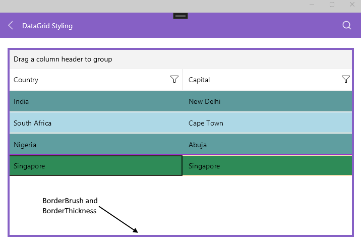
Border Brush and Thickness
The DataGrid supports the following properties for styling its border brush and thickness:
-
BorderBrush—Defines the brush of the border placed around the DataGrid control. -
BorderThickness—Defines the thickness of the border around the DataGrid control.
The following snippet shows how to set the BorderBrush and BorderThickness properties of the DataGrid control:
The next image shows the end result.
Cells and Rows
You can style the rows and cells of the DataGrid with the following properties:
-
RowBackgroundStyle(of typeStylewith target typeDataGridRowBackgroundAppearance)—Defines the style of each row. -
AlternateRowBackgroundStyle(of typeStylewith target typeDataGridAlternateRowBackgroundAppearance)—Defines the appearance style of an alternated row. -
SelectionStyle(of typeStylewith target typeDataGridSelectionAppearance)—Defines the appearance settings applied to the selected DataGrid row. -
CurrentCellStyle(of typeStylewith target typeDataGridCurrentCellAppearance)—Defines the style applied to the current cell. - (Desktop-only)
MouseHoverStyle(of typeStylewith target typeDataGridMouseHoverAppearance)—Specifies the style applied to the cells and rows when the mouse is over them.
The target types of the RowBackgroundStyle, AlternateRowBackgroundStyle, SelectionStyle, CurrentCellStyle, and MouseHoverStyle styling properties derive from the DataGridBorderAppearance class. The DataGridBorderAppearance exposes BackgroundColor, SearchMatchBackgroundColor, BorderColor, and BorderTickness properties.
The following example shows how to set the RowBackgroundStyle property:
The next example demonstrates how to set the AlternateRowBackgroundStyle property:
The following snippet shows how to set the SelectionStyle property:
For styling the CurrentCell by using the CurrentCellStyle property, review the Cells article.
Lines
Use the following properties for configuring the DataGrid grid lines:
-
GridLinesVisibility(Telerik.Maui.Controls.DataGrid.GridLinesVisibility)—Defines which DataGrid lines are currently visible (displayed). The property accepts theBoth,Horizontal,None, andVerticalvalues. -
GridLinesColor—Defines the appearance of the horizontal and vertical DataGrid lines. -
GridLinesThickness—Defines the width of the vertical and the height of the horizontal DataGrid lines.
You can set the GridLinesVisibility property in the following way:
Frozen Columns
The DataGrid provides the FrozenColumnsSplitterStyle (of type Style with target type DataGridFrozenColumnsSplitterAppearance) property which allows you to style the UI of the splitter dividing the frozen (locked) from the unfrozen (unlocked) columns.
Splitter UI
To style the appearance of the splitter, which appears when the user freezes (locks) DataGrid columns, use the Width, BackgroundColor, BorderColor, and BorderThickness properties.