Configure the Groups in .NET MAUI DataForm
The DataForm control for .NET MAUI provides the following properties to configure and customize the groups appearance.
-
GroupName(string)—Specified the unique name of the group. -
Spacing(double)—Specifies the spacing in pixels between the header view and the content view(where the editors are defined).
Header
Each group has a header. Here are the properties you can use to configure the group header:
-
HeaderText(string)—Specifies the text of the header. -
HeaderImageSource(Microsoft.Maui.Controls.ImageSource)—Specifies the image in the header. -
HeaderDisplayOptions(Telerik.Maui.Controls.DataFormHeaderDisplayOptions)—Specifies the display options of the header. The available options are:-
None—Header image and text are not visualized. -
Text—Visualizes the header text. For this optionHeaderTexthas to be defined. -
Image—Visualizes the image in the header. For this optionHeaderImageSourcehas to be defined.
-
You can combine the Text and the Image in the HeaderDisplayOption:
HeaderDisplayOptions="Image, Text"
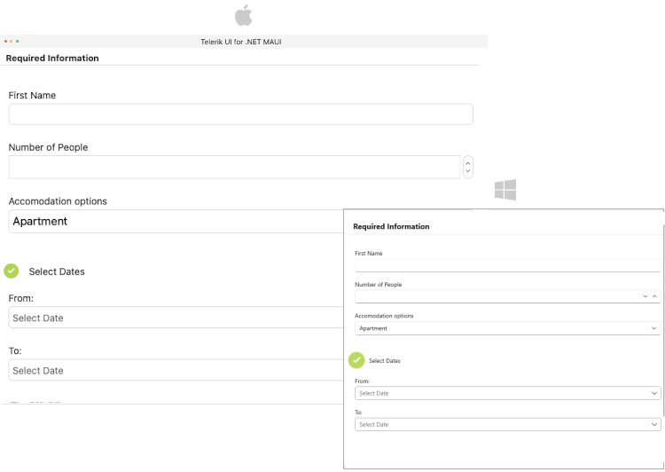
Here is an example for defining Dataform header options:
<telerik:DataFormGroup HeaderDisplayOptions="Text"
                       Spacing="15"
                       HeaderText="Required Information"
                       HeaderImageSource="away.png">
    <telerik:DataFormRadEntryEditor PropertyName="FirstName"/>
    <telerik:DataFormRadNumericEditor PropertyName="People" Minimum="1" Maximum="10"/>
    <telerik:DataFormRadComboBoxEditor PropertyName="Accommodation" HeaderText="Accomodation options"/>
</telerik:DataFormGroup>
Layouts
DataForm supports different group layouts. You can apply a layout to a particular group by setting the LayoutDefinition property to the DataFormGroup. The available layouts are described in the DataForm Layouts article.
This is an example when the DataFormGroup.LayoutDefinition is set to DataFormGridLayout:
<telerik:DataFormGroup HeaderDisplayOptions="None">
    <telerik:DataFormGroup.LayoutDefinition>
        <telerik:DataFormGridLayout ColumnCount="2"/>
    </telerik:DataFormGroup.LayoutDefinition>
    <telerik:DataFormRadTimeSpanPickerEditor PropertyName="Duration" HeaderText="Duration"/>
    <telerik:DataFormRadCheckBoxEditor PropertyName="Visited" HeaderText="Visited before"/>
</telerik:DataFormGroup>
Templates
-
HeaderTemplate(Microsoft.Maui.Controls.ControlTemplate)—Specifies the template of the header view. -
ContentTemplate(Microsoft.Maui.Controls.ControlTemplate)—Specifies the template of the content view. The view where the editors are defined.
Here is an example for defining Dataform HeaderTemplate:
<telerik:DataFormGroup>
    <telerik:DataFormGroup.HeaderTemplate>
        <ControlTemplate>
            <HorizontalStackLayout Spacing="10" HorizontalOptions="Start">
                <Image Source="available.png"/>
                <Label Text="Select Dates" VerticalTextAlignment="Center"/>
            </HorizontalStackLayout>
        </ControlTemplate>
    </telerik:DataFormGroup.HeaderTemplate>
    <telerik:DataFormRadDatePickerEditor PropertyName="StartDate" HeaderText="From:"/>
    <telerik:DataFormRadDatePickerEditor PropertyName="EndDate" HeaderText="To:"/>
</telerik:DataFormGroup>
For a runnable example with the DataForm Grouping Configuration scenario, see the SDKBrowser Demo Application and go to DataForm > Grouping category.
Styling
You can customize the groups using the flexible styling API. For more details review the Groups Styling article.