.NET MAUI AutoComplete Visual States
This article describes the visual states provided by the AutoComplete control. You can use these visual states to change the appearance of the control based on its state—such as when it’s disabled, focused, hovered, and more.
The AutoComplete provides the following CommonStates visual states:
| Visual State | Description |
|---|---|
Normal |
Applies when the AutoComplete is in its normal state. |
Focused |
Applied when the AutoComplete receives focus. |
MouseOver |
(Windows-only) Applied when the mouse cursor is hovering over the AutoComplete. |
PointerOver |
(MacCatalyst-only) Applied when the mouse cursor is hovering over the AutoComplete. |
Disabled |
Applied when the AutoComplete's IsEnabled is False. |
Using the Visual States
The example below demonstrates some of the styling capabilities of the AutoComplete, such as custom ClearButtonStyle, TextInputStyle, TextColor, PlaceholderColor, and others. It also shows how to switch its appearance through the .NET MAUI Visual State Manager.
1. Add a Style that targets the RadAutoComplete to your page's resources and apply all the needed styling properties and the visual states:
<Style TargetType="telerik:RadTextInput" x:Key="TextInputStyle">
<Setter Property="CharacterSpacing" Value="4" />
<Setter Property="HorizontalTextAlignment" Value="Start" />
</Style>
<Style TargetType="telerik:RadTemplatedButton" x:Key="ClearButtonStyle">
<Setter Property="FontFamily" Value="{x:Static telerik:TelerikFont.Name}" />
<Setter Property="FontSize" Value="16" />
<Setter Property="Content" Value="" />
<Setter Property="TextColor" Value="#A30111"/>
<Setter Property="VisualStateManager.VisualStateGroups">
<VisualStateGroupList>
<VisualStateGroup Name="CommonStates">
<VisualState Name="Normal" />
<VisualState Name="PointerOver">
<VisualState.Setters>
<Setter Property="telerik:RadTemplatedButton.TextColor" Value="#B53340" />
</VisualState.Setters>
</VisualState>
<VisualState Name="Pressed">
<VisualState.Setters>
<Setter Property="telerik:RadTemplatedButton.TextColor" Value="#C76670" />
</VisualState.Setters>
</VisualState>
<VisualState Name="Disabled" />
</VisualStateGroup>
</VisualStateGroupList>
</Setter>
</Style>
<Style TargetType="telerik:RadAutoComplete" x:Key="AutoCompleteStyle">
<Setter Property="TextColor" Value="#00897B" />
<Setter Property="BorderThickness" Value="1" />
<Setter Property="BorderBrush" Value="#00897B" />
<Setter Property="PlaceholderColor" Value="#00A392" />
<Setter Property="BackgroundColor" Value="#FFFFFF" />
<Setter Property="SuggestionItemHighlightTextColor" Value="#00897B" />
<Setter Property="SuggestionViewBorderColor" Value="#00897B" />
<Setter Property="SuggestionViewBackgroundColor" Value="#F4FAF9" />
<Setter Property="SuggestionViewCornerRadius" Value="8" />
<Setter Property="ClearButtonStyle" Value="{StaticResource ClearButtonStyle}" />
<Setter Property="TextInputStyle" Value="{StaticResource TextInputStyle}" />
<Setter Property="VisualStateManager.VisualStateGroups">
<VisualStateGroupList>
<VisualStateGroup Name="CommonStates">
<VisualState Name="Normal" />
<VisualState Name="Focused">
<VisualState.Setters>
<Setter Property="telerik:RadAutoComplete.BorderBrush" Value="#00BCA9" />
<Setter Property="telerik:RadAutoComplete.BorderThickness" Value="1" />
</VisualState.Setters>
</VisualState>
<VisualState Name="MouseOver">
<VisualState.Setters>
<Setter Property="telerik:RadAutoComplete.BackgroundColor" Value="#F9F9F9" />
</VisualState.Setters>
</VisualState>
<VisualState Name="Disabled">
<VisualState.Setters>
<Setter Property="Opacity" Value="0.6" />
</VisualState.Setters>
</VisualState>
</VisualStateGroup>
</VisualStateGroupList>
</Setter>
</Style>
2. Define the AutoComplete in XAML:
<telerik:RadAutoComplete ItemsSource="{Binding Source}"
                         TextSearchPath="Name"
                         Placeholder="Search here"
                         Style="{StaticResource AutoCompleteStyle}">
    <telerik:RadAutoComplete.BindingContext>
        <local:ExtendedClientsViewModel/>
    </telerik:RadAutoComplete.BindingContext>
</telerik:RadAutoComplete>
3. Create the needed business objects, for example type Client with the following properties:
public class Client
{
    public Client() { }

    public Client(string name, string imageSource)
    {
        this.Name = name;
        this.ImageSource = imageSource;
    }

    public Client(string name, string email, string imageSource)
    {
        this.Name = name;
        this.Email = email;
        this.ImageSource = imageSource;
    }

    public string Name { get; set; }
    public string Email { get; set; }
    public string ImageSource { get; set; }
}
4. Create a ViewModel with a collection of Client objects:
public class ExtendedClientsViewModel
{
    public ExtendedClientsViewModel()
    {
        this.Source = new ObservableCollection<Client>()
        {
            new Client("Freda Curtis", "available.png"),
            new Client("Jeffery Francis", "away.png"),
            new Client("Eva Lawson", "available.png"),
            new Client("Emmett Santos", "away.png"),
            new Client("Theresa Bryan", "away.png"),
            new Client("Jenny Fuller", "available.png"),
            new Client("Terrell Norris", "away.png"),
            new Client("Eric Wheeler", "busy.png"),
            new Client("Julius Clayton", "available.png"),
            new Client("Alfredo Thornton", "busy.png"),
            new Client("Roberto Romero", "busy.png"),
            new Client("Orlando Mathis", "available.png"),
            new Client("Eduardo Thomas", "away.png"),
            new Client("Harry Douglas", "available.png"),
            new Client("Parker Blanton", "available.png"),
            new Client("Leanne Motton", "busy.png"),
            new Client("Shanti Osborn", "available.png"),
            new Client("Merry Lasker", "busy.png"),
            new Client("Jess Doyon", "away.png"),
            new Client("Kizzie Arjona", "busy.png"),
            new Client("Augusta Hentz", "available.png"),
            new Client("Tasha Trial", "away.png"),
            new Client("Fredda Boger", "busy.png"),
            new Client("Megan Mowery", "available.png"),
            new Client("Hong Telesco", "away.png"),
            new Client("Inez Landi", "busy.png"),
            new Client("Taina Cordray", "available.png"),
            new Client("Shantel Jarrell", "busy.png"),
            new Client("Soo Heidt", "available.png"),
            new Client("Rayford Mahon", "away.png"),
            new Client("Jenny Omarah", "away.png"),
            new Client("Denita Dalke", "available.png"),
            new Client("Nida Carty", "available.png"),
            new Client("Sharolyn Lambson", "away.png"),
            new Client("Niki Samaniego", "available.png"),
            new Client("Rudy Jankowski", "away.png"),
            new Client("Matha Whobrey", "busy.png"),
            new Client("Jessi Knouse", "available.png"),
            new Client("Vena Rieser", "away.png"),
            new Client("Roosevelt Boyce", "available.png"),
            new Client("Kristan Swiney", "away.png"),
            new Client("Lauretta Pozo", "busy.png"),
            new Client("Jarvis Victorine", "away.png"),
            new Client("Dane Gabor", "busy.png")
        };
    }
    public ObservableCollection<Client> Source { get; set; }
}
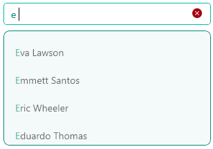
Here is how the AutoComplete looks when styling is applied:
For a runnable example demonstrating the AutoComplete's Visual States, see the SDKBrowser Demo Application and go to the AutoComplete > Styling category.