Input View Styling
The Input View of the AIPrompt control provides the following customization properties:
-
InputEditorStyle(Style)—Defines the style that is to be applied to the input editor. -
InputButtonStyle(Style)—Defines he style that is to be applied to the input button for generating the AI response.
The following example demonstrates how to modify the editor and the input button appearance:
1. Add Style properties with TargetType set to Editor for the input editor and RadTemplatedButton for the input button to the page's resources:
<Style x:Key="MyInputEditorStyle" TargetType="Editor">
    <Setter Property="TextColor" Value="#00897B" />
</Style>
<Style x:Key="MyInputButtonStyle" TargetType="telerik:RadTemplatedButton">
    <Setter Property="TextColor" Value="#00897B" />
    <Setter Property="Background" Value="#D6EEEC" />
    <Setter Property="ContentTemplate">
        <DataTemplate>
            <HorizontalStackLayout Spacing="8">
                <Label FontFamily="{Binding Source={RelativeSource AncestorType={x:Type telerik:RadTemplatedButton}}, Path=FontFamily}"
                       FontSize="{Binding Source={RelativeSource AncestorType={x:Type telerik:RadTemplatedButton}}, Path=FontSize}"
                       FontAttributes="{Binding Source={RelativeSource AncestorType={x:Type telerik:RadTemplatedButton}}, Path=FontAttributes}"
                       TextColor="{Binding Source={RelativeSource AncestorType={x:Type telerik:RadTemplatedButton}}, Path=TextColor}"
                       Text="{Binding}"
                       HorizontalTextAlignment="{Binding Source={RelativeSource AncestorType={x:Type telerik:RadTemplatedButton}}, Path=HorizontalTextAlignment}"
                       VerticalTextAlignment="{Binding Source={RelativeSource AncestorType={x:Type telerik:RadTemplatedButton}}, Path=VerticalTextAlignment}" />
                <Label FontFamily="TelerikFont"
                       FontSize="{OnPlatform Default=16, MacCatalyst=12}"
                       Text="{x:Static telerik:TelerikFont.IconSendMessage}"
                       TextColor="{Binding Source={RelativeSource AncestorType={x:Type telerik:RadTemplatedButton}}, Path=TextColor}"
                       VerticalTextAlignment="{Binding Source={RelativeSource AncestorType={x:Type telerik:RadTemplatedButton}}, Path=VerticalTextAlignment}" />
            </HorizontalStackLayout>
        </DataTemplate>
    </Setter>
    <Setter Property="VisualStateManager.VisualStateGroups">
        <VisualStateGroupList>
            <VisualStateGroup Name="CommonStates">
                <VisualState Name="Normal" />
                <VisualState Name="PointerOver">
                    <VisualState.Setters>
                        <Setter Property="telerik:RadTemplatedButton.Background" Value="#E8F5F4" />
                    </VisualState.Setters>
                </VisualState>
                <VisualState Name="Pressed">
                    <VisualState.Setters>
                        <Setter Property="telerik:RadTemplatedButton.TextColor" Value="#9900897B" />
                        <Setter Property="telerik:RadTemplatedButton.Background" Value="#E8F5F4" />
                    </VisualState.Setters>
                </VisualState>
                <VisualState Name="Disabled">
                    <VisualState.Setters>
                        <Setter Property="telerik:RadTemplatedButton.TextColor" Value="#6100897B" />
                    </VisualState.Setters>
                </VisualState>
            </VisualStateGroup>
        </VisualStateGroupList>
    </Setter>
</Style>
2. Add the RadAIPrompt control with InputEditorStyle and InputButtonStyle properties applied:
<telerik:RadAIPrompt x:Name="aiPrompt"
                     InputText="{Binding InputText}"
                     InputEditorStyle="{StaticResource MyInputEditorStyle}"
                     InputButtonText="Send request"
                     InputButtonStyle="{StaticResource MyInputButtonStyle}"
                     PromptRequestCommand="{Binding PromptRequestCommand}"
                     OutputItems="{Binding OutputItems}" />
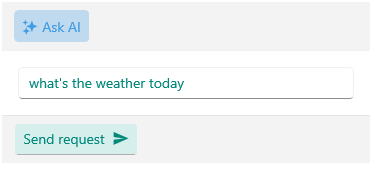
Here is how the customized Input View looks: