AIPrompt Button Styling
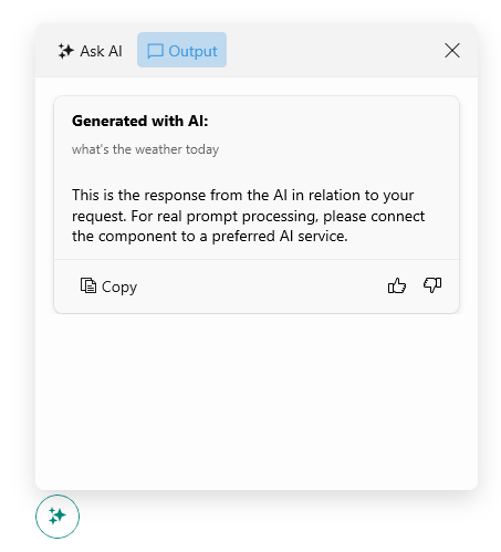
The AIPrompt Button is used to show the AIPrompt inside a popup. You can customize the AIPrompt Button by setting its Style
property with TargetType
set to RadTemplatedButton
.
The following example demonstrates how to modify the AIPrompt Button's appearance:
1. Add a Style
property with the needed styling settings applied to the page's resources:
<Style x:Key="MyAIPromptButtonStyle" TargetType="telerik:RadTemplatedButton">
<Setter Property="TextColor" Value="#00897B" />
<Setter Property="Background" Value="White" />
<Setter Property="BorderBrush" Value="#00897B" />
<Setter Property="BorderThickness" Value="1" />
<Setter Property="VisualStateManager.VisualStateGroups">
<VisualStateGroupList>
<VisualStateGroup Name="CommonStates">
<VisualState Name="Normal" />
<VisualState Name="PointerOver">
<VisualState.Setters>
<Setter Property="telerik:RadTemplatedButton.Background" Value="#E8F5F4" />
</VisualState.Setters>
</VisualState>
<VisualState Name="Pressed">
<VisualState.Setters>
<Setter Property="telerik:RadTemplatedButton.TextColor" Value="#9900897B" />
<Setter Property="telerik:RadTemplatedButton.Background" Value="#E8F5F4" />
</VisualState.Setters>
</VisualState>
<VisualState Name="Disabled">
<VisualState.Setters>
<Setter Property="telerik:RadTemplatedButton.TextColor" Value="#6100897B" />
<Setter Property="telerik:RadTemplatedButton.BorderBrush" Value="#6100897B" />
</VisualState.Setters>
</VisualState>
</VisualStateGroup>
</VisualStateGroupList>
</Setter>
</Style>
2. Add the RadAIPromptButton
control with its Style
applied:
Check the result below: