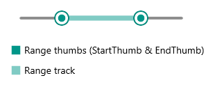
New to Telerik UI for .NET MAUI? Start a free 30-day trial

Range Thumb Styling

RangeSlider for .NET MAUI provides styling options for its range thumb. The range thumb includes start thumb, end thumb and range track. These elements can be styled separately through Fill and Style properties:

  • StartThumbFill(Color)—Applies fill color to the start thumb.
  • RangeTrackFill(Color)—Defines fill color to the range track.
  • EndThumbFill(Color)—Sets fill color to the end thumb.

  • StartThumbStyle(Style)—Defines a custom style to the start thumb.

  • RangeTrackStyle(Style)—Applies a custom style to the range track.
  • EndThumbStyle(Style)—Defines a custom style to the end thumb.

Here is a quick example on how styling properties can be applied to the RangeSlider:

1. Add the styles to the page resources:

<Style x:Key="CustomRangeTrackStyle" TargetType="telerik:SliderRangeTrack">
    <Setter Property="TrackThickness" Value="8" />
    <Setter Property="Fill" Value="#80CBC4" />
    <Setter Property="Stroke" Value="#B2DFDB" />
    <Setter Property="StrokeThickness" Value="1" />
</Style>
<Style x:Key="CustomStartEndThumbStyle" TargetType="telerik:SliderThumb">
    <Setter Property="Fill" Value="#009688" />
    <Setter Property="Stroke" Value="#00897B" />
    <Setter Property="StrokeThickness" Value="2" />
</Style>

2. Define the RangeSlider with the above style properties as well as Fill properties applied:

<telerik:RadRangeSlider Minimum="0"
                        Maximum="100"
                        RangeStart="25"
                        RangeEnd="75"
                        RangeTrackStyle="{StaticResource CustomRangeTrackStyle}"
                        StartThumbStyle="{StaticResource CustomStartEndThumbStyle}"
                        EndThumbStyle="{StaticResource CustomStartEndThumbStyle}" />

Check the result below:

Telerik RangeSlider for .NET MAUI Range Thumb Styling

See Also

In this article