Ticks
The RangeSlider for .NET MAUI can show ticks along the track in order to enable users to easily identify the range values.
Ticks Step and Placement
To display ticks along the track, define TickStep and TickPlacement properties of the RangeSlider.
-
TickStep(double)—Defines at what positions/values ticks will be displayed. -
TicksPlacement(type Telerik.Maui.Controls.RangeSlider.SliderTicksPlacement)—Specifies the position of the ticks in the RangeSlider with respect to its track. The available options are:-
None—no ticks are displayed. -
Start—ticks appear above the track. -
Center—ticks appear in the track area of the slider, overlaying the track. -
End—ticks appear below the track.
-
RangeSlider SnapMode
RangeSlider for .NET MAUI provides snapping to ticks thus limiting RangeStart and RangeEnd to a predefined set of values depending on TickStep value. You can control whether the snapping is enabled through SnapMode property:
-
SnapMode(type Telerik.Maui.Controls.RangeSlider.SliderSnapMode)—Defines whether a value should be snapped to a tick while the end-user is dragging a start thumb, end thumb or the range track. Available options are:-
None—The end user can move the dragged thumb freely. -
SnapToTicks—The start and end thumbs are snapped to the position of the ticks when an end-user is dragging them.
-
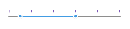
The snippet below shows how the ticks configuration settings can be applied:
<telerik:RadRangeSlider x:Name="rangeSlider"
                        Minimum="0"
                        Maximum="100"
                        RangeStart="10"
                        RangeEnd="60"
                        TicksPlacement="End"
                        TickStep="5"
                        SnapMode="SnapToTicks" />
Check the result below:
Tick Template
Through the TickTemplate property you can customize the appearance of the ticks.
-
TickTemplate (DataTemplate)—Defines the template of the RangeSlider ticks.
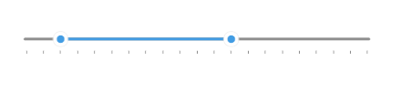
Check below a sample TickTemplate example:
1. First define the custom DataTemplate:
<DataTemplate x:Key="CustomTickTemplate">
    <Rectangle WidthRequest="4"
               HeightRequest="10"
               BackgroundColor="#7C59B6" />
</DataTemplate>
2. Then apply it to the RangeSlider's TickTemplate:
<telerik:RadRangeSlider x:Name="rangeSlider"
                        Minimum="0"
                        Maximum="100"
                        RangeStart="10"
                        RangeEnd="60"
                        TicksPlacement="Start"
                        TickStep="20"
                        TickTemplate="{StaticResource CustomTickTemplate}" />