Styling the DataPager Buttons
The DataPager for .NET MAUI provides a styling mechanism for customizing the look of the navigation and page buttons.
Styling the Navigation Buttons
The DataPager provides a styling mechanism for customizing the look of the navigation buttons by using the following properties:
-
NavigateToFirstPageButtonStyle(Stylewith target type oftelerik:DataPagerButton)—Specifies the style which applies to the first page navigation button. -
NavigateToPreviousPageButtonStyle(Stylewith target type oftelerik:DataPagerButton)—Specifies the style which applies to the previous page navigation button. -
NavigateToNextPageButtonStyle(Stylewith target type oftelerik:DataPagerButton)—Specifies the style which applies to the next page navigation button. -
NavigateToLastPageButtonStyle(Stylewith target type oftelerik:DataPagerButton)—Specifies the style which applies to the last page navigation button.
The DataPagerButton inherits from RadTemplatedButton. Set the properties described in the TemplatedButton Styling article to the DataPager navigation buttons styling properties.
The DataPagerButton exposes additional visual states—Selected and SelectedDisabled. Review the TemplatedButton Visual States article to check what are the other states you can set to the navigation buttons.
Styling the Numeric Buttons
The DataPager provides a styling mechanism for customizing the look of the numeric buttons by using the following properties:
-
NumericButtonStyle(Stylewith target type oftelerik:DataPagerButton)—Specifies the style which applies to the numeric buttons. -
NumericButtonsViewStyle(Stylewith target type oftelerik:DataPagerNumericButtonsView)—Specifies the style which applies to the view presenting the numeric buttons.
The DataPagerButton inherits from RadTemplatedButton. Set the properties described in the TemplatedButton Styling article to the DataPager navigation buttons styling properties.
s
The DataPagerButton exposes additional visual states—Selected and SelectedDisabled. Review the TemplatedButton Visual States article to check what are the other states you can set to the navigation buttons.
Example
Here is an example how to style the buttons in the DataPager control.
1. Define the DataPager in XAML:
2. Add the telerik namespace:
3. Define the button resources in the page's resource:
4. Define sample data:
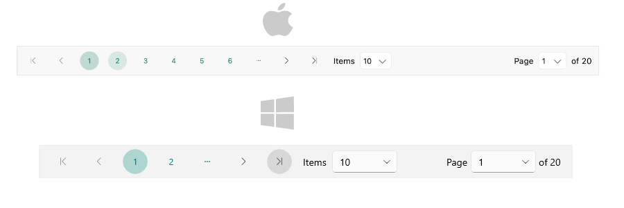
This is the result on desktop:
For the DataPager Buttons styling example, go to the SDKBrowser Demo Application and navigate to the DataPager > Styling category.