.NET MAUI DataPager Ellipsis Mode
The ellipsis appears when the pages are more than the rendered numeric buttons. It provides a hint for the end user and indicates that there are undisplayed pages.
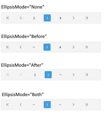
You can specify where the ellipsis is allowed to appear by setting the EllipsisMode (enum of type Telerik.Maui.Controls.DataPager.DataPagerEllipsisMode) property. The EllipsisMode controls whether the numeric buttons for the first/last page are replaced with an ellipsis (...) when there are more pages to the left/right.
The available options for EllipsisMode are:
-
None—The ellipsis is disabled. -
Before—Display an ellipsis instead of the first numeric button. - (Default)
After— Display an ellipsis instead of the last numeric button. -
Both—Display an ellipsis on both sides.
The image below shows the ellipsis modes:

Example
Here is a quick example on how you can define the EllipsisMode in the DataPager.
1. Define the DataPager in XAML:
2. Add the telerik namespace:
3. Define the ViewModel:
For the DataPager Ellipsis Mode example, go to the SDKBrowser Demo Application and navigate to the DataPager > Features category.