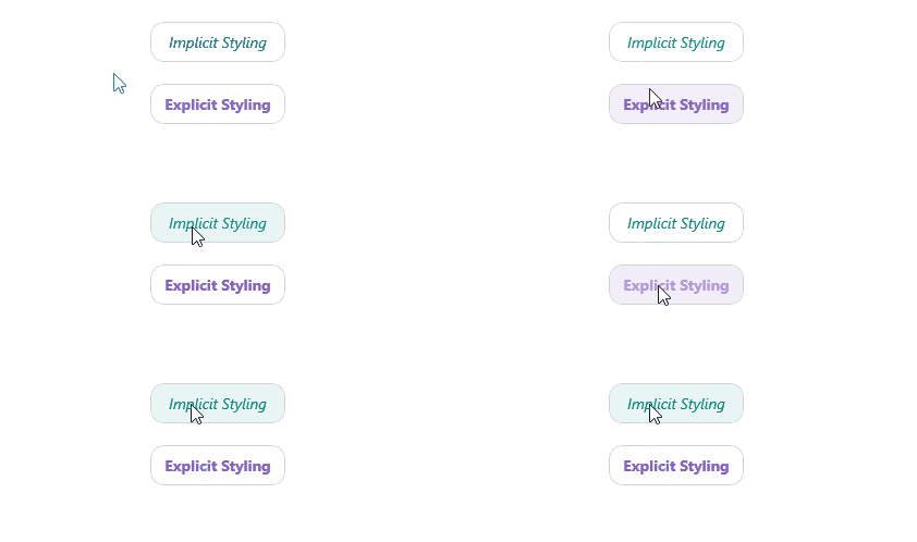
.NET MAUI TemplatedButton Styling
The TemplatedButton provides a set of styling options by exposing properties for customizing its visual appearance.
Styling the TemplatedButton
To style the TemplatedButton, you can use the following properties:
-
Background(Brush)—Specifies the background brush of the control. -
BorderBrush(Brush)—Specifies the border brush of the control. -
BorderColor(Color)—Specifies the border color of the control. -
BorderThickness(Thickness)—Specifies the border thickness of the control. -
CornerRadius(CornerRadius)—Specifies the corner radius of the control. -
Padding(Thickness)—Specifies the padding of the control. -
TextColor(Color)—Specifies the color of theLabel.Textcreated whenContentisstringandContentTemplateis not set. - All Properties from the Content Configuration article can be applied through style.
The TemplatedButton uses the .NET MAUI Visual State Manager and defines a visual state group named CommonStates with the following visual states:
NormalPointerOverPressedDisabled
Using the Styling API
The following example demonstrates how to apply implicit and explicit styles to the TemplatedButton using the visual states.
1. Define the buttons in XAML:
2. Define the explicit styling to the page's resources:
3. Define the implicit styling to the page's resources:
4. Add the telerik namespace:
This is the result on WinUI:

For a runnable example demonstrating the TemplatedButton styling options, see the SDKBrowser Demo Application and go to the TemplatedButton > Styling category.