New to Telerik UI for .NET MAUI? Start a free 30-day trial

.NET MAUI DataPager Display Mode

The DataPager lets you control the visibility of its visual elements. In addition, you can use Adaptive Display modes to arrange the pager's elements.

To define which elements can be displayed in the DataPager, use the DisplayMode (enum of type Telerik.Maui.Controls.DataPager.DataPagerDisplayMode) property. The available options are:

  • None—Displays no elements in the DataPager.
  • FirstPageButton—Displays the first page button.
  • PrevPageButton—Displays the previous page button.
  • NumericButtons—Displays the numeric buttons.
  • NavigationComboBox—Displays the navigation ComboBox.
  • NextPageButton—Displays the next page button.
  • LastPageButton—Displays the last page button.
  • PageSizesView—Displays the PageSizes view.
  • NavigationView—Displays the navigation view.

The DisplayMode property supports a bitwise combination of the values from the DataPagerDisplayMode enumeration to enable more than one option.

The following example demonstrates how to use the DisplayMode property:

1. Define the DataPager in XAML:

<telerik:RadDataPager x:Name="pager" 
                      DisplayMode="NavigationView"
                      Source="{Binding Data}">
    <telerik:RadDataPager.BindingContext>
        <local:ViewModel/>
    </telerik:RadDataPager.BindingContext>
</telerik:RadDataPager>

2. Add the telerik namespace:

xmlns:telerik="http://schemas.telerik.com/2022/xaml/maui"

3. Define the ViewModel:

public class ViewModel
{
    public ViewModel()
    {
        Data = CreateData(200);
    }

    public List<int> Data { get; set; }

    internal static List<int> CreateData(int count)
    {
        List<int> source = new List<int>();

        for (int i = 0; i < count; i++)
        {
            source.Add(i);
        }

        return source;
    }
}

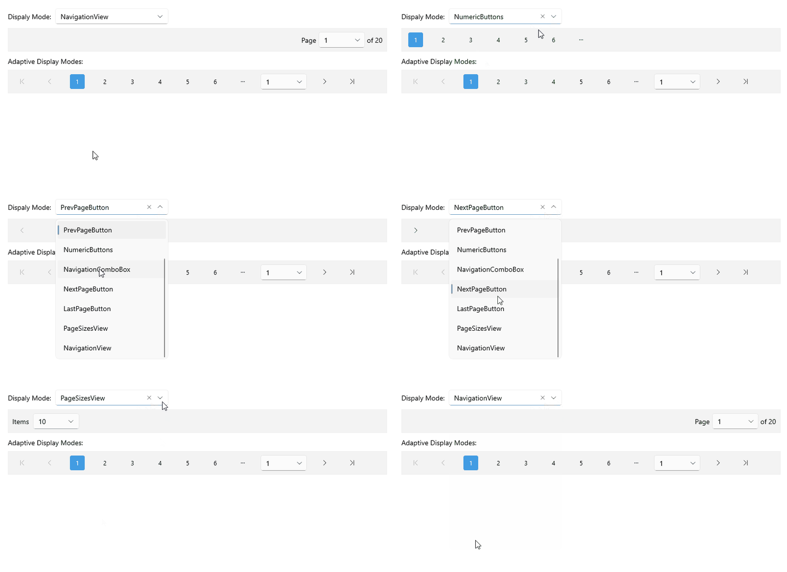
This is the result on desktop:

.NET MAUI DataPager Display mode

For the DataPager Display Mode example, go to the SDKBrowser Demo Application and navigate to the DataPager > Features category.

Adaptive Display Modes

The DataPager lets you customize the default arrangement of the elements in the pager by providing the AdaptiveDisplayModes property:

  • AdaptiveDisplayModes (IList<DataPagerDisplayMode>)—Specifies a list of the desired combinations of elements that should be displayed. The actual elements that will be displayed are the result of the DataPager's DisplayMode property, and the size of the control.

For example, if you set AdaptiveDisplayModes and DisplayMode to the values in the snippet below, the DataPager will arrange the elements based on the values set in the AdaptiveDisplayModes collection and will skip the elements that are not defined in the DisplayMode property—the NextPageButton element.

<telerik:RadDataPager Source="{Binding Data}"
                      DisplayMode="FirstPageButton,LastPageButton,NavigationComboBox">
    <telerik:RadDataPager.AdaptiveDisplayModes>
        <x:Array Type="{x:Type telerik:DataPagerDisplayMode}">
            <telerik:DataPagerDisplayMode>FirstPageButton, NavigationComboBox, NextPageButton, LastPageButton</telerik:DataPagerDisplayMode>
        </x:Array>
    </telerik:RadDataPager.AdaptiveDisplayModes>
</telerik:RadDataPager>

This is the result on WinUI:

.NET MAUI DataPager Display mode and AdaptiveDisplay mode

Example

The following example demonstrates how to use the AdaptiveDisplayModes property:

1. Define the DataPager in XAML:

<telerik:RadDataPager Source="{Binding Data}">
    <telerik:RadDataPager.AdaptiveDisplayModes>
        <x:Array Type="{x:Type telerik:DataPagerDisplayMode}">
            <telerik:DataPagerDisplayMode>FirstPageButton, PrevPageButton, NumericButtons, NavigationComboBox, NextPageButton, LastPageButton</telerik:DataPagerDisplayMode>
        </x:Array>
    </telerik:RadDataPager.AdaptiveDisplayModes>
    <telerik:RadDataPager.BindingContext>
        <local:ViewModel />
    </telerik:RadDataPager.BindingContext>
</telerik:RadDataPager>

2. Add the following namespace:

xmlns:telerik="http://schemas.telerik.com/2022/xaml/maui"

3. Define the ViewModel:

public class ViewModel
{
    public ViewModel()
    {
        Data = CreateData(200);
    }

    public List<int> Data { get; set; }

    internal static List<int> CreateData(int count)
    {
        List<int> source = new List<int>();

        for (int i = 0; i < count; i++)
        {
            source.Add(i);
        }

        return source;
    }
}

This is the result on desktop:

.NET MAUI DataPager Adaptive Display mode

For the DataPager Display Mode example, go to the SDKBrowser Demo Application and navigate to the DataPager > Features category.

Additional Resources

See Also

In this article