.NET MAUI DataGrid Aggregates Styling
The .NET MAUI DataGrid provides a styling functionality for its group footer, header, and column footer aggregates.
Style the Group Header
The Telerik UI for .NET MAUI DataGrid provides the GroupHeaderStyle (of type Style with target type DataGridGroupHeaderAppearance) configuration, which defines the style of the GroupHeader and the aggregates inside the header.
To visualize the aggregates in the DataGrid group header, set the
ShowGroupHeaderAggregatestoTrue. The property is a property inside theRadDataGridinstance.
Use the following properties to style the GroupHeader:
| Property | Description |
|---|---|
BackgroundColor |
Defines the color that fills the area within the header. |
BorderColor |
Defines the color that fills the border region. |
BorderThickness |
Defines the thickness of the border. |
ButtonFontAttributes |
Defines the font attributes for the expand/collapse symbol for the group headers. |
ButtonFontFamily |
Defines the font family for the expand/collapse symbol of the GroupHeader. |
ButtonFontSize |
Defines the font size for the expand/collapse symbol of the GroupHeader. |
ButtonMargin |
Defines the margin for the expand/collapse symbol of the GroupHeader. |
ButtonTextColor |
Defines the color for the expand/collapse symbol of the GroupHeader. |
TextColor |
Defines the color for the text part of the GroupHeader
|
TextFontAttributes |
Defines the font attributes for the text part of the GroupHeader. |
TextFontFamily |
Defines the font family for the text part of the GroupHeader. |
TextFontSize |
Defines the size for the text part of the GroupHeader. |
TextMargin |
Defines the margin for the text part of the GroupHeader. |
Style the Aggregates in the Group Header
You can style the appearance of the aggregate results based on the value of the GroupAggregatesAlignment (enum of type Telerik.Maui.Controls.DataGrid.DataGridGroupAggregatesAlignment) property.
To style the aggregates in the group header when the value for the GroupAggregatesAlignment is None, use the GroupHeaderStyle (of type Style with target type DataGridGroupHeaderAppearance) property.
The available properties in the GroupHeaderStyle are:
| Property | Description |
|---|---|
AggregatesTextColor |
Defines the color for the aggregates part of the GroupHeader
|
AggregatesTextFontAttributes |
Defines the font attributes for the aggregates part of the GroupHeader
|
AggregatesTextFontFamily |
Defines the font family of the aggregates part of the GroupHeader
|
AggregatesTextFontSize |
Defines the size of the aggregates part of the GroupHeader
|
AggregatesTextMargin |
Defines the margin for the aggregates part of the GroupHeader
|
The following example shows how to style the aggregate results in the group header when setting the GroupHeaderStyle in the page's resources:
To style and customize the aggregate results when setting the GroupAggregatesAlignment to NextToHeader, use the following properties:
-
GroupAggregateCellStyle(of typeStylewith target typeDataGridGroupAggregateCellAppearance)—Defines the style of the aggregates cell within the group header of the DataGrid. -
GroupAggregateCellStyleSelector(IStyleSelector)—Allows you to set different styles for each aggregate within the group header of the DataGrid by passing theGroupAggregateCellContextin the selector. -
GroupAggregateCellTemplate(DataTemplate)—Defines the appearance of each aggregate within the group header of the DataGrid.
The properties listed above are properties inside the
RadDataGridinstance. The table below describes the available properties for theGroupAggregateCellStyle:
| Property | Description |
|---|---|
TextColor |
Defines the color of the cell text. |
FontAttributes |
Defines the font attributes for the text in the cell. |
FontFamily |
Defines the font family for the text in the cell. |
FontSize |
Defines the size for the text in the cell. |
Margin |
Defines the margin that is applied to the text of the cell. |
Example with the GroupAggregateCellStyle
1. Define the DataGrid in XAML:
2. Define the GroupAggregateCellStyle in the page's resources:
3. Define theDataModel:
4. Define the ViewModel:
For the DataGrid
GroupHeaderAggregates Styleexample refer to the SDKBrowser Demo application and navigate to the DataGrid > Aggregates category.
Example with the GroupAggregateCellStyleSelector
1. Define the DataGrid in XAML:
2. Define the StyleSelector class:
3. Define the GroupAggregateCellStyleSelector in the page's resources:
4. Define the DataModel:
5. Define the ViewModel:
For the DataGrid
GroupHeaderAggregates StyleSelectorexample refer to the SDKBrowser Demo application and navigate to the DataGrid > Aggregates category.
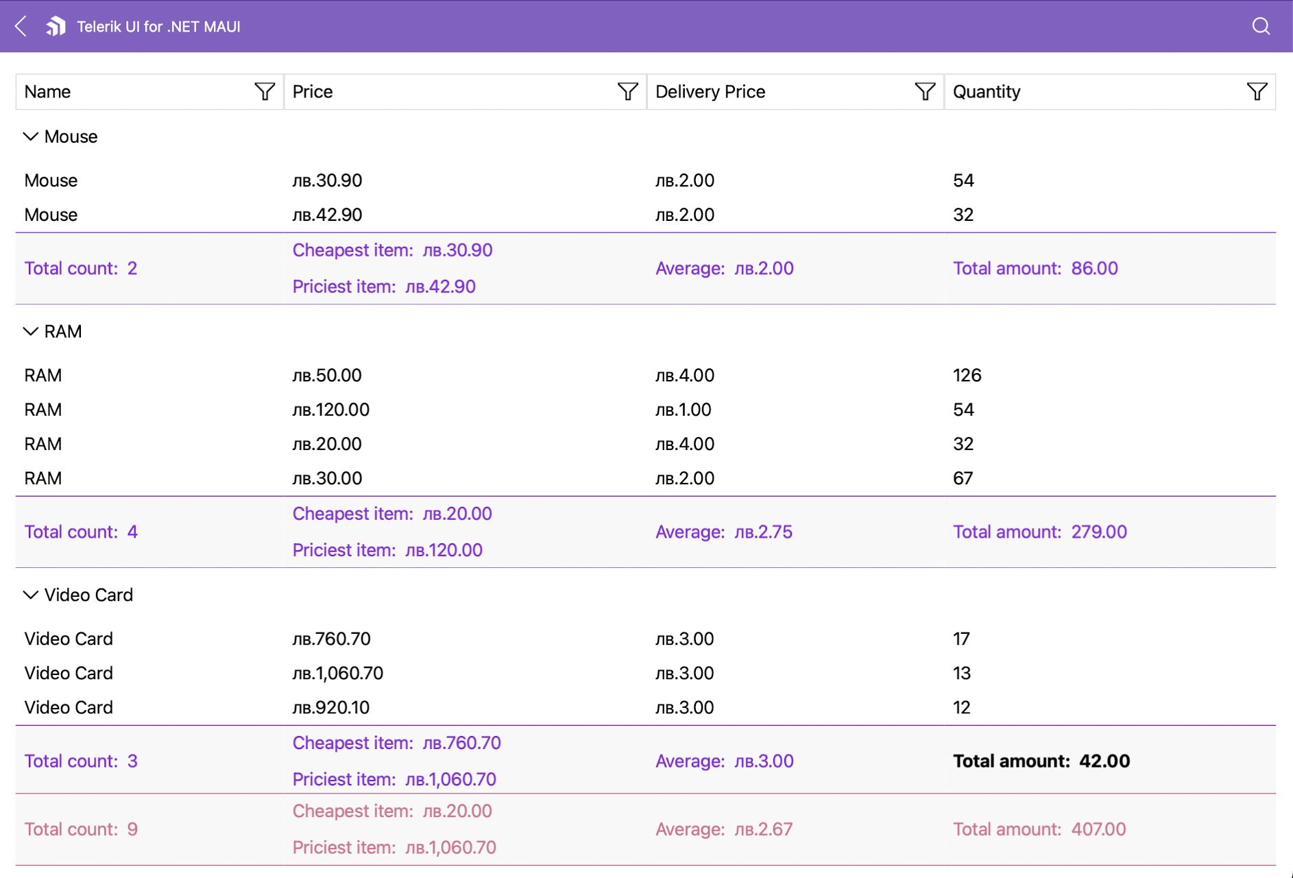
Style the Group Footer
The DataGrid provides the following options for styling its group footer:
-
GroupFooterStyle(of typeStylewith target typeDataGridColumnFooterAppearance)—Defines the style of theGroupFooterand the aggregates inside the footer. -
GroupFooterStyleSelector(IStyleSelector)—Defines the style of the selectedGroupFooterby passing theGroupFooterContextin the selector. -
FooterStyle(of typeStylewith target typeDataGridColumnFooterAppearance)—Defines the style of the Column Footer and the aggregates inside the Column Footer.
To visualize the
GroupFooter, set theShowGroupFootersproperty toTrue. The property is a property inside theRadDataGridinstance.
The following example shows how to define the GroupFooterStyle in XAML:
The following example shows how to use the GroupFooterStyleSelector property:
1. Define the class to which the GroupFooterContext will be passed.
2. Define the style selector which will passed to the DataGrid in XAML.
For the DataGrid
GroupFooterAggregates styling example refer to the SDKBrowser Demo application and navigate to the DataGrid > Aggregates category.
Customizing the Group Footer Appearance
Customizing the footer in the DataGrid also changes the appearance of the aggregates inside the component.
The following example demonstrates how to change the style of the column footer aggregates:
1. Define the footer style in XAML.
2. Add the styling to the DataGrid.
The footer style is added per column.
The following image shows the end result.
For the DataGrid
GroupFooterstyling example refer to the SDKBrowser Demo application and navigate to the DataGrid > Aggregates category.