Align and Position the .NET MAUI BadgeView
The BadgeView provides properties for setting the alignment and position of the Badge indicator based on the BadgeView Content.
Positioning the Badge
To specify the position of the Badge according to its content, use the following properties:
-
BadgeHorizontalPosition(of typeTelerik.Maui.Controls.BadgeView.BadgePosition)—Specifies the horizontalBadgePositionof the Badge. The supported options are:Start,Center,End. The default value isEnd.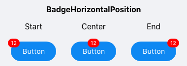
-
BadgeVerticalPosition(of typeTelerik.Maui.Controls.BadgeView.BadgePosition)—Specifies the verticalBadgePositionof the Badge. The supported options are:Start,Center,End. The default value isStart.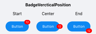
Aligning the Badge
To specify the alignment of the Badge according to its content, use the following properties:
-
BadgeHorizontalAlignment(of typeTelerik.Maui.Controls.BadgeView.BadgeAlignment)—Specifies the horizontal alignment of the badge. The supported options are:Start,Center,End. The default value isCenter.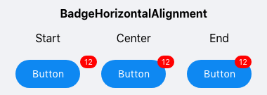
-
BadgeVerticalAlignment(of typeTelerik.Maui.Controls.BadgeView.BadgeAlignment)—Specifies the vertical alignment of the Badge. The supported options are:Start,Center,End. The default value isEnd.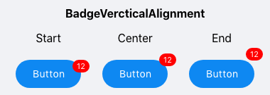
Offset
You can also specify the horizontal and vertical distance between the content of the Badge indicator and its alignment point by using the following properties:
BadgeOffsetX(double)—Specifies the horizontal distance between the content of the Badge and its alignment point. The default value is0.BadgeOffsetY(double)—Specifies the vertical distance between the content of the Badge and its alignment point. The default value is0.
Example
The following example demonstrates how to position and align the Badge as well as set its offset.
The following image shows the final result.