Customizations in .NET MAUI BadgeView
If you don't want to use a predefined Badge type and need to customize the text inside the Badge indicator, use the BadgeText(string) property.
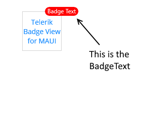
The following image shows the final result.
ControlTemplate
The BadgeView supports a default ControlTemplate which you can customize.
To override the default control template, you need to set an implicit style with
TargetType="telerik:Badge".
Use the Default ControlTemplate
To use the default ControlTemplate:
1. Set the default ControlTemplate in the page resources:
2. The following snippet shows the BadgeView definition in XAML:
3. Add the telerik namespace:
The following image shows the final result.

Use a Custom ControlTemplate
To customize the ControlTemplate:
1. Define the custom ControlTemplate in the page resources:
2. The following snippet shows the BadgeView definition in XAML:
3. Add the following namespace:
The following image shows the final result.

For a runnable example with the BadgeView ControlTemplate scenario, see the SDKBrowser Demo Application and go to BadgeView > Features.