Badge Indicator
The Badge is the indicator (or marker) which is displayed to show notifications, statuses, and so on, while the BadgeView is the control in which you can add content and position the Badge based on this content.
To provide the best experience use the BadgeView control. The control gives you the option to add elements in the BadgeView content and display a badge indicator for this view. You can customize the badge directly in the BadgeView.
The following image shows the difference between the BadgeView control and the Badge indicator.
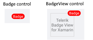
Badge Features
The Badge indicator provides the following properties:
-
Text(string)—Defines the Badge text. -
TextColor(Microsoft.Maui.Graphics.Color)—Defines the text color of the Badge. -
TextMargin(Microsoft.Maui.Thickness)—Defines the margin of the Badge text. -
FontSize(double)—Defines the Badge text font size. -
FontFamily(string)—Defines the Badge text font family. -
FontAttributes(Microsoft.Maui.Controls.FontAttributes)—Defines the Badge text font attributes. -
BorderColor(Microsoft.Maui.Graphics.Color)—Defines the Badge border color. -
CornerRadius(Microsoft.Maui.Thickness)—Defines the corner radius of the Badge border. -
BorderThickness(Microsoft.Maui.Thickness)—Defines the Badge border thickness. -
AnimationType(Telerik.Maui.Controls.BadgeView.BadgeAnimationType)—You can choose betweenScaleandNone. The default value isScale. -
AnimationEasing(Microsoft.Maui.Easing)—Defines the animation easing. For more details about different easing options, refer to the article onMicrosoft.Maui.Easing. The default value isSinInOut. -
AnimationDurationin milliseconds(int)—Defines the animation duration in milliseconds. The default value is 300. -
ControlTemplate(Microsoft.Maui.Controls.ControlTemplate)—Specifies the Badge control template.
Define the Badge
The following example demonstrates how to define the Badge in XAML:
<telerik:Badge/>
Add the namespace:
xmlns:telerik="http://schemas.telerik.com/2022/xaml/maui"
Use the Default ControlTemplate
The default Badge ControlTemplate definition in XAML is the following:
<Style TargetType="telerik:Badge">
    <Setter Property="ControlTemplate">
        <Setter.Value>
            <ControlTemplate>
                <!-- you can change the control template in order to customize the bage default look  -->
                <telerik:RadBorder BorderThickness="{TemplateBinding BorderThickness}"
                                   BorderColor="{TemplateBinding BorderColor}"
                                   CornerRadius="{TemplateBinding CornerRadius}"
                                   BackgroundColor="{TemplateBinding BackgroundColor}"
                                   MinimumHeightRequest="{TemplateBinding MinimumHeightRequest}"
                                   MinimumWidthRequest="{TemplateBinding MinimumWidthRequest}">
                    <Label x:Name="PART_BadgeContent"
                           Text="{TemplateBinding Text}"
                           TextColor="{TemplateBinding TextColor}"
                           Margin="{TemplateBinding TextMargin}"
                           FontSize="{TemplateBinding FontSize}"
                           FontFamily="{TemplateBinding FontFamily}"
                           FontAttributes="{TemplateBinding FontAttributes}"
                           HorizontalTextAlignment="Center"
                           VerticalTextAlignment="Center" />
                </telerik:RadBorder>
            </ControlTemplate>
        </Setter.Value>
    </Setter>
</Style>
Define the Badge in the following way:
<telerik:Badge/>