Configure the .NET MAUI BadgeView
This article demonstrates the main configuration options of the Telerik UI for .NET MAUI BadgeView control.
Content
The BadgeView exposes the Content(of type Microsoft.Maui.Controls.View) property, which defines its content. The Badge marker/indicator is positioned based on the content inside the BadgeView.
You are required to define content for the BadgeView by setting its
Contentproperty. Otherwise, the control will not be visualized.
<telerik:RadBadgeView>
    <telerik:RadBadgeView.Content>
        <!-- Add the content of the BadgeView. For exmaple: Label, Image, Frame, Border, Button, and so on. -->
    </telerik:RadBadgeView.Content>
</telerik:RadBadgeView>
Example
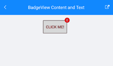
The example demonstrates how to set the content of the BadgeView and features a Button inside the Content. The BadgeText will be updated on a ButtonClick.
<telerik:RadBadgeView BadgeText="0"
                                VerticalOptions="Center"
                                HorizontalOptions="Center"
                                x:Name="badgeView">
    <telerik:RadBadgeView.Content>
        <Button Text="Click me!"
                Clicked="Button_Clicked"
                BorderColor="Gray"
                BorderWidth="2"
                Padding="3"
                VerticalOptions="Center"
                HorizontalOptions="Center"/>
    </telerik:RadBadgeView.Content>
</telerik:RadBadgeView>
The following snippet demonstrates the code behind with the button click implementation:
public partial class BadgeViewContent : RadContentView
{
    private int badgeCounter = 0;

    public BadgeViewContent()
    {
        InitializeComponent();
    }

    private void Button_Clicked(object sender, EventArgs e)
    {
        badgeCounter++;
        badgeView.BadgeText = badgeCounter.ToString();
    }
}
The following image shows the final result.
Badge Text
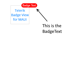
To define some text in the BadgeView, set the BadgeText property(string). The text will be displayed in the Badge indicator.
<telerik:RadBadgeView BadgeText="Badge Text">
    <telerik:RadBadgeView.Content>
        <telerik:RadBorder WidthRequest="80"
                           HeightRequest="80"
                           BorderThickness="1"
                           BorderColor="LightGray">
            <Label Text="Telerik BadgeView for .NET MAUI"
                   FontSize="14"
                   VerticalTextAlignment="Center"
                   HorizontalTextAlignment="Center"/>
        </telerik:RadBorder>
    </telerik:RadBadgeView.Content>
</telerik:RadBadgeView>
The following image shows the final result.
You can customize the look and feel of the BadgeView. For detailed information, refer to the articles on BadgeView styling and customization.
Badge Visibility
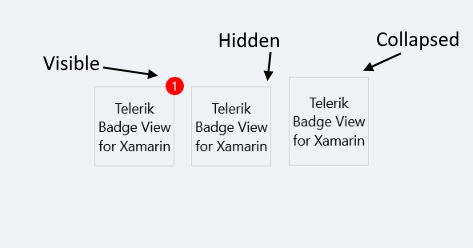
To change the visibility state of the Badge indicator, use the BadgeVisibility property (enum of type Microsoft.Maui.Visibility).
The following options are supported:
- (Default)
Visible—The Badge marker/indicator is visualized. -
Hidden—The Badge marker/indicator is hidden. -
Collapsed—The Badge marker/indicator is collapsed.
Example
The following example demonstrates how to hide the BadgeVisibility state.
<telerik:RadBadgeView BadgeText="1" BadgeVisibility="Hidden">
    <telerik:RadBadgeView.Content>
        <telerik:RadBorder WidthRequest="80"
                           HeightRequest="80"
                           BorderThickness="1"
                           BorderColor="LightGray">
            <Label Text="Telerik Badge View for .NET MAUI"
                FontSize="14"
                VerticalTextAlignment="Center"
                HorizontalTextAlignment="Center"/>
        </telerik:RadBorder>
    </telerik:RadBadgeView.Content>
</telerik:RadBadgeView>
The following image shows the final result.
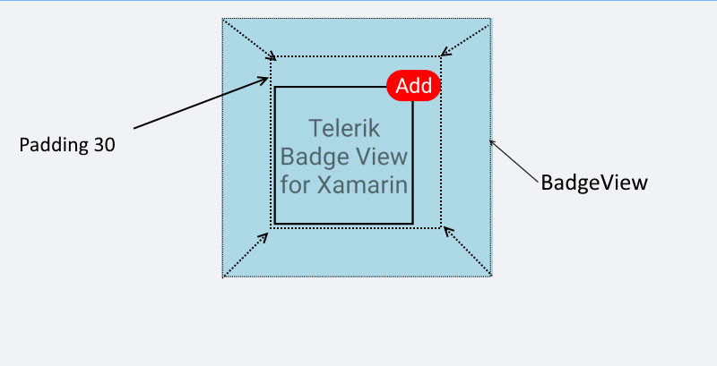
Padding
The BadgeView provides the Padding(Microsoft.Maui.Controls.Compatibility) property, which defines its inner padding.
 <telerik:RadBadgeView BadgeText="Add" Padding="30">
     <telerik:RadBadgeView.Content>
     <!-- add your content here -->
     </telerik:RadBadgeView.Content>
 </telerik:RadBadgeView>
The following image shows the result.