.NET MAUI BadgeView Overview
The Telerik UI for .NET MAUI BadgeView allows you to display badges in your application.
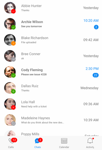
Badges can be used as an additional marker for any element: to decorate avatars, navigation menus, or other components in the application when the visual notification is needed. In addition, you can change the look of the Badge indicator by setting different predefined Badge types, and by using templates and various styling options.
The BadgeView is part of Telerik UI for .NET MAUI, the most comprehensive UI suite for .NET MAUI! To try it out, sign up for a free 30-day trial and kickstart your cross-platform app development today.

Key Features of the .NET MAUI BadgeView
- Badge indicator—The BadgeView provides a number of features for customizing its Badge indicator.
-
Position—The BadgeView allows you to specify the
Positionof the Badge indicator based on its content. - Alignment—You can align the Badge indicator according to its content.
-
Animation—You can choose whether to have an
Animationwhile displaying the Badge indicator. In addition, you can specify the animation duration and animation easing. - Badge types—You can select the type of a Badge from a set of various predefined options. Also, you can customize and style each Badge type.
- Badge indicator visibility—Change the visibility of the badge indicator to collapsed, hidden and visible.
- Badge text—You can add custom text to the indicator.
- Flexible styling API and customization options—Allows you to change the
BackgroundColor,BorderThickness, andColorproperties of the BadgeView. Also, the BadgeView exposes an API, which you can use to customize and style the Badge indicator.