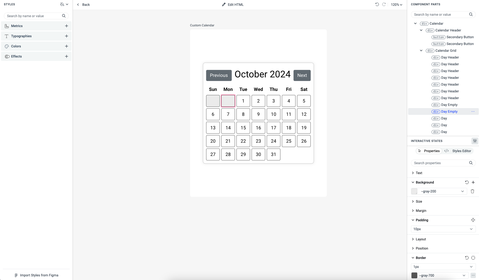
How to Style Custom Components
ThemeBuilder is designed to work seamlessly with Telerik and Kendo UI components. However, with the introduction of custom components and the ability to upload external styles, you can now style any component using ThemeBuilder's user-friendly interface.
For instance, let's say you are using Blazor and have created a Calendar component that appears as follows:
<h1>Calendar</h1>

<div class="calendar">
    <div class="calendar-header">
        <button class="btn btn-secondary" @onclick="PreviousMonth">Previous</button>
        <h2>@currentMonth.ToString("MMMM yyyy")</h2>
        <button class="btn btn-secondary" @onclick="NextMonth">Next</button>
    </div>

    <div class="calendar-grid">
        @foreach (var day in daysOfWeek)
        {
            <div class="day-header">@day</div>
        }
        @for (int i = 0; i < (int)firstDayOfMonth.DayOfWeek; i++)
        {
            <div class="day empty"></div>
        }
        @for (int day = 1; day <= daysInMonth; day++)
        {
            <div class="day">@day</div>
        }
    </div>
</div>

@code {
    private DateTime currentMonth = DateTime.Now;
    private readonly string[] daysOfWeek = { "Sun", "Mon", "Tue", "Wed", "Thu", "Fri", "Sat" };

    private int daysInMonth => DateTime.DaysInMonth(currentMonth.Year, currentMonth.Month);
    private DateTime firstDayOfMonth => new DateTime(currentMonth.Year, currentMonth.Month, 1);

    private void PreviousMonth()
    {
        currentMonth = currentMonth.AddMonths(-1);
    }

    private void NextMonth()
    {
        currentMonth = currentMonth.AddMonths(1);
    }
}
In this tutorial, you will learn how to leverage ThemeBuilder's features to style any custom components you have created.
Creating Custom Components in ThemeBuilder
To style your custom components in ThemeBuilder, follow these steps:
-
Open an existing ThemeBuilder project and click the Add Component button.

If your project is based on a Telerik and Kendo UI theme, adding your first custom component creates a new My Components section. This section contains all custom components and the Add Component button.
-
In the ADD COMPONENT dialog:
Enter a name for the new component, for example,
Custom Calendar.Enter a new category or choose an existing one from the dropdown menu.
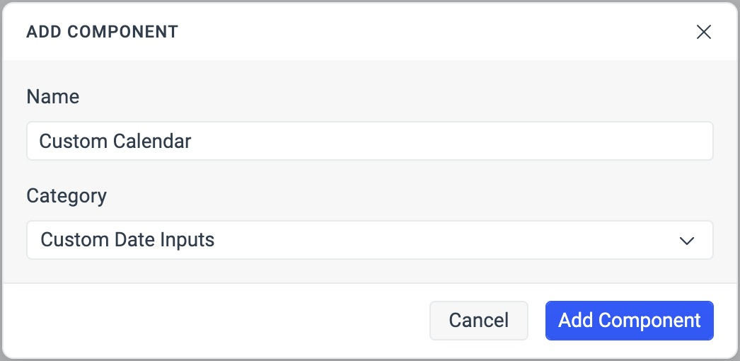
Select Add Component.
Adding HTML Content to the Custom Component
To add HTML content to the newly created custom component, follow these steps:
-
Select Advanced Edit from the ThemeBuilder toolbar.

Locate the newly created custom component and drill-down to it by clicking on it.
-
Click the Add HTML button.
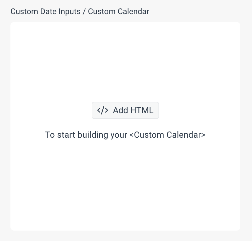
-
Copy the HTML content of your custom component by following these steps:
Open the browser page where the custom component is rendered.
Open the browser's DevTools. In Google Chrome, for example, you can do this by pressing
F12.Copy the HTML content of the component. For example, you can do this in Google Chrome by right-clicking on the element and then choosing Copy > Copy OuterHTML.
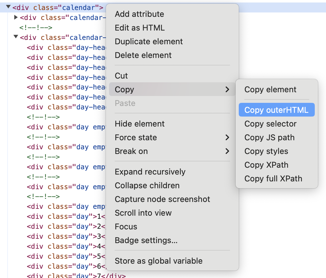
-
Paste the copied HTML as HTML content of the custom component in ThemeBuilder.
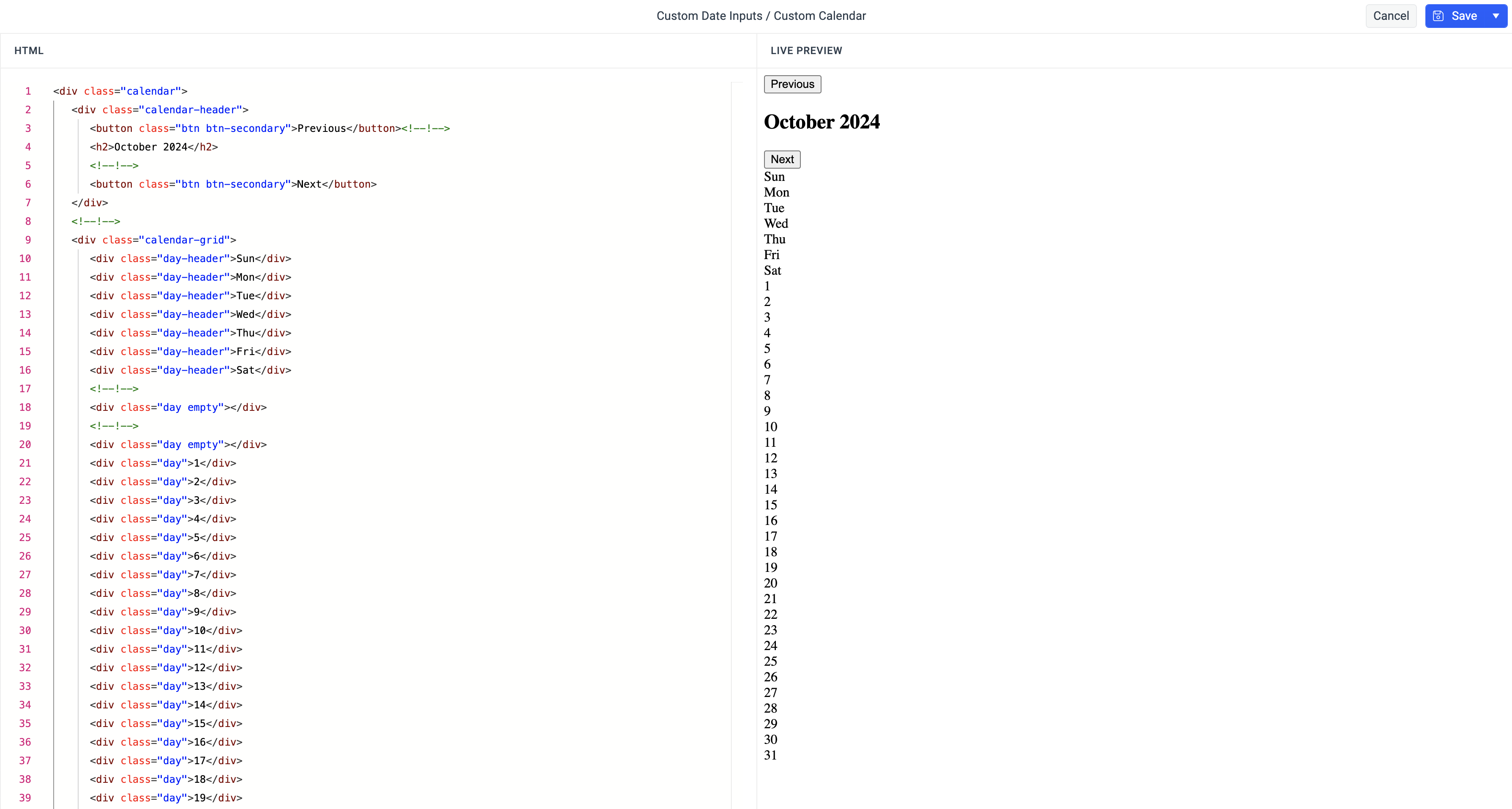
-
Select Save & Close.
To ensure the HTML content is correct, make sure the root element has a specific class name. Additionally, each element that you want to style separately must have its own class name. This approach allows ThemeBuilder to identify these elements and render them as component parts of the overall component, enabling further customization through its user interface.
Uploading External Styles (Optional)
If you have CSS files that affect your custom components, you can upload them to your ThemeBuilder project. This allows you to leverage ThemeBuilder's features and build upon these existing styles. For instance, Blazor projects typically include a CSS file with the Bootstrap theme by default. To upload your CSS files, follow these steps:
-
Click the Project Settings button in the toolbar.

-
Select the External Styles tab from the Project Settings dialog.
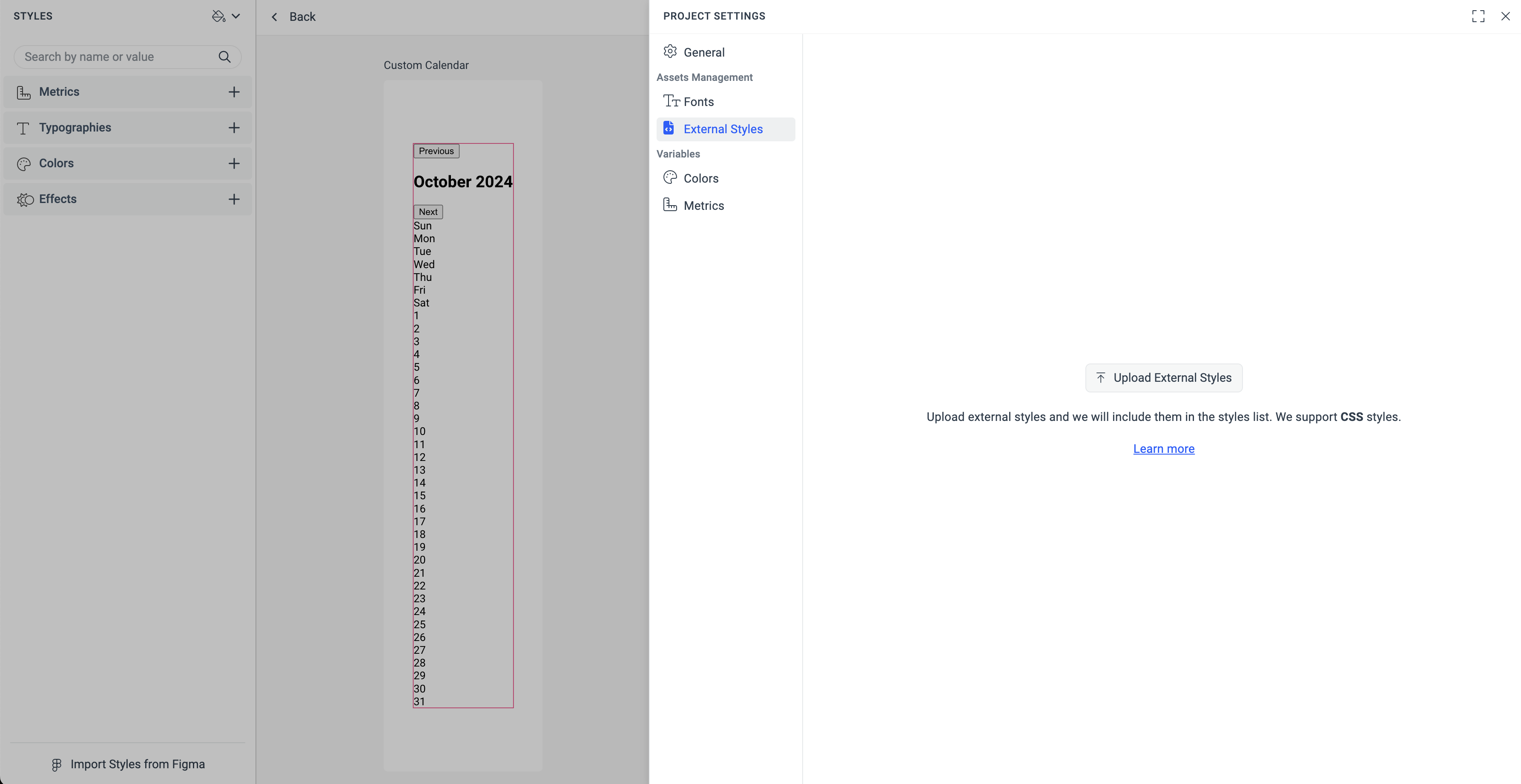
Select Upload External Styles from the External Styles tab.
-
Add the external styles, then click Save.

Styling Custom Components
Styling custom components works the same way as styling Telerik and Kendo UI components. For more details, check the Applying Advanced Customizations article.
When working with custom components, there are various strategies you can adopt. For instance, some components update their HTML content based on JavaScript code. A good example of this is a calendar that can display different views for days, months, and years depending on the buttons that are clicked. In such cases, creating separate custom components in ThemeBuilder for styling each view individually can be an effective approach.
By default, the component parts of the custom components in ThemeBuilder are named after the corresponding HTML elements (for example, Div). However, you can rename these elements for smoother customizations. For more information, refer to the Rename Custom Components Parts article section.
