Applying Advanced Customizations
In ThemeBuilder, you can manually edit the properties of the UI components and apply advanced styling strategies that allow you to entirely transform the appearance of your UI components.
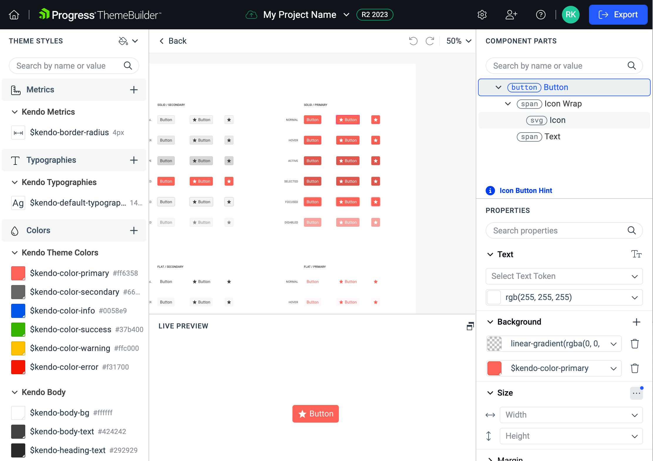
To enable the advanced functionality and to start editing the properties of the UI components, open your ThemeBuilder project and use the Advanced Edit button. This button enables you to drill down into the selected components and turns the components pane into an infinite canvas where you can inspect and edit all UI components and their variants.
Before proceeding with the advanced customization, use ThemeBuilder to build your own visual styles that you can granularly apply to the UI components in the advanced view.
General Guidelines
In the advanced view, the Telerik and Kendo UI components are organized in frames. Each frame holds the variants and states of one components, for example, the Button.
The frames in ThemeBuilder were created by following strict rules that save a considerable amount of time and that are advisable for you to follow:
From common to individual—Start with the most common form of the component, for example, the Button component in its
normalstate. Continue with the Button component with an added icon.From left to right—Start with a component on the left side of the frame. Then continue with the component on its right.
From top to bottom—Start with the component that is on the first row of the frame, then move to the second row, and so on.
These recommended rules will allow you to take advantage of the CSS inheritance ThemeBuilder uses. The inheritance is one-way. This means that if you change the normal state color of the Button, the change will propagate not only to all the states of the Button, but also to the UI components that are located in other frames which are below the frame with the buttons. If you change the hover state color of the Button, the change will propagate only to a few other Button forms in the hover state.

Editing the Component Properties
Plan the changes to the appearance of the UI components by considering the guidelines above. ThemeBuilder offers a complete set of property editors that allow you to change the CSS properties of the Telerik and Kendo UI components and customize them.
To edit the UI components properties:
Open an existing ThemeBuilder project and select Advanced Edit.
Select the frame with the desired UI component, zoom in, and then select the component.
In the COMPONENT PARTS pane, select the desired component part.
-
Use the Properties or Styles Editor to enter the desired values. The Styles Editor lets you edit the CSS directly, while the Properties let you define your styles in a user-friendly grid. When using the Properties view:
- To enter a value, expand the desired property, click the editor and type the desired value.
- If the property that you edit supports variables, you can select the desired variable from the combo box.
Some browsers (Firefox, for example) limit the clipboard permissions, and you cannot paste content that you copy from other browser tabs or windows. As a result, when you use such browsers, you can copy styles from ThemeBuilder and paste them there, but you cannot paste CSS copied from another browser tab or window.
If you set any non-default values through an editor, the editor will automatically expand when you select the modified UI component. You can use the Reset button of the editor to revoke these modifications.
Considerations
When working with the property editors in ThemeBuilder, keep the following in mind:
- The background color editor in the Properties pane supports solid colors and linear gradients. Conic and radial gradients are not supported.
- Deleting a value containing an image exported from Figma Plugin, for example,
url(my-figma-background.png), also deletes the image file. The operation is irreversible.