Using Custom Components
Custom components in ThemeBuilder allow you to enrich your set of UI components by adding new ones. These custom components are based on pure HTML and can be styled using the built-in features and capabilities of ThemeBuilder.
These characteristics define the custom components concept in ThemeBuilder:
- You can create custom components in all types of ThemeBuilder projects—projects created from scratch (blank) and projects starting from Telerik & Kendo UI themes.
- They consist of pure HTML code.
- Their HTML must have a single root element with a unique
classattribute. - They expose HTML elements for styling when you set a
classattribute to them.
Creating Custom Component
To create a custom component:
-
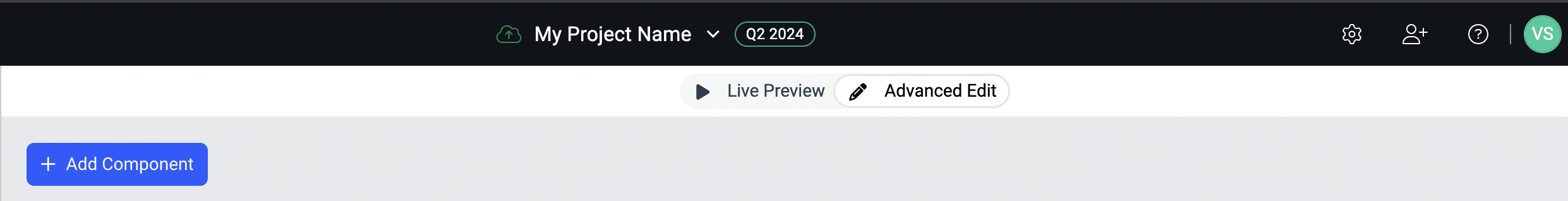
Open an existing ThemeBuilder project and click the + Add Component button.
If your project is based on a Telerik and Kendo UI theme, adding your first custom component creates a new My Components section. This section contains all custom components and the + Add Component button.
-
In the ADD COMPONENT popup:
- Enter a name for the new component, for example,
Login Form. -
Enter a category or choose an existing one from the categories list.
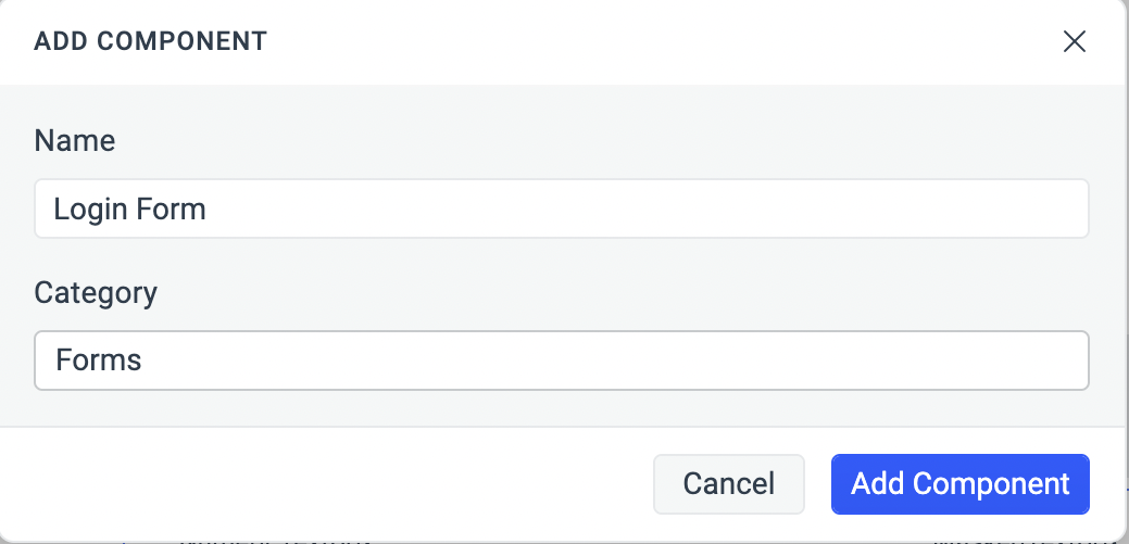
If you have a Telerik and Kendo UI Accelerator subscription, you'll see an additional button named Start From Building Block. This button allows you to select and customize a building block from the included presets.
- Enter a name for the new component, for example,
Select Add Component to add the new custom component.
Adding or Editing Custom Component HTML Content
To add initial or edit existing custom component HTML content:
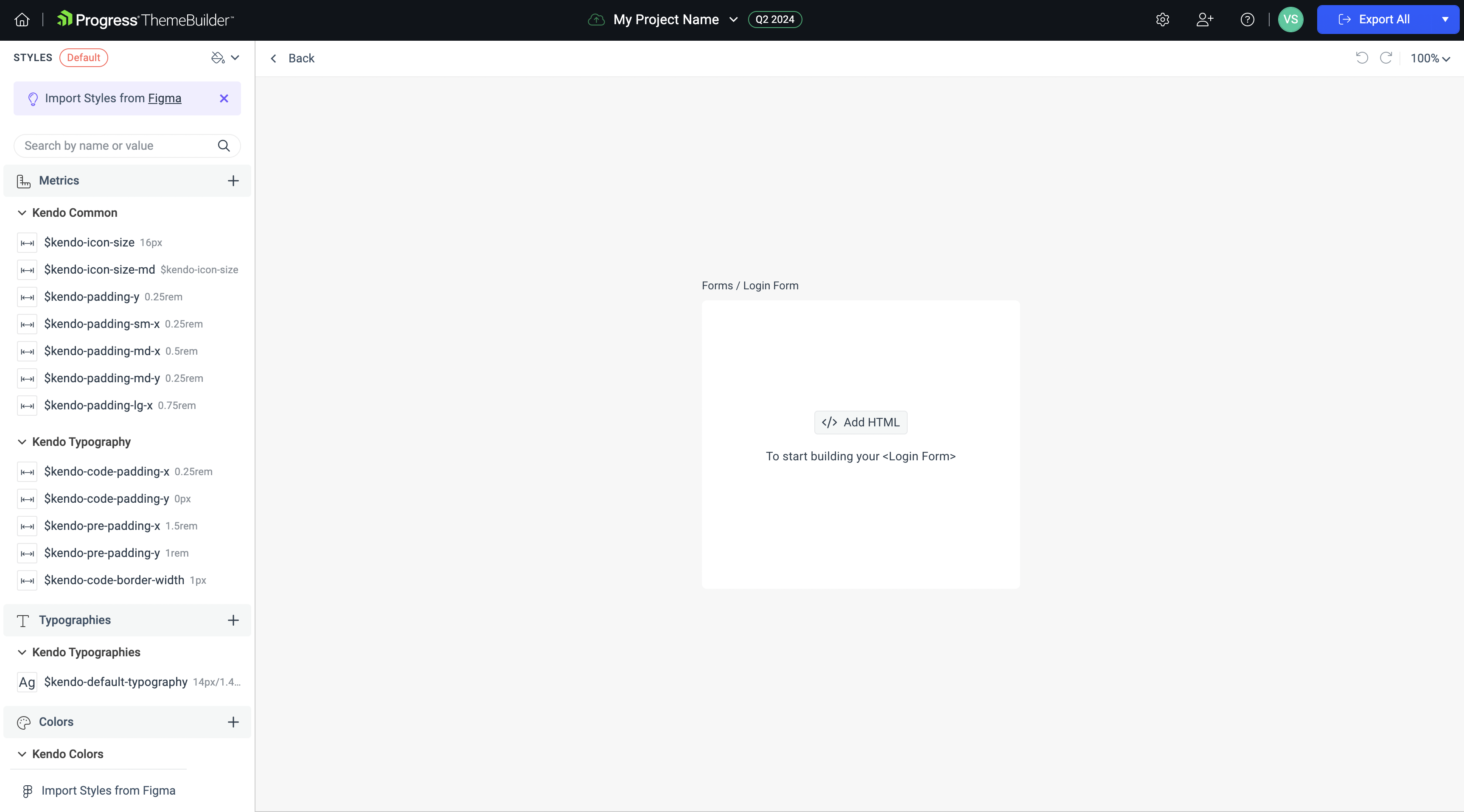
- With your custom component on the screen, select Advanced Edit.
- Drill-down to the desired custom component.
-
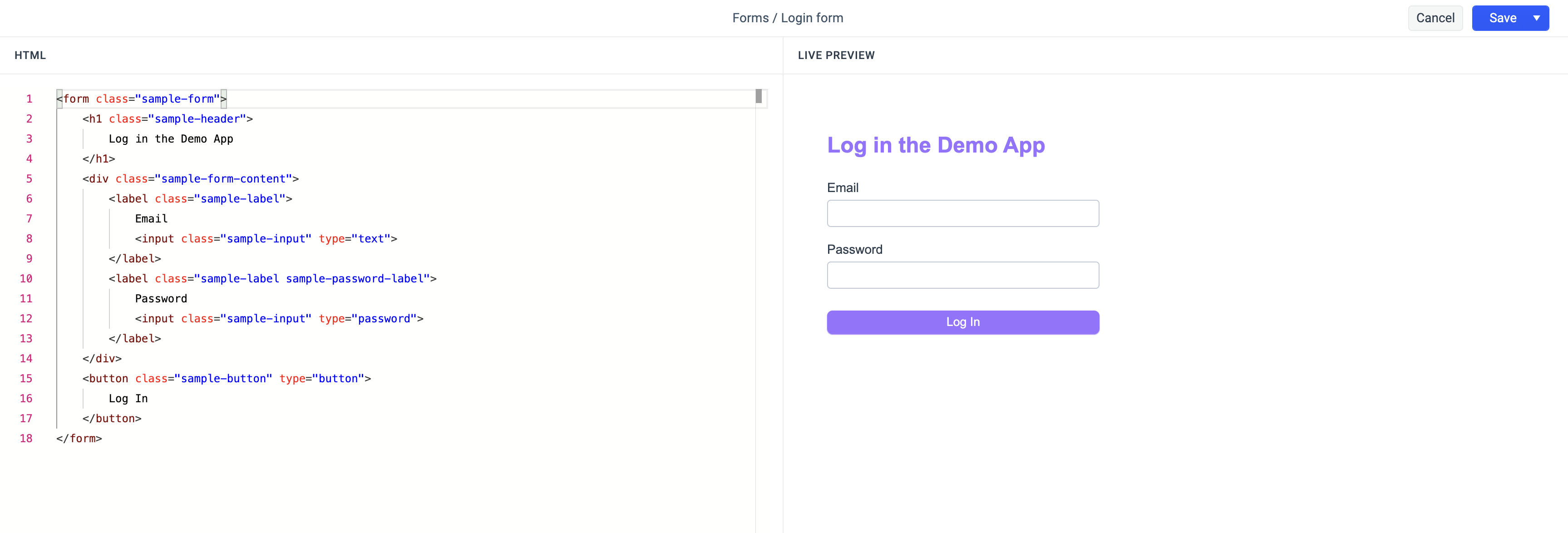
Open the Code Editor.
- If adding initial content to your custom component, select Add HTML.
- If updating HTML content in an existing custom component, Select Edit HTML.

- Type or paste the HTML content of the component.
> When editing custom component HTML, the
idattributes are used internally by ThemeBuilder. The exported custom components HTML will not include them. - Select Save or Save & Close once you are done with the changes.
Using the Code Editor
ThemeBuilder incorporates a code editor that allows you to easily manage the HTML content of your custom components. The editor consists of two main parts to ensure comprehensive and fast code input, validation, and preview.
- HTML code editor—the left pane is an HTML code editor. Use it to type (or paste existing) HTML code with intellisense and common development keyboard shortcuts. The editor validates periodically the HTML code input and guides you with the appropriate warnings or errors when needed by listing them at the bottom of the pane.
-
Code preview—the right pane is the code preview area. It gives you real time preview of the HTML code input with all the existing styles matching the HTML code classes already applied.
Manage Custom Components
To manage and organize custom components:
- With your custom components on the screen, select Advanced Edit.
- Hover over the drill-down container with the desired component and click the context menu button.
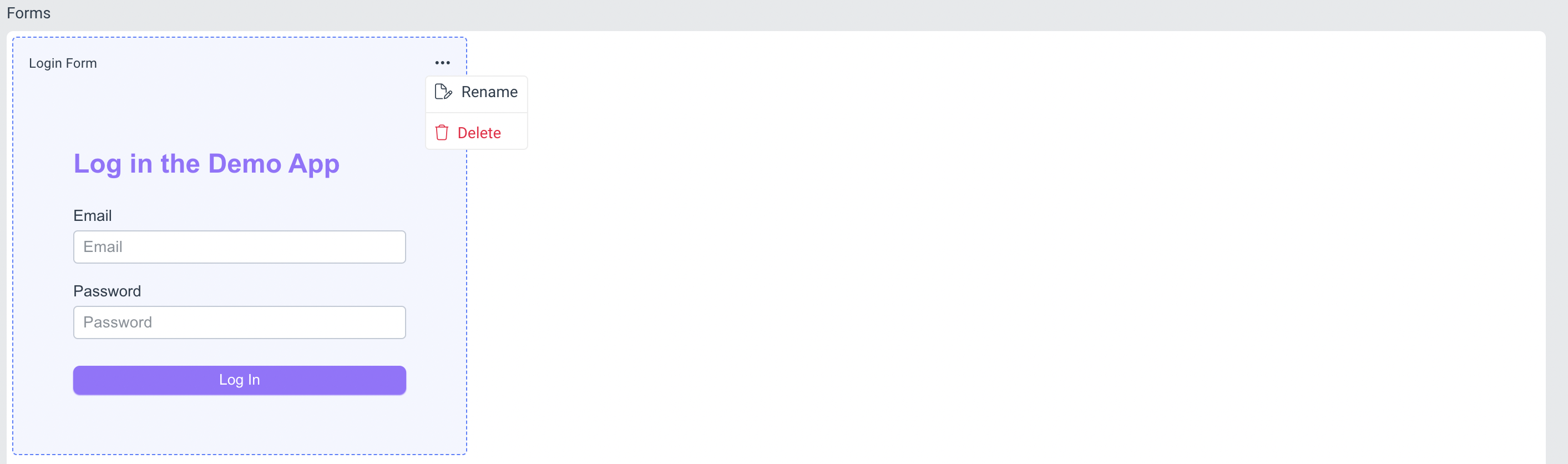
- Select the desired action:
- Click Rename to change the custom component name and/or category.
- Click Delete to delete it from your custom UI components set. > If the component is used in another one for the purpose of composition and reusability, the component cannot be deleted.
Rename Custom Component Parts
Each custom component element with a set class attribute is exposed for styling in ThemeBuilder. Initially, it appears in the components parts tree with a default name. To improve readability and management, you can change the default names to logically match the HTML elements.
- With your custom components on the screen, select Advanced Edit.
- Drill-down to the desired custom component.
- Select the part you want to rename in the components tree on the right side of the screen.
- Click the ... button to open the context menu.
- Select Rename.
-
Enter the new name of the component part and press
enter.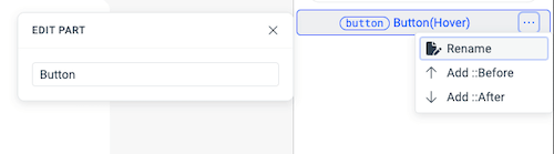
Custom Components Reusability & Composition
Modern UI frameworks rely on component composition to reuse existing components and build more complex ones quickly. ThemeBuilder also supports this concept.
To reuse already existing custom or Telerik and Kendo UI components:
- Create new or open existing custom component where you want to reuse other UI components.
- Select Add/Edit HTML.
- Place the cursor on the place in code where you want to insert another component.
-
In the Code Editor:
- Type
ct-to view a list of all existing custom components that can be inserted.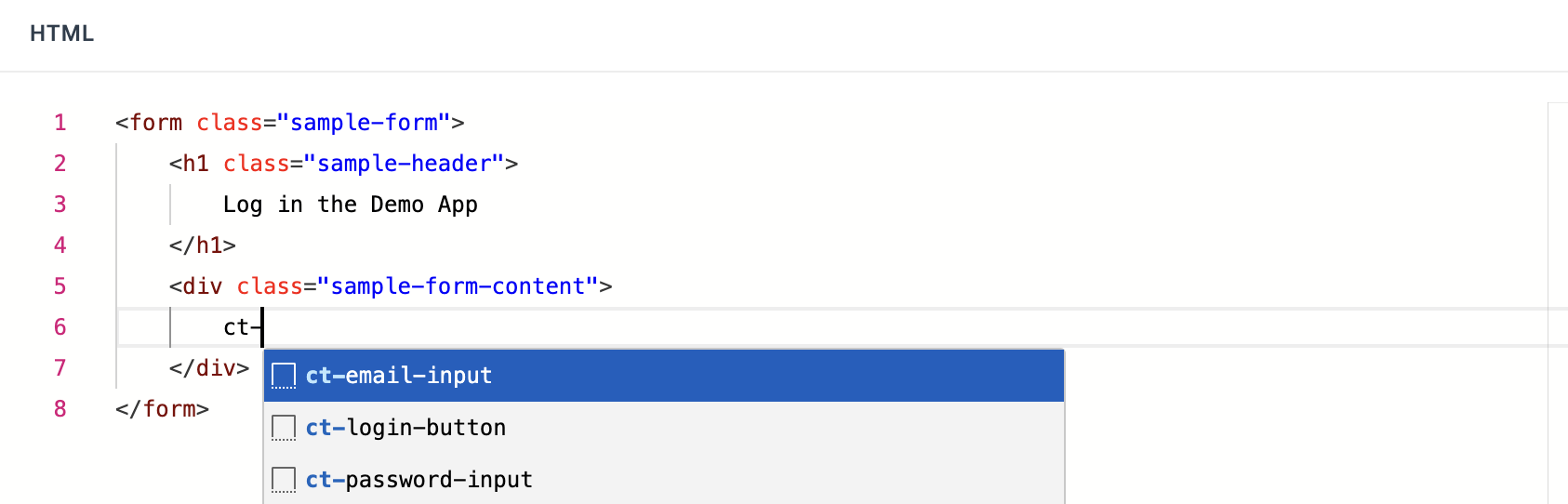
-
If your project is based on a Telerik and Kendo UI, type
kendo-to view a list of all Telerik and Kendo UI components that can be inserted.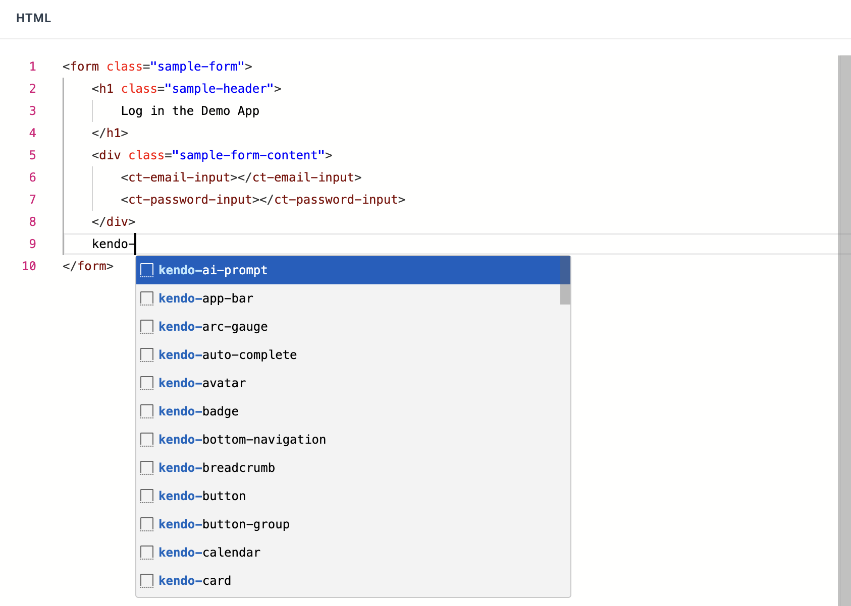
When your project contains Kendo component configurations, you can use them in your custom component HTML by typing
kendo-followed by the name of the configuration and its configuration options (border radius, fill mode, size, and theme color). For example, a specific configuration of the Large Primary Button applying large size solid primary button with medium rounded corners exists in the Telerik and Kendo UI list of reusable components askendo-large-primary-button-medium-solid-large-primary.
- Type
Select the component you want to insert from the list.
The HTML preview on the right shows the reused component with all its styles applied. When done altering the HTML, select Save & Close.
Styling Custom Components
Consider the following when styling a custom component:
- To style an HTML element of a custom component, the element must have a
classattribute with one or more classes set. - Styling custom components works in the same way as with the Telerik and Kendo UI components. For more details, see the Advanced Customization article.
- You can reuse classes from other custom components and all styles attached to them will be applied. For example, if you have a FromInput component with a
sample-form-inputclass, you can create a FormEmailInput component and apply this class to inherit all its styles. - To specifically style a component that reuses other component classes, set a component specific class to it. In the prior example, to specifically style the FormEmailInput component and inherit from FormInput, apply
sample-form-input sample-form-email-inputclasses to the FormEmailInput component.
Custom Components in the Exported Package
If you have custom components within your project, the exported ZIP package contains their HTML content and styles.
For example, the HTML content of the Login Form component mentioned earlier would be included in the <ZIP PACKAGE>/custom-components/login-form.html file. It would be structured as follows:
<form class="sample-form">
  <h1 class="sample-header">
    Log in to the Demo App
  </h1>
  <div class="sample-form-content">
    <!-- Use Email Input component here -->
    <!-- Use Password Input component here -->
  </div>
  <!-- Use Login Button component here -->
</form>
If your project is based on a Kendo UI theme and includes custom components that reuse existing Telerik and Kendo UI components (for example, the Login Form uses the Button component as the action button), these Telerik and Kendo UI components will be replaced with comments in the generated HTML file:
 <form class="sample-form">
  <h1 class="sample-header">
    Log in to the Demo App
  </h1>
  <div class="sample-form-content">
    <!-- Use Email Input component here -->
    <!-- Use Password Input component here -->
  </div>
  <!-- Use Telerik & Kendo UI Button component here -->
</form>
If you export custom components through the ThemeBuilder Figma plugin, and these custom components include images (either through the CSS property background-image or through an <img> tag), the utilized image files will be placed in the <ZIP PACKAGE>/images/ directory of the exported package.