ThemeBuilder Quick Tour
This article takes you through the various ThemeBuilder app screens and shows how to perform common operations.
ThemeBuilder Dashboard
The ThemeBuilder Dashboard allows you to create new projects and access all your existing projects. Once you create your first project, the Dashboard is the first screen that you will see after logging in.
ThemeBuilder Toolbar
The ThemeBuilder toolbar provides quick access to several commands. The toolbar is available only when you open an existing project or create a new one.
Toolbar Elements
The toolbar includes the following buttons and elements:
- Home—Go back to the ThemeBuilder dashboard.
- Document status—Indicates if all changes are saved.
- Project name and menu—The name of the opened project and a dropdown menu with the version of the Telerik and Kendo UI themes and several project operations: Share, Rename, Export Metadata, Import Metadata, and Delete.
- Active collaborators icons—These icons display the initials of other collaborators who currently work on this project.
- Project Settings—Manage project settings, such as asset types, dark theme settings, and custom fonts that you can use when customizing the components.
- Share—Share the project with others or remove someone from the access list.
- Help—Provides quick access to the documentation and allows you to enable the onboarding hints.
- Account—Shows the currently logged in user and the account settings.
- Export All—Export all CSS and SASS changes that have been applied to the components.
- Export Selected—Export the CSS and SASS changes only for the components that are visible on the components canvas.

Project Main Screen
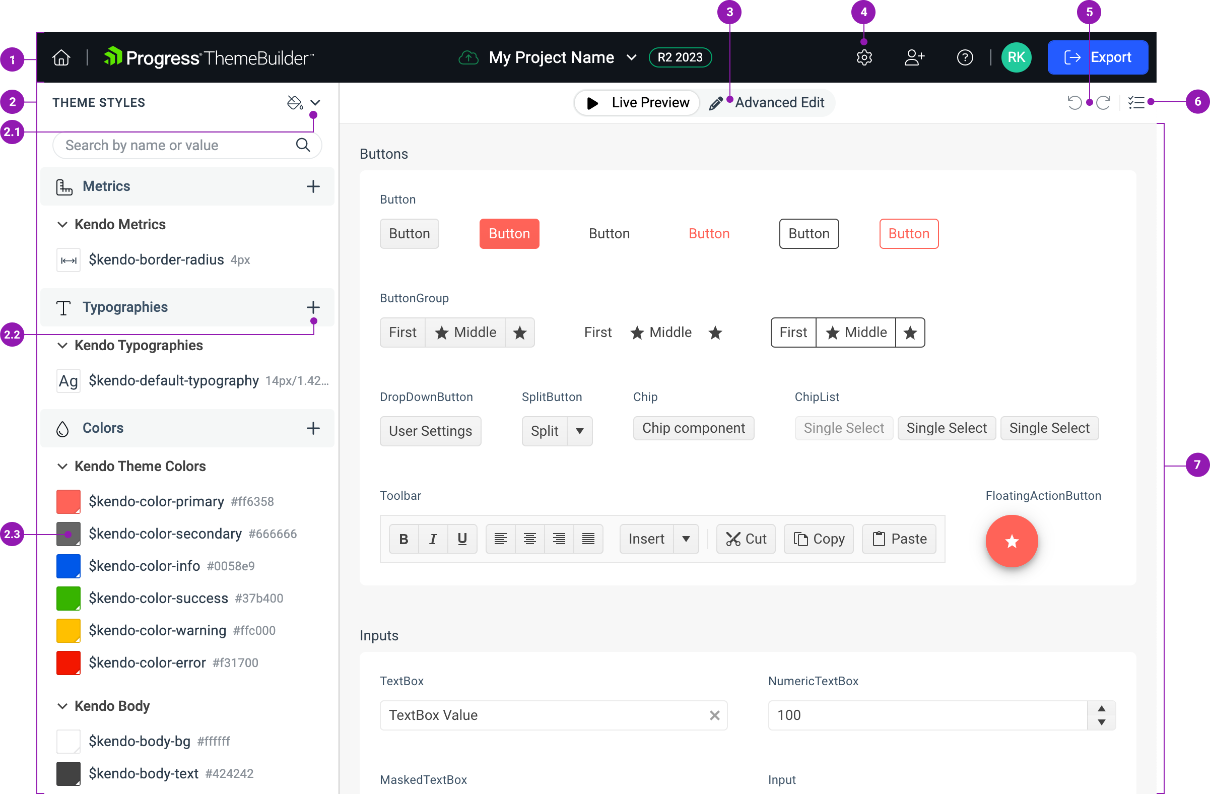
The Project Main Screen appears when you open an existing project or create a new one. This screen has several elements:
The ThemeBuilder toolbar.
-
The THEME STYLES pane—allows you to customize the visual theme by:
2.1. Selecting a color swatch.
2.2. Adding a new Sass or CSS variable.
2.3. Editing the values of the variables.
2.4. Using component-specific variables in the THEME STYLES pane in advanced customization mode.
The Advanced Edit switch—allows you to enable the advanced customization mode, which allows you to drill-down to specific components and style them individually. To use the advanced editing functionalities, you need a ThemeBuilder license.
Project settings button that opens the Project Settings dialog.
The Undo and Redo buttons.
The Select Components button—allows you reduce the number of UI components that are shown in the Live Preview pane.
The Live Preview—shows how the theme changes when you modify its variables.

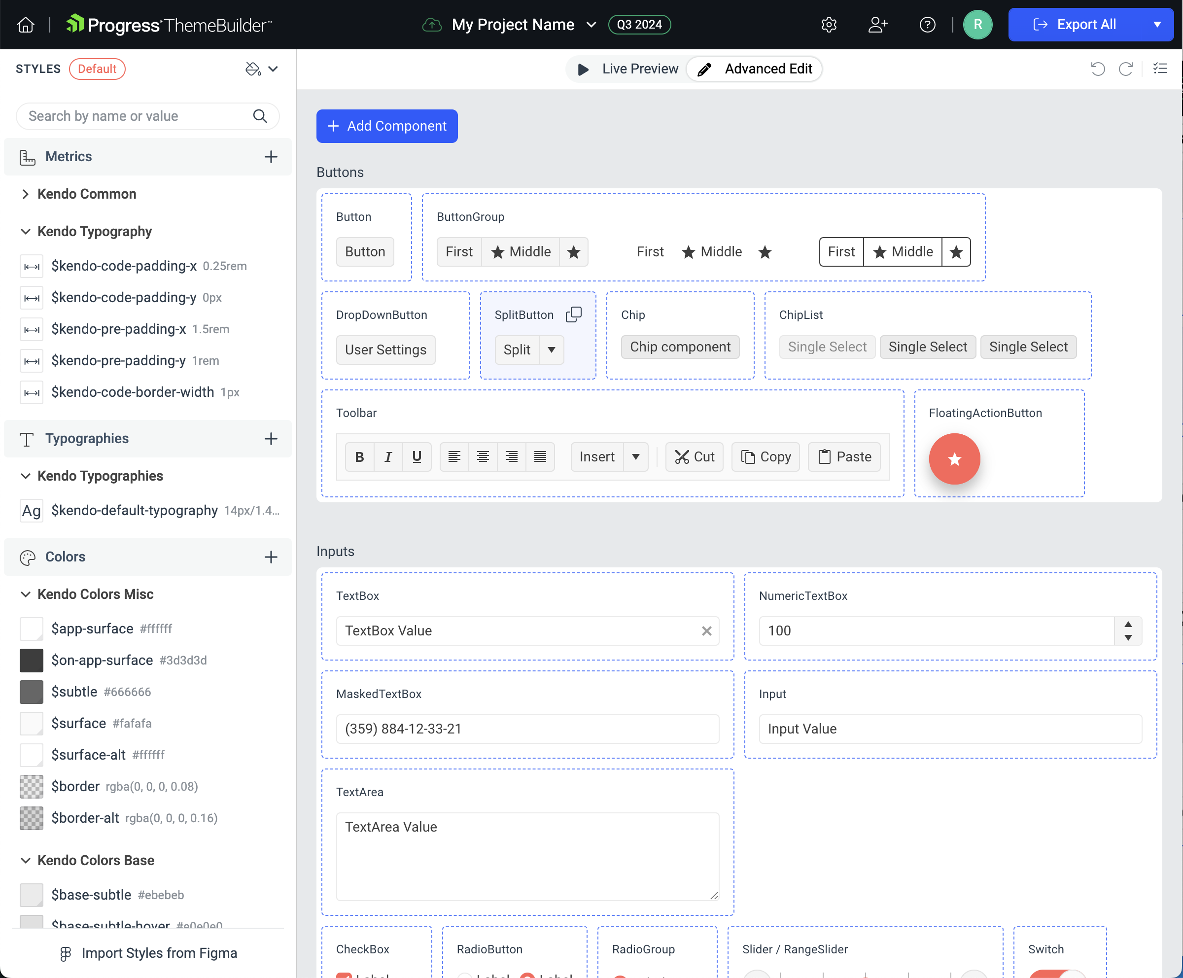
Advanced Edit View
In the Advanced Edit view, you can select individual components—this opens the Component Canvas and allows you to drill-down to the component states level where you can start applying advanced customization.

Component Canvas
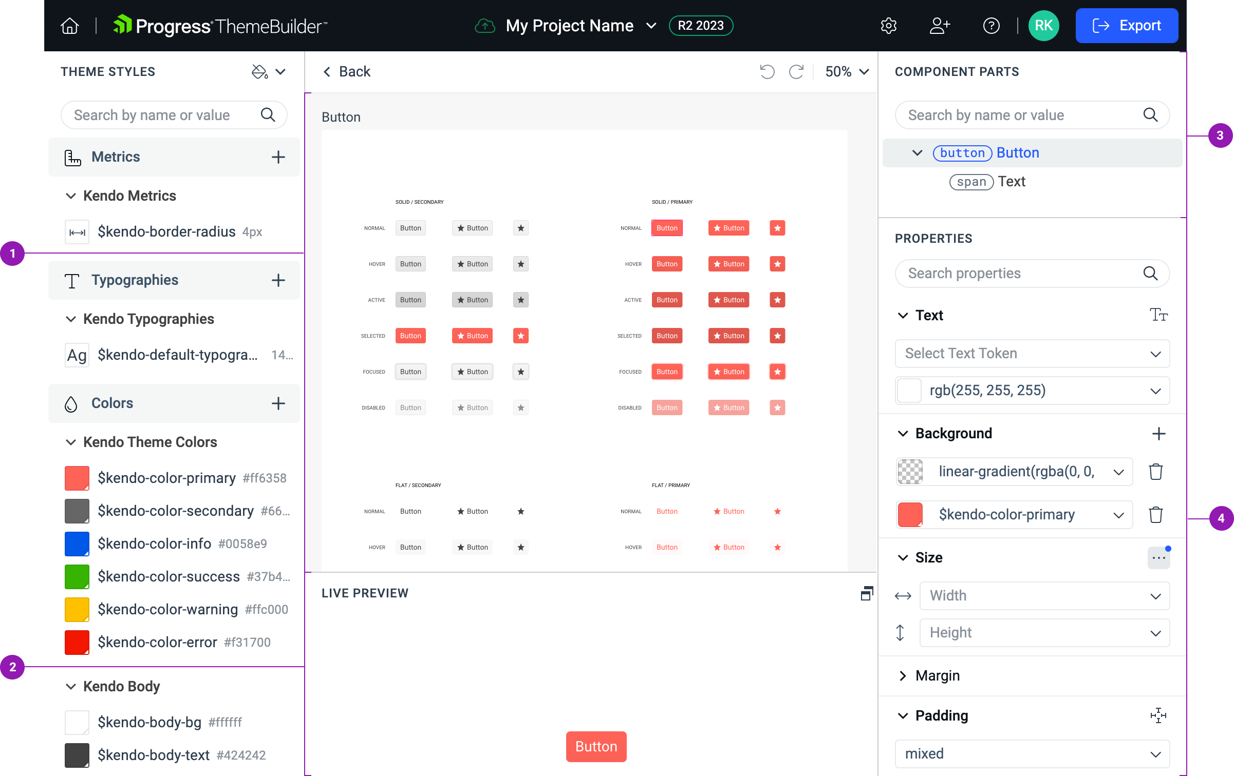
Each UI component has a dedicated component canvas, which shows all states of the selected component. Once you drill-down to the component states level, ThemeBuilder reveals the following elements:
The Component Canvas—displays all component states.
The component-level LIVE PREVIEW pane—renders a preview for each component state that you select on the canvas.
The COMPONENT PARTS tree—shows the parts of the component that you have selected on the canvas.
The PROPERTIES pane—displays the property editors for the component part that you selected in the COMPONENT PARTS tree.
