Exploring the Component Properties
The Properties view in ThemeBuilder allows you to speed up the styling process by applying the customizations you need through its user-friendly interface.
Choosing the Right Styles Editor
ThemeBuilder lets you apply styles to the components in two ways:
- By using the Styles Editor.
- By using the Properties view.
Choosing between the Properties view and the Styles Editor depends on your preferences and CSS knowledge. The Properties view is visually oriented and lets you style the components without needing any CSS knowledge. The Styles Editor on the other hand requires CSS knowledge.
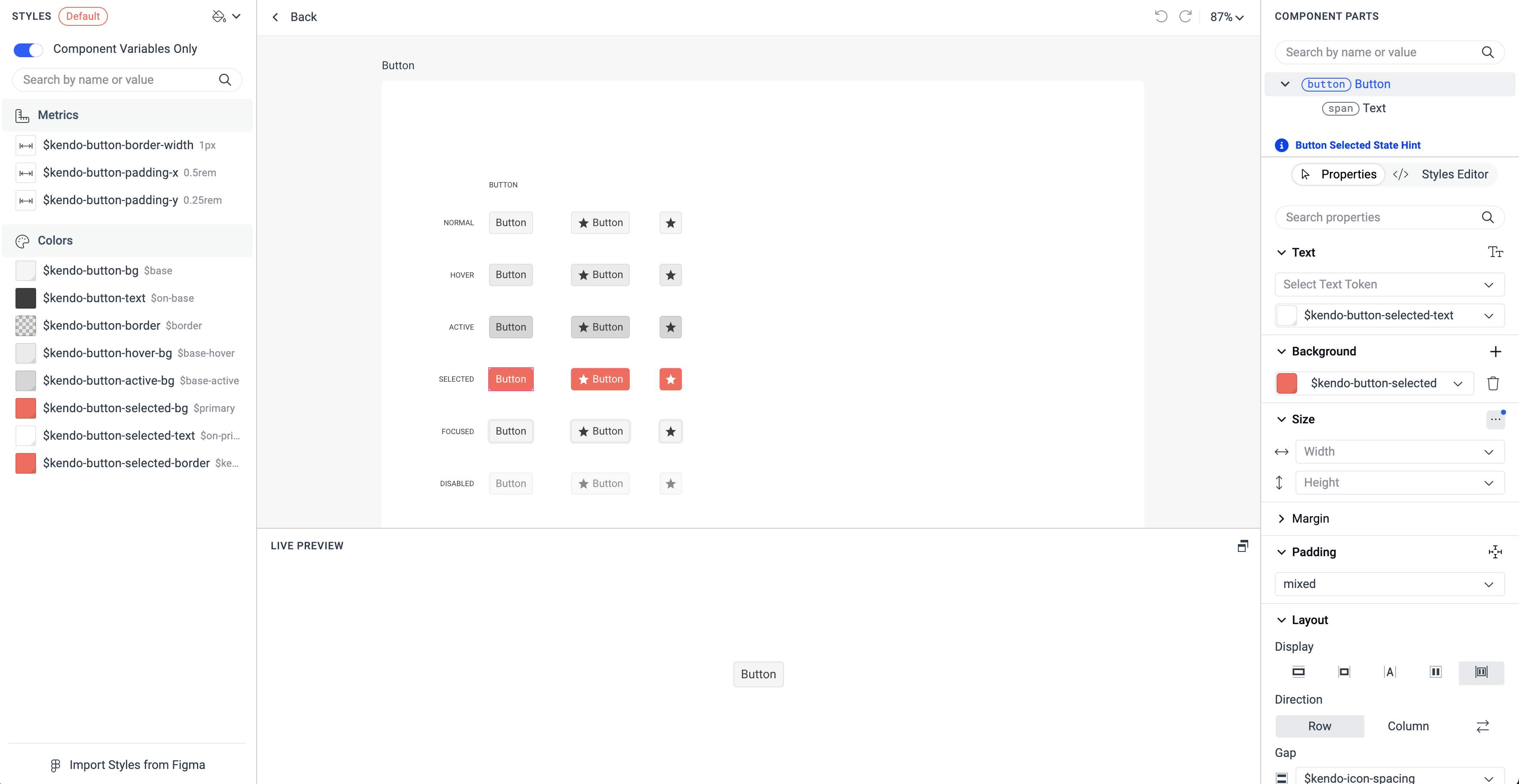
Accessing the Properties View
The Properties view consists of multiple mini editors to control the different styling settings of the components. To access these properties:
Open an existing ThemeBuilder project and select Advanced Edit.
Select the frame with the desired UI component, zoom in, and then select the component.
In the COMPONENT PARTS pane, select the desired component part.
The available editors in the Properties view are:
- Text Editor
- Background Editor
- Size Editor
- Margin and Padding Editors
- Layout and Position Editors
- Border Editor
- Border Radius Editor
- Outline Editor
- Effects Editor
- Opacity & Visibility Editor
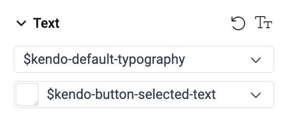
Text Editor
The Text editor in the Properties view allows you to apply typography settings to the component part. By default, there are two input fields:
- The upper input expects a token from the Typographies category, which controls text settings such as font weight, font size, and more.
- The lower input expects either a token or a direct value for the text color. Currently, ThemeBuilder supports keywords, HEX, and RGB values, as well as linear gradients.
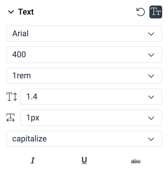
Additionally, instead of using a single token, you can control the values for the typography settings separately. To do this, click the Set Local Text Properties button in the top-right corner of the Text editor.
This enables additional options for styling the text. From there, you can set:
Font family name, such as
Arial. If you have uploaded custom fonts, they will be listed as options you can choose from.Font weight using keywords like
thin,normal,bold, and others, or numeric values.Font size, for example,
1rem.Line height for the text, for example,
1.4.Letter spacing, for example,
1px.Text transform option, such as
capitalize,uppercase, orlowercase.Font style/text decoration options, such as
italic,underline, orline-through. You can set multiple such options at once.
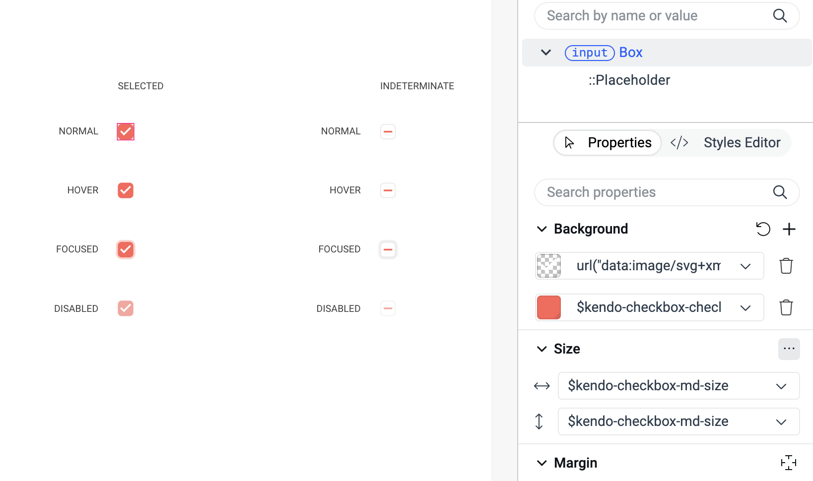
Background Editor
The Background editor enables you to add backgrounds to selected component parts. You can either use Data URLs to embed SVGs and images or specify color values. Additionally, you can combine multiple backgrounds. For example, you can layer several backgrounds with opacities ranging from 0 to 1, allowing them to blend together. Another option is to mix a color background with an SVG from a Data URL.
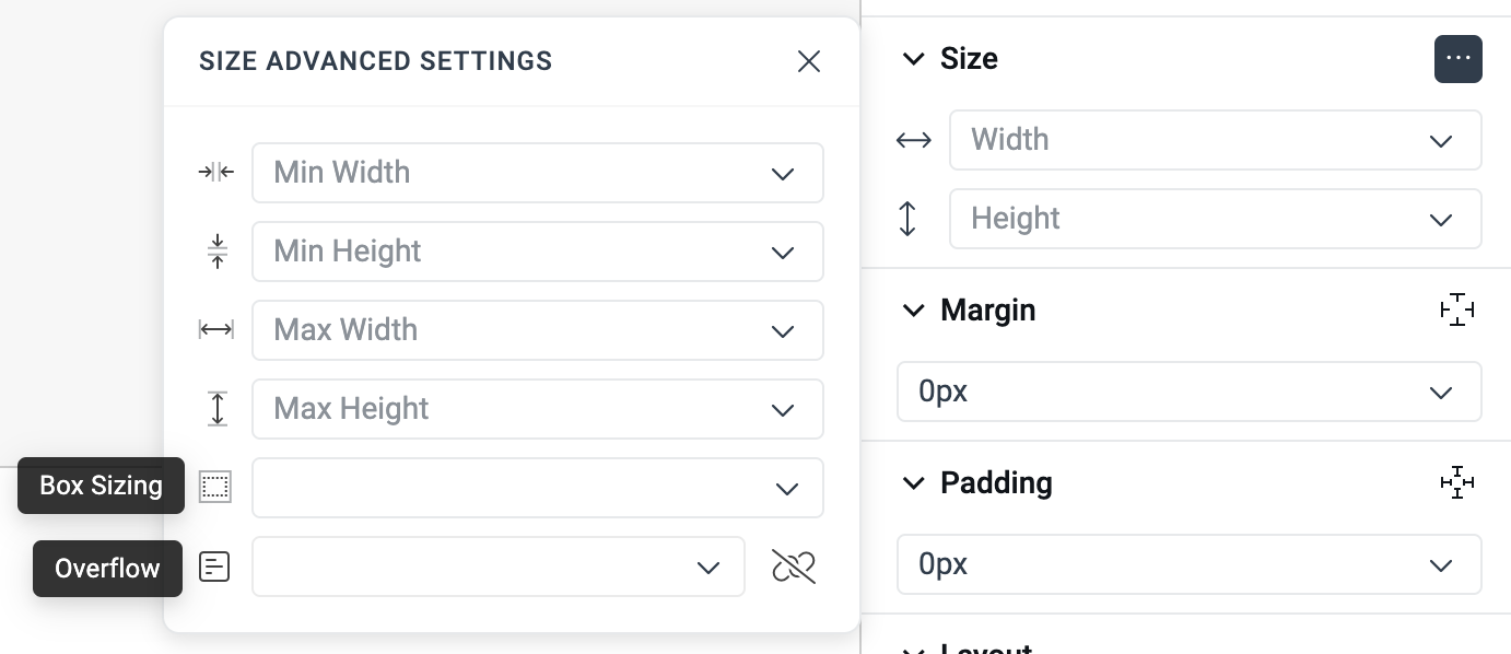
Size Editor
The Size editor allows you to adjust the width and height of the selected component part. Additionally, you can access the advanced settings for further size customizations by clicking ... on the left side of the editor. In the advanced settings, you can modify the minimum and maximum values for both the width and height. You can also adjust the following options:
-
Box Sizing—This determines how the width and height of the element are calculated. The possible values include:
content-box—The specified width and height only style the content of the element, excluding any paddings and borders.border-box—The specified width and height include paddings, borders, and the content itself. For example, if an element has a width of 300 px with 20 px padding and a 5 px border, the content size will be calculated as follows:300px (width) - 20px (left padding) - 20px (right padding) - 5px (left border) - 5px (right border) = 250px. This enables a more intuitive way of sizing elements, as you can focus on the total size rather than the individual components.
-
Overflow—This controls how content that exceeds the element's boundaries is handled. This situation often arises in components like Grids, where you need to display many records that may not fit within the initial size of the element. Use the button with the link icon in the bottom-right corner of the menu to adjust the overflow options for both the X and Y axes separately. The supported options are:
visible—Content that exceeds the boundaries is not handled at all.auto/scroll—Content that exceeds the boundaries is managed by adding a scrollbar. The difference between these two is thatautoadds a scrollbar only when there is overflowing content, whereasscrollshows it by default regardless of whether the content exceeds the boundaries.hidden/clip—This makes the exceeding content invisible. The difference here is thathiddenmakes the element a scroll container, andclipdoes not. Depending on whether an element is a scroll container or not, some CSS declarations behave differently.
Margin and Padding Editors
The Margin editor and the Padding editor enable you to adjust the size of the margins and the paddings of the selected component part. You can set values for all four sides simultaneously, or you can specify different values for each side by using the Separate Margins and Separate Paddings buttons located in the top-right corner of the editor.
Layout and Position Editors
The Layout editor gives you control over whether an element is treated as a block or inline element, as well as how its children should be arranged. The Position editor allows you to determine the positioning of an element on the page and manage its z-index. To use these editors effectively and achieve the desired results, a basic understanding of CSS is necessary. For more information, refer to the MDN documentation on the CSS properties display, position, and z-index.
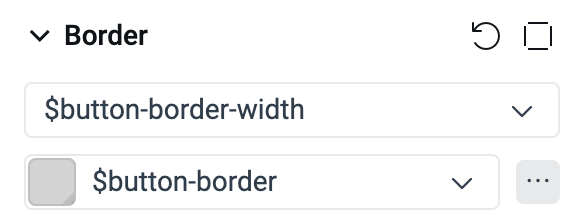
Border Editor
The Border editor allows you to set a border for the selected component part. It includes two input fields:
- The upper input controls the width of the border and requires a metric value.
- The lower input controls the color of the border and requires a color value.
You can also customize the style of the border. To view the available options, click the ... button located in the bottom-right corner of the editor.
Additionally, you can style each of the four sides of the border independently by using the Separate Borders button in the top-right corner of the editor.
Border Radius Editor
The Border Radius editor allows you to customize the rounding of the corners for the selected component part. Like other editors, you can apply styles to all four corners at once or adjust them individually. To modify the rounding for each corner separately, click the Separate Border Radius button in the top-right corner of the editor.
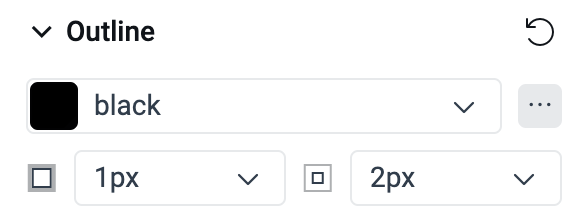
Outline Editor
The Outline editor enables you to set an outline for the component part. You can control the following aspects:
- The outline color.
- The style of the outline. To view the available options, click the ... button.
- The outline width.
- The outline offset—defines the space between the outline and the edge of the element.
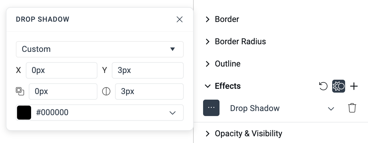
Effects Editor
The Effects editor enables you to add various effects to the selected component part. You can apply multiple effects to a single component by using the + button located in the top-right corner of the editor. You can either select a token from the Effects category or configure the effect's properties individually by accessing the advanced settings. To access the advanced settings, click the Set Local Effects Properties button in the top-right corner of the editor.
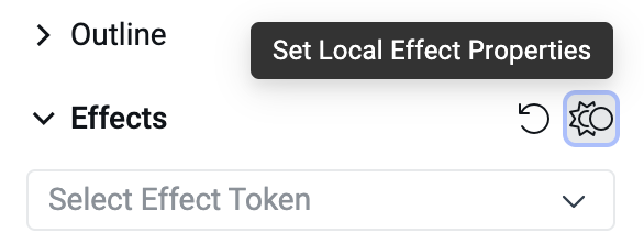
Currently, ThemeBuilder supports two types of effects:
-
Shadows (Drop Shadow and Inner Shadow)—The drop shadow applies the shadow behind the element, while the inner shadow applies it inside the element. The advanced settings for shadow effects include the following inputs:
- Horizontal offset of the shadow.
- Vertical offset of the shadow.
- Spread radius of the shadow—A higher metric value results in a larger shadow.
- Blur radius of the shadow—A higher metric value increases the blur effect.
- Shadow color.
- Blur Effects (Layout Blur and Background Blur)—The layout blur effect applies to the content of the element, whereas the background blur effect applies to the area behind the element if it is fully or partially transparent. The advanced settings for blur effects consist of a single input for controlling the blur radius, where a higher matric value results in a stronger blur effect.
Opacity & Visibility Editor
The Opacity & Visibility editor enables you to adjust how an element is displayed on the screen. To completely hide a component part from a view, click the Visibility button located in the bottom-right corner of the editor. To make the component part semi-transparent, enter an opacity value between 0 (completely transparent) and 1 (fully opaque) in the input field.