How to Manage Color Palettes
Having well-defined color palettes that include reusable colors is an invaluable asset when it comes to styling applications. This approach not only helps developers and designers maintain consistency across the application but also significantly reduces the time spent on creating new variables when a color is needed. By establishing a cohesive set of colors, teams ensure that their applications have a unified look, which ultimately enhances the user experience.
In this tutorial, you will learn how to create color palettes with reusable colors in ThemeBuilder and reap all the benefits they bring.
Creating Color Palettes
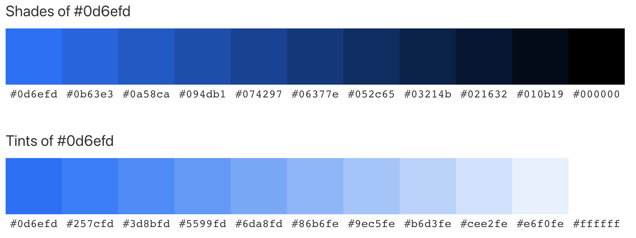
To create color palettes in ThemeBuilder, you need a predefined set of colors that you can reuse. For this purpose, you can use a third-party tool, like Color Hex, to generate these colors for you.
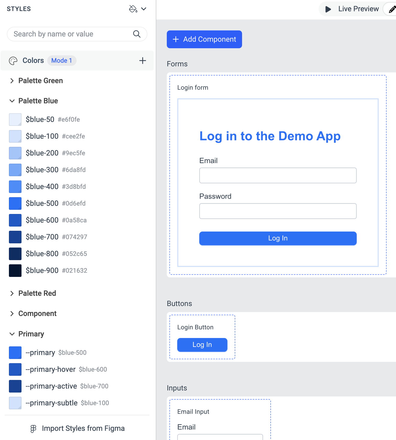
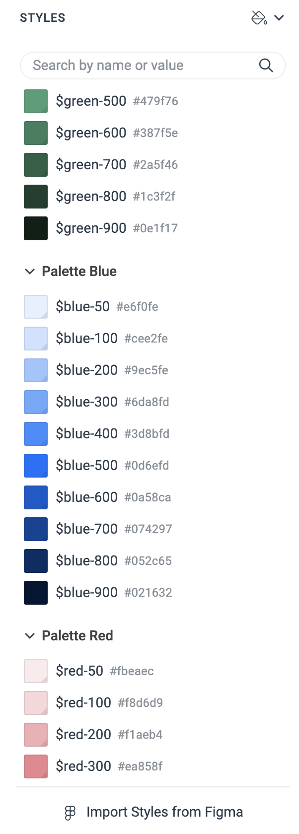
To create a color palette in ThemeBuilder, you can utilize its color variables. To keep these color variables organized, put them in separate categories, for example, Palette Blue, Palette Green, and others.
When it comes to naming your color variables, one effective convention is to use names like blue-50, blue-100, and so on. In this system, blue-50 represents the lightest shade, and the colors become progressively darker as the numbers increase. Maintaining consistent naming conventions is essential to keep your variables organized. This allows you to select the appropriate color by adjusting the lightness number without referencing the entire set each time you need to use a color.
To create a color palette:
-
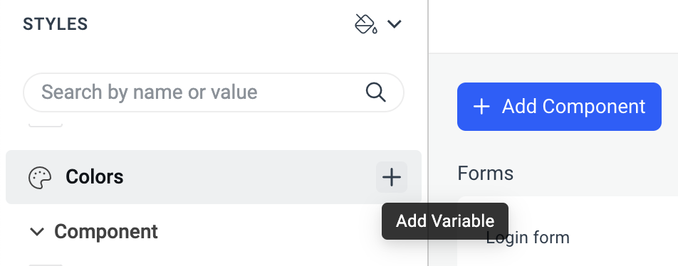
Go to the STYLES pane and click the + button right next to the Colors category.
-
In the ADD COLOR popup:
Enter a category name, for example,
Palette Blue.Enter a variable name, for example,
blue-50.Enter the value for the variable.
Repeat this process until you add all the variables for the palettes.
Using Color Palettes
To effectively use the variables from the color palettes, a good practice is to apply them to other color variables. For instance, consider a variable named primary that represents your main accent color, which you plan to use on elements like action buttons. You might assign it the value of a variable called blue-500.
When you need to create variations of this variable for different purposes, you can follow a consistent naming convention for the color variables. For example, if you need a primary-hover variable to style the hover state of these components, you would typically use a slightly darker shade of the base color. In this case, you could use a palette variable such as blue-600.
Additionally, if you require a primary-subtle variable to style a more understated version, you would use a lighter shade. For this, a palette variable like blue-100 would be appropriate. This approach maintains consistency and clarity in your color variables.