Managing States for Custom Components
ThemeBuilder provides a convenient means for adding and managing component state styles for your custom components. This allows you to add various styles that will be applied in response to user interactions like hovering over or focusing a button.
Adding states dynamically is currently supported only for custom components.
Adding or Removing States
ith your custom component on the screen, select Advanced Edit.
Drill-down to the desired custom component (for example, Login Button).
-
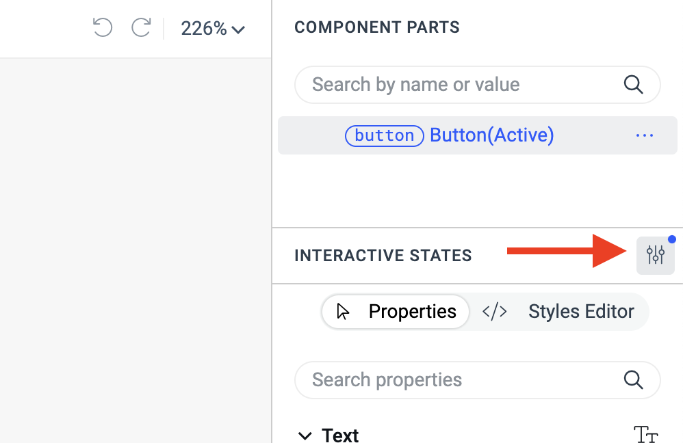
Click the Advanced Editing button in the INTERACTIVE STATES section on the right.
-
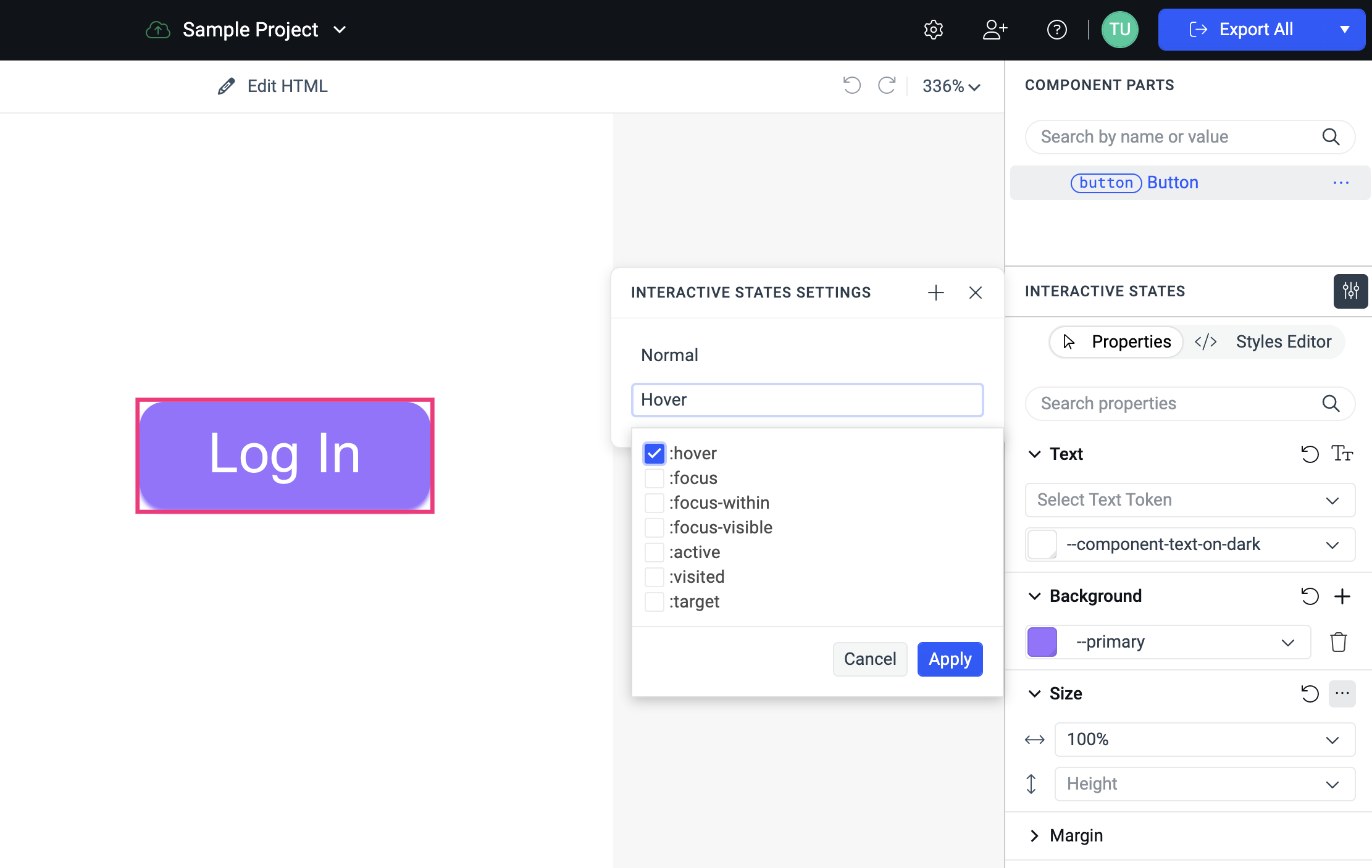
In the INTERACTIVE STATES SETTINGS popup, click the + button to add new states.
-
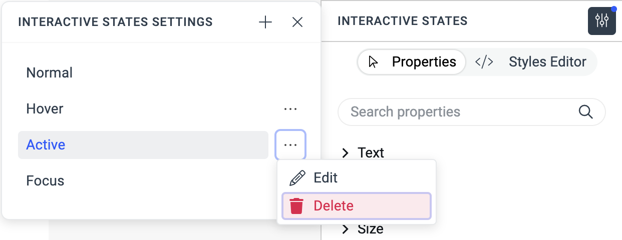
To delete or edit an already added state, click its context menu button and select the desired action.
Applying Styles to a State
Once you add the desired states to your custom component, you are ready to create their corresponding styles:
-
Click the Advanced Editing button in the INTERACTIVE STATES section on the right.
-
Put the component in the state that you want to edit by selecting the desired state in the INTERACTIVE STATES SETTINGS popup. Note that the COMPONENT PARTS tree displays the currently selected state in brackets, for example, Button(Active).
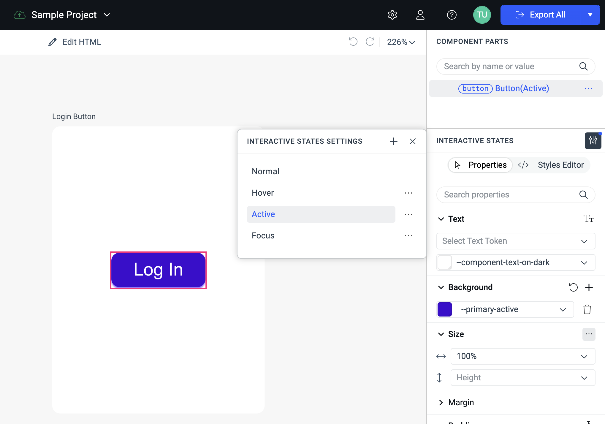
Edit the properties in the pane on the right. All displayed properties are applied to the currently selected state, for example, the active state.