Creating and Customizing Scatter Charts
A Scatter (Point) chart shows correlations between two sets of values, enables users to observe the dependence of one value to another, and is often used for scientific data modeling.
Scatter charts are typically not used with time-dependent data where a Line chart is more suited. A common usage of the Scatter chart is to compare aggregated data across categories.
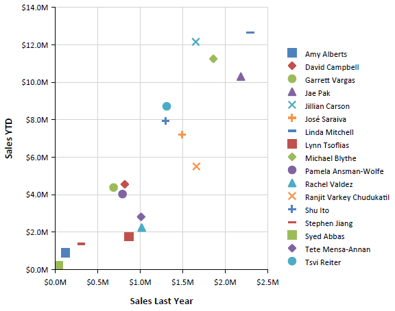
Scatter charts are different from other chart types because, instead of using the category values as X-values, they have explicit X-values for the data points. Consequently, the data can be grouped and aggregated into a different category than the value that is shown on the X-axis. For example, to show last year's sales for individual salespersons along the X-axis, you will not aggregate Y-values if two salespersons have identical X-values.
The following image illustrates a Scatter chart:
Types
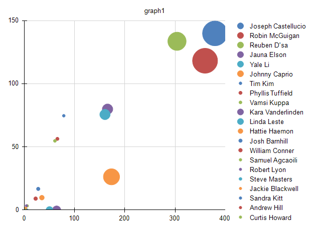
Bubble charts are a variation of the Scatter charts in which the data points are replaced with bubbles. This chart type displays the differences between data points based on the size of the bubble. The larger the bubble is, the larger the difference between the two data points is.
The following Bubble chart sample report has a category set to a sales person so that it aggregates sales data per sales person. However, the value of last year's sales is shown on the X-axis.
Creating Bubble with the Bubble Chart Wizard
In this section, you will learn how to create a Bubble chart with our Bubble Chart Wizard. The Bubble Chart is a variation of the more general Scatter Chart and its wizard is under the Scatter Chart menu item. Our Bubble Chart will display the decrease in the sales from 2003 to 2004 in Toronto for the employees from the region.
The sample report will use a pre-defined SqlDataSource that connects to the example AdventureWorks database. The query that returns the needed fields is the following:
SELECT
    [Person].[Contact].[FirstName] + ' ' + [Person].[Contact].[LastName] AS 'SalesPersonName',
    [Sales].[SalesOrderHeader].[OrderDate],
    [Sales].[SalesOrderHeader].[SubTotal]
FROM
    [Person].[Address] INNER JOIN
    [Sales].[SalesOrderHeader] ON [Person].[Address].[AddressID] = [Sales].[SalesOrderHeader].[BillToAddressID] AND
        [Person].[Address].[AddressID] = [Sales].[SalesOrderHeader].[ShipToAddressID] INNER JOIN
    [Person].[Contact] ON [Sales].[SalesOrderHeader].[ContactID] = [Person].[Contact].[ContactID]
WHERE
    YEAR([Sales].[SalesOrderHeader].[OrderDate]) IN (2003, 2004) AND
    [Person].[Address].[City] = 'Toronto'
To create the Scatter chart by using the Scatter Chart Wizard:
-
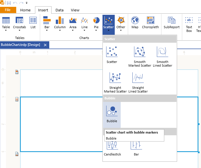
Add Bubble Chart as shown in the image below:
-
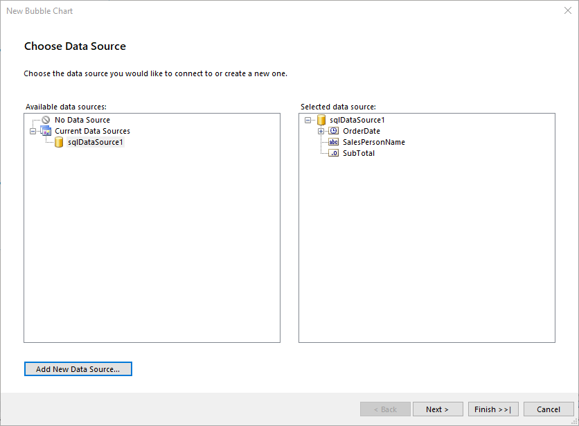
Select the SqlDataSource, or create it with the Add New Data Source... button and by using the query above:
-
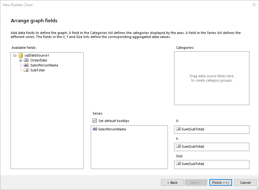
Arrange the Bubble Chart:
- Drag the SalesPersonName field to Series.
- Leave Categories empty.
- Drag the SubTotal field to X. The wizard will automatically apply the
Sumaggregate function - Drag the SubTotal field to Y.
- Drag the SubTotal field to Size.
-
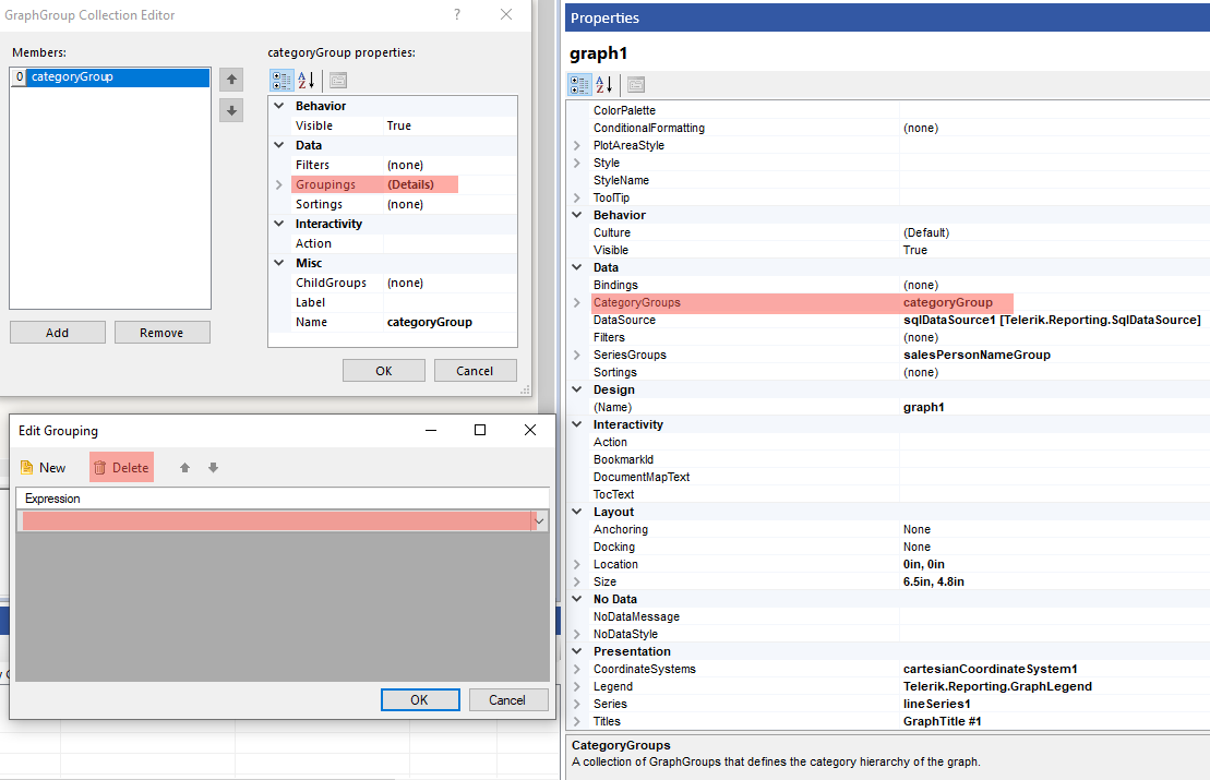
In the Graph properties, select the CategoryGroups and if the Groupings property is different from Static, click the ellipses (...) beside the property and delete the group as shown in the image below:
-
You need to modify
X,Y, andSizewith the values they need to display for the purposes of this sample report.Select the LineSeries and change the properties as specified below:
-
X:=Sum(IIF(Fields.OrderDate.Year=2003, Fields.SubTotal, 0))/1000.0 -
Y:=Sum(IIF(Fields.OrderDate.Year=2004, Fields.SubTotal, 0))/1000.0 -
Size:=Sum(IIF(Fields.OrderDate.Year=2003, Fields.SubTotal, 0)) - Sum(IIF(Fields.OrderDate.Year=2004, Fields.SubTotal, 0))
Note that since the SubTotal value is large, you need to configure the Graph to display it in thousands.
-
To see the full implementation of the sample report, refer to the BubbleChart.trdp project on GitHub.
Creating Bubble Scatter Charts Manually
This section will show how to manually create a Bubble chart.
1. Add the Graph
To add a new Graph report item to the report, refer to the article on getting started with the Graph report item.
2. Set the SeriesGroups Hierarchy
Now you can set the SeriesGropus hierarchy of the Bubble chart:
- Open the SeriesGroups collection editor and click Add.
- Set the Groupings to
=Fields.SalesPersonName. - Set the Sortings to
=Sum(Fields.SubTotal)withDescorder. - Set the Name to
seriesGroup1.
3. Set the CategoryGroups Hierarchy
Next, you will have to define the CategoryGroups hierarchy of the Bubble chart:
- Open the CategoryGroups collection editor and click Add. By default, this will add a new static group (group without grouping).
- Set the Name to
categoryGroup1.
4. Configure the Coordinate System
Here you will specify the coordinate system details:
- Open the CoordinateSystems collection editor and Add a new CartesianCoordinateSystem.
- Leave the Name to
cartesianCoordinateSystem1. - Set the XAxis to New Axis with Numerical Scale.
- Set the YAxis to New Axis with Numerical Scale.
5. Configure the Series
In this step, you will configure the series of the chart:
- Open the
Seriescollection editor and Add newLineSeries. - Set the
CategoryGroupto categoryGroup1. - Set the
SeriesGroupto seriesGroup1. - Set the
CoordinateSystemto cartesianCoordinateSystem1. - Set the
Xvalue to=Sum(IIF(Fields.OrderDate.Year=2003, Fields.SubTotal, 0))/1000.0. - Set the
Yvalue to=Sum(IIF(Fields.OrderDate.Year=2004, Fields.SubTotal, 0))/1000.0. - Set the
Sizeexpression to=Sum(IIF(Fields.OrderDate.Year=2003, Fields.SubTotal, 0)) - Sum(IIF(Fields.OrderDate.Year=2004, Fields.SubTotal, 0)). - Set the
LineStyle.VisibletoFalse. - Set the
DataPointStyle.VisibletoTrue. - Set the
MarkerTypetoCircle.
6. Style the Appearance
To set the color palette, format the labels, define the values of the legend, and elaborate on any other styling options, refer to the section on formatting the Graph.
Design Considerations
- Scatter charts usually display and compare numeric values, such as scientific, statistical, and engineering data.
- A typical usage of the Scatter chart is when you want to compare large numbers of data points not related to time. The more data you include in a scatter chart, the better the comparisons that you can make.
- The bubble chart requires an additional value per data point, the Size of the bubble.
- Scatter charts are most suitable for handling the distribution of values and clusters of data points. This is the best chart type if your dataset contains many points, for example, several thousand points. Displaying multiple series on a Point chart is visually distracting, and you have to avoid it and consider using a Line chart.