Creating and Customizing Bar Charts
A Bar chart displays data series as sets of horizontal bars, graphically summarizes and renders data categories, and enables users to easily compare amounts or values between different categories.
Bar charts are also useful for comparing multiple series of data because they provide snapshots of data at specific times, and are popular for representing data that occurs over time, with a finite start and end date. Bar charts are also used to show categorical information because you can display the categories horizontally.
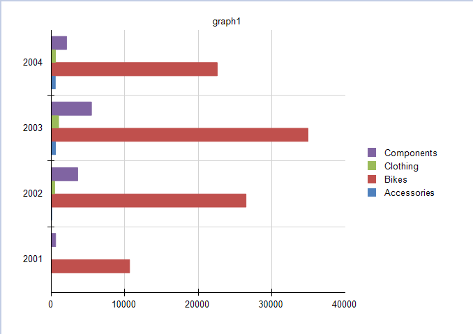
The following image shows a typical Bar chart which is well suited for the visualized data because all four series share a common time period and allow for valid comparisons.

Types
The Graph supports the following Bar chart types:
- Clustered Bar Charts—A Bar chart for displaying series as sets of horizontal bars.
- Stacked Bar Charts—A Bar chart where multiple series are stacked vertically. Stacked Bar charts compare contributions of values to a total across categories. If there is only one series in your chart, the Stacked Bar chart will display in the same way as a Bar chart.
- 100% Stacked Bar Charts—A Bar chart where multiple series are stacked vertically to fit 100% of the chart area. 100% Stacked Bar Charts are used for three or more data series when you want to compare distributions within categories and at the same time display the differences between categories. Each bar represents 100% of the amounts for that category. If there is only one series in your chart, all the bars will fit to 100% of the chart area.
Creating Bar Charts with the Bar Chart Wizard
In this section, you will learn how to create a Bar chart with the Telerik Reporting Bar Chart Wizard. You will create a Clustered Bar Chart that displays the LineTotal of the Product Categories by Years. The final report will look like the image above.
In the general case, you can select a Stacked Bar or a 100% Stacked Bar chart. The required settings are basically the same.
The sample report will use a pre-defined SqlDataSource that connects to the example AdventureWorks database. The query that returns the needed fields is the following:
SELECT
    [Production].[ProductCategory].[Name] AS 'Category',
    [Sales].[SalesOrderHeader].[OrderDate],
    [Sales].[SalesOrderDetail].[LineTotal]
FROM
    [Production].[Product] INNER JOIN
    [Production].[ProductSubcategory] ON [Production].[Product].[ProductSubcategoryID] = [Production].[ProductSubcategory].[ProductSubcategoryID] INNER JOIN
    [Production].[ProductCategory] ON [Production].[ProductSubcategory].[ProductCategoryID] = [Production].[ProductCategory].[ProductCategoryID] INNER JOIN
    [Sales].[SalesOrderDetail] ON [Production].[Product].[ProductID] = [Sales].[SalesOrderDetail].[ProductID] INNER JOIN
    [Sales].[SalesOrderHeader] ON [Sales].[SalesOrderDetail].[SalesOrderID] = [Sales].[SalesOrderHeader].[SalesOrderID] AND [Sales].[SalesOrderDetail].[SalesOrderID] = [Sales].[SalesOrderHeader].[SalesOrderID] AND
    [Sales].[SalesOrderDetail].[SalesOrderID] = [Sales].[SalesOrderHeader].[SalesOrderID]
To create the Bar chart by using the Bar Chart Wizard:
-
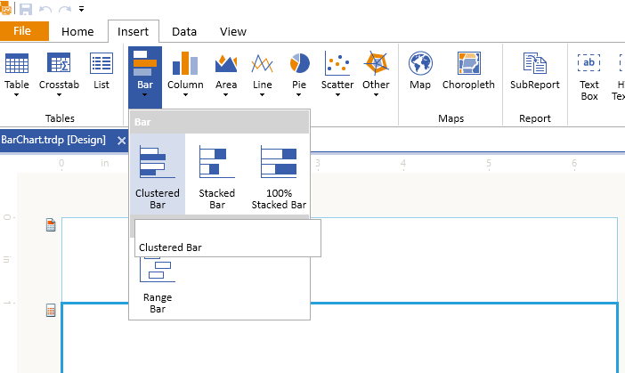
Add a Clustered Bar chart as shown in the image below:

-
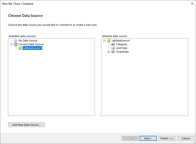
Select the SqlDataSource, or create it with the Add New Data Source... button and by using the query above:

-
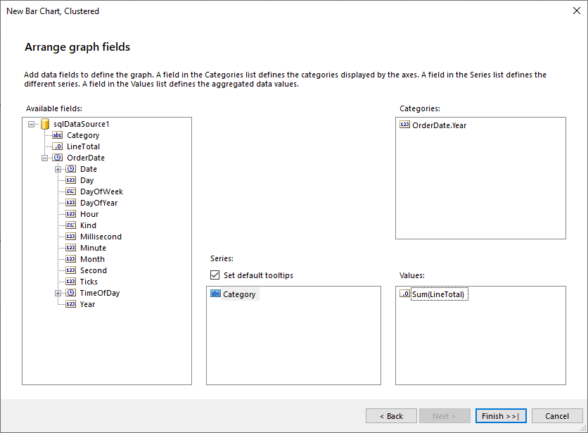
Arrange the Bar Chart:
- Drag the Category field to Series.
- Drag the OrderDate.Year field to Categories.
- Drag the LineTotal field to the Values. The wizard will automatically apply the
Sumaggregate function.

The
LineTotalvalue is large, so let's change theData > Xexpression ofbarSeriesthat is currently=Sum(Fields.LineTotal)to=ISNULL(Sum(Fields.LineTotal), 0) / 1000.0. Note that aNullcheck is also included and theNullvalues to be replaced with a0(zero).
To see the full implementation of the sample report, refer to the BarChart.trdp project on GitHub.
Creating Bar Charts Manually
This section will show how to manually create a Bar chart.
1. Add the Graph
To add a new Graph report item to the report, refer to the article on getting started with the Graph report item.
2. Set the SeriesGroups Hierarchy
Now you can set the SeriesGropus hierarchy of the Bar chart:
- Open the SeriesGroups collection editor and click Add.
- Set the Groupings to
=Fields.Category. - Set the Sortings to
=Fields.Category. - Set the Filter to
=Fields.Category<>Bikes. - Set the Name to
seriesGroup1.
3. Set the CategoryGroups Hierarchy
Next, you will have to define the CategoryGroups hierarchy of the Bar chart:
- Open the CategoryGroups collection editor and click Add.
- Set the Groupings to
=Fields.OrderDate.Year. - Set the Sortings to
=Fields.OrderDate.Year. - Set the Name to
categoryGroup1.
4. Configure the Coordinate System
Here you will specify the coordinate system details:
- Open the CoordinateSystems collection editor and Add a new CartesianCoordinateSystem.
- Leave the Name to
cartesianCoordinateSystem1. - Set the XAxis to New Axis with Numerical Scale.
- Set the YAxis to New Axis with Category Scale.
5. Configure the Series
In this step, you will configure the series of the chart:
- Open the Series collection editor and Add new BarSeries.
- Set the CategoryGroup to categoryGroup1.
- Set the SeriesGroup to seriesGroup1.
- Set the CoordinateSystem to cartesianCoordinateSystem1.
- Set the ArrangeMode to Clustered.
- Set the X value to
=ISNULL(Sum(Fields.LineTotal), 0) / 1000.0.
6. Style the Appearance
To set the color palette, format the labels, define the values of the legend, and elaborate on any other styling options, refer to the section on formatting the Graph.
Design Considerations
- Bar charts have reversed axes. The category axis is the vertical axis (Y axis) and the value axis is the horizontal axis (X axis). This means that in a Bar chart, you have more space for category labels to display along the Y axis as a list that reads from top to bottom.
- Commonly, Bar and Column charts show comparisons between groups. If more than three series are present on the chart, consider using a Stacked Bar or Column chart.
- A Bar chart displays values from left to right, which may be more intuitive when displaying data related to durations.
- When a Bar chart renders data point labels, the labels are placed on the outside end of each bar (OutsideEnd). This behavior may result in a label that is overlapped by its corresponding bar when the bar takes up all of the allotted space within the chart area. To change the position of the data point labels displayed for each bar, set the
DataPointLabelAlignmentproperty in the Properties tool window. - If there are many data points in your dataset that are relative to the size of your chart, the size of the bars and the spacing between them are reduced. To modify the width of the bars in a chart, consider changing the SpacingSlotCount property of the category axis scale. By default, the value is
1which indicates equal widths of the bars and the free space. The greater the value, the more free space is reserved between the bars.