Creating and Customizing Range Area Charts
A Range chart displays sets of data points, each of which is defined by multiple values for the same category, and emphasizes the distance between the two values.
The category labels are displayed on the category axis. The plain Range chart fills in the area between the top and the bottom value for each data point.
The following image displays a plain Range chart with one Range Area series:

Types
The Graph supports the following Range chart types:
- Column range—The Column Range chart uses columns to represent the range.
- Bar range—The Bar Range chart uses bars to represent the range.
- Smooth range—A Smooth Range chart uses curved lines to connect data points rather than straight ones.
Creating Range Charts with the Range Chart Wizard
In this section, you will learn how to create a Range Area Chart with our Range Chart Wizard. The Range Chart is a modification of the more general Area Chart. That's why, its Wizard is under the Area Charts menu item. Our Range Chart will display the difference between years 2002 and 2003 for the earnings (field TotalDue from the below query) for the sales territories. The range value will be displayed as a Column range. The final report will look like the image above.
The sample report will use a pre-defined SqlDataSource that connects to the example AdventureWorks database. The query that returns the needed fields is the following:
SELECT
    [Sales].[SalesTerritory].[Name] AS 'TerritoryName',
    [Sales].[SalesOrderHeader].[OrderDate],
    [Sales].[SalesOrderHeader].[TotalDue]
FROM
    [Sales].[SalesOrderHeader] INNER JOIN
    [Sales].[SalesTerritory] ON [Sales].[SalesOrderHeader].[TerritoryID] = [Sales].[SalesTerritory].[TerritoryID]
WHERE
    YEAR([Sales].[SalesOrderHeader].[OrderDate]) IN (2002, 2003)
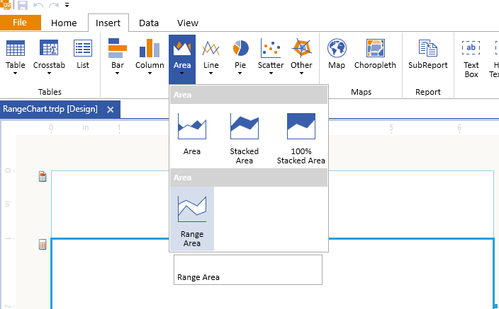
To create the Range chart by using the Range Chart Wizard:
-
Add Range Chart as shown in the image below:
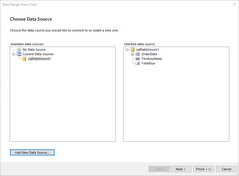
-
Select the SqlDataSource, or create it with the Add New Data Source... button and by using the query above:
-
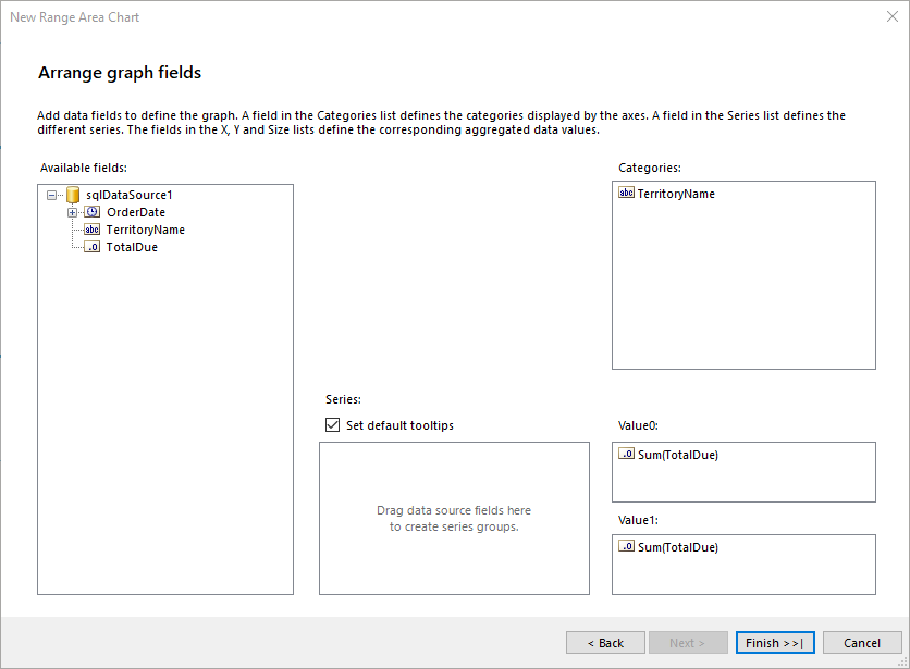
Arrange the Range Chart:
- Leave Series empty.
- Drag the TerritoryName field to Categories.
- Drag the TotalDue field to Value0. The wizard will automatically apply the
Sumaggregate function. - Drag the TotalDue field also to Value1. Later, you will edit both Value fields manually to display the required information.
-
Select the areaSeries and change its properties
YandY0in the Properties Data tab from the current=Sum(Fields.TotalDue)to the following values:-
Y:=Sum(IIF(Fields.OrderDate.Year=2002, Fields.TotalDue, 0)) / 1000.0 -
Y0:=Sum(IIF(Fields.OrderDate.Year=2003, Fields.TotalDue, 0)) / 1000.0
The above expressions set the range value of the Range Area Chart to be the difference between years 2002 and 2003.
The
TotalDuevalue is large, so you have to also change the areaSeries to display the value in thousands. -
Select the Graph Legend and set its Style > Visible to
False. As a result, the legend will be hidden and will free space for the Chart itself as having only one series and the legend is not very informative.If the Category labels that represent territory names in the example are still too long and wrap on a new line, you can either shorten the names, or increase the Graph width.
To see the full implementation of the sample report, refer to the RangeChart.trdp project on GitHub.
Creating Range Charts Manually
This section will show how to manually create a Range Area chart.
1. Add the Graph
To add a new Graph report item to the report, refer to the article getting started with the Graph report item.
2. Set the SeriesGroups Hierarchy
Now you can set the SeriesGropus hierarchy of the Range Area chart:
- Open the SeriesGroups collection editor and click Add. By default, this will add a new static group (group without grouping).
- Set the Name to
seriesGroup1.
3. Set the CategoryGroups Hierarchy
Next, you will have to define the CategoryGroups hierarchy of the Range Area chart:
- Open the CategoryGroups collection editor and click Add.
- Set the Groupings to
=Fields.TerritoryName. - Set the Sortings to
=Fields.TerritoryName. - Set the Name to
categoryGroup1.
4. Configure the Coordinate System
Here you will specify the coordinate system details:
- Open the CoordinateSystems collection editor and Add a new CartesianCoordinateSystem.
- Leave the Name to
cartesianCoordinateSystem1. - Set the XAxis to New Axis with Category Scale.
- Set the YAxis to New Axis with Numerical Scale.
5. Configure the Series
In this step, you will configure the series of the chart:
- Open the Series collection editor and Add new AreaSeries.
- Set the CategoryGroup to categoryGroup1.
- Set the SeriesGroup to seriesGroup1.
- Set the CoordinateSystem to cartesianCoordinateSystem1.
- Set the Y value to
=Sum(IIF(Fields.OrderDate.Year=2002, Fields.TotalDue, 0)). - Set the Y0 value to
=Sum(IIF(Fields.OrderDate.Year=2003, Fields.TotalDue, 0)).
6. Style the Appearance
To set the color palette, format the labels, define the values of the legend, and elaborate on any other styling options, refer to the section on formatting the Graph.
Design Considerations
- Range charts require two values per data point. These values represent a high value and a low value that define the range for each data point.
- If only one value is specified, the Range chart will display as if it were a regular Area, Bar, or Column chart with a single value per data point.
- Range charts are often used to graph data that contains minimum and maximum values for each category group in the dataset.
- It is not recommended to display markers on each data point in a Range chart.
- Like the Area chart, in a plain Range chart, if the values in multiple series are similar, the series will overlap. In this scenario, you may want to use a Column Range or Bar Range chart instead of a plain Range chart.
- You can create Gantt charts by using a Range Bar chart.